
Angular Guider Service
This library was generated with Angular CLI version 16.1.0.
Overview
The Angular Guider Service is a utility service in Angular that provides functionality to create a guided interface experience, helping users navigate through specific elements on your application.
See the code also on GitHub.
Features
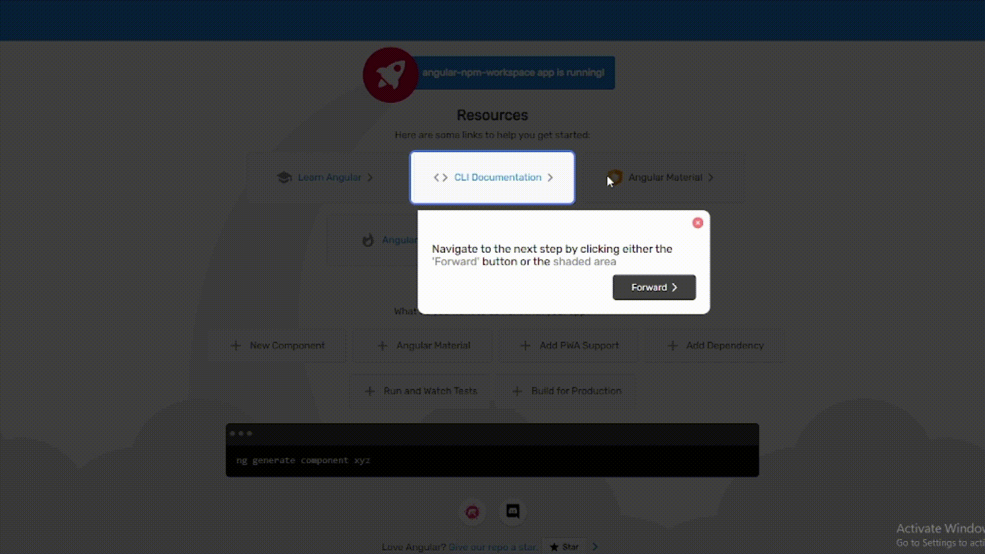
- Guided interface walkthrough with step-by-step instructions.
- Automatic resizing and repositioning based on the target elements.
- Disable scrolling during the guide for a focused experience.
Installation
To use the Angular Guider Service in your Angular application, follow these steps:
1. Install the service using npm:
npm install --save angular-guider2. Import the AngularGuiderService and provide it in your module:
import { AngularGuiderService } from 'angular-guider';

@NgModule({
  providers: [AngularGuiderService]
})
3. Inject the AngularGuiderService where you need to use it:
import { AngularGuiderService } from 'angular-guider';

constructor(private guiderService: AngularGuiderService) { }
4. Add the following CSS rule to your global styles (e.g., styles.css or styles.scss) to ensure a focused experience during the guide:
.guider-active {
    height: 100vh;
    width: 100vw;
    overflow: hidden !important;
}
This CSS rule will be applied when the guide is active, preventing scrolling and ensuring a focused view for users during the interface walkthrough.
Feel free to customize the CSS rule based on your application's styling needs.
Usage
Input
The Angular Guider Service provides the following input methods for controlling the guide:
-
setSteps(steps: AngularGuiderStep[]): void- Description: Sets up an array of guider steps that define the sequence of steps in the guided interface walkthrough.
-
Parameters:
-
steps(type:AngularGuiderStep[]): An array ofAngularGuiderStepobjects, where each object represents a step in the guided interface.
-
-
startGuide(): void- Description: Initiates the guider, starting from the default index (usually the first step).
- Usage: Call this method to begin the guided interface experience.
-
startGuideAt(index: number): void- Description: Initiates the guider, starting from the specified index in the array of guider steps.
-
Parameters:
-
index(type:number): The index at which to start the guider.
-
- Usage: Call this method to start the guider at a specific step.
-
nextStep(): void- Description: Moves the guider to the next step in the sequence.
- Usage: Call this method to progress to the next step in the guided interface.
-
prevStep(): void- Description: Moves the guider to the previous step in the sequence.
- Usage: Call this method to go back to the previous step in the guided interface.
-
endGuide(): void- Description: Ends the guider, terminating the guided interface experience.
- Usage: Call this method to conclude the guided interface walkthrough.
Output
Subscribe to the following events to be notified of guider actions:
-
onNext(): Observable<void>- Description: Emits when the user successfully navigates to the next step in the guided interface.
- Usage: Subscribe to this event to perform additional actions when the user advances to the next step.
-
onPrev(): Observable<void>- Description: Emits when the user successfully navigates to the previous step in the guided interface.
- Usage: Subscribe to this event to perform additional actions when the user goes back to the previous step.
-
onClose(): Observable<void>- Description: Emits when the user closes the guider, either by reaching the end or manually ending the guide.
- Usage: Subscribe to this event to perform cleanup or additional actions when the user closes the guided interface.
Angular Guider Step Interface
The AngularGuiderStep interface is used to define the properties of each step in the Angular Guider. Each step represents a specific point in the guided interface walkthrough.
| Property | Type | Description |
|---|---|---|
elementId |
string |
(Required) The HTML element's ID associated with the step. |
message |
string |
(Optional) Message or instructions linked with the step. |
clickable |
boolean |
(Optional) Indicates whether the element's area is clickable. |
hideButtons |
boolean |
(Optional) Indicates whether to hide the guider buttons during this step. |
disableShadedArea |
boolean |
(Optional) Indicates whether to disable interaction with the shaded area during this step. |
borderColor |
string |
(Optional) The color of the border associated with this step. Default is '#5478f0'. |
Example Usage:
import { AngularGuiderStep } from 'angular-guider';

const step: AngularGuiderStep = {
  elementId: 'exampleElement',
  message: 'Click on this element to proceed.',
  clickable: true,
  hideButtons: true,
  disableShadedArea: true,
  borderColor: '#ff0000' // Customize the border color for this step
};
Feel free to customize the example usage based on your specific implementation.
Component Examples
//app-app-example.component.ts

// Import necessary modules and services
import { Component, OnInit } from '@angular/core';
import { AngularGuiderService } from 'angular-guider';

@Component({
  selector: 'app-example',
  template: `
    <button (click)="startGuide()">Start Guider</button>

    <!-- Your application content -->
    <div id="my-example-step1">Element 1</div>
    <div>Some other element</div>
    <div id="my-example-step2">Element 2</div>
  `,
})
export class ExampleComponent implements OnInit {
  constructor(private guiderService: AngularGuiderService) {}

  ngOnInit(): void {
    // Set up guider steps
    const guideSteps = [
      {
        elementId: 'my-example-step1',
        message: `
        <div style="width: 500px">
          <h2 style="color: #dd1b16">Title</h2>
          <p>
            This is the first step.
          </p>
        </div>`
      },
      {
        elementId: 'my-example-step2',
        message: 'This is the second step.',
        clickable: true,
        hideButtons: true
      },
      // Add more steps as needed
    ];

    // Initialize guider steps
    this.guiderService.setSteps(guideSteps);
  }

  // Start the guider
  startGuide(): void {
    this.guiderService.startGuide();
  }
}
License
This project is licensed under the MIT License - see the LICENSE file for details.
Feel free to modify the content based on your specific needs and add more sections if required.