
Angular Credit Cards
A slick credit card component for Angular.
Installation
- You can install angular-credit-card using npm
npm install angular-credit-cards --save
- You will also need to install and include
payment.jslibrary in your application (it is a peer dependency of this library, more info can be found in the officialpayment.jsdocumentation)
npm install payment --save
- Import the
NgCreditCardModulein your app main module:
import { NgCreditCardModule } from "angular-credit-card";

// In your App's module:
imports: [NgCreditCardModule];
Props
-
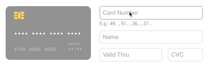
name{string}: Name on card. * -
number{string}: Card number. * -
expiry{string}: Card expiry date.10/20or012017* -
cvc{string}: Card CVC/CVV. * -
focused{string}: Focused card field.name|number|expiry|cvc -
i18n{object}: placeholder text (e.g.{ name: 'YOUR NAME HERE', valid: 'valid thru', } -
acceptedCards{array}: If you want to limit the accepted cards. (['visa', 'mastercard', ,'amex' 'visaelectron', 'unionpay', 'maestro', 'jcb', 'hipercard', 'elo', 'discover', 'dinersclub']
Usage
Use <ng-credit-card> in your component html.
<ng-credit-card [name]="name" [number]="number" [cvc]="cvc" [expiry]="expiry"></ng-credit-card>
SCSS options
Credit Card sizing
-
$rccs-card-ratio: Card ratio. Defaults to1.5858 -
$rccs-size: Card width. Defaults to290px
Credit Card fonts
-
$rccs-name-font-size: Defaults to17px -
$rccs-name-font-family: Defaults toConsolas, Courier, monospace -
$rccs-number-font-size: Defaults to17px -
$rccs-number-font-family: Defaults toConsolas, Courier, monospace -
$rccs-valid-font-size: Defaults to10px -
$rccs-expiry-font-size: Defaults to16px -
$rccs-expiry-font-family: Defaults toConsolas, Courier, monospace -
$rccs-cvc-font-size: Defaults to14px -
$rccs-cvc-font-family: Defaults toConsolas, Courier, monospace -
$rccs-cvc-color: Defaults to#222
Credit Card styling
-
$rccs-shadow: Defaults to0 0 20px rgba(#000, 0.2) -
$rccs-light-text-color: Card text color for dark cards. Defaults to#fff -
$rccs-dark-text-color: Card text color for light cards. Defaults to#555 -
$rccs-stripe-bg-color: Stripe background color in the back. Defaults to#2a1d16 -
$rccs-signature-background: Signature background in the back. Defaults torepeating-linear-gradient(0.1deg, #fff 20%, #fff 40%, #fea 40%, #fea 44%, #fff 44%) -
$rccs-default-background: Default card background. Defaults tolinear-gradient(25deg, #939393, #717171) -
$rccs-unknown-background: Unknown card background. Defaults tolinear-gradient(25deg, #999, #999) -
$rccs-background-transition: Card background transition. Defaults toall 0.5s ease-out -
$rccs-animate-background: Card background animation. Defaults totrue
Credit Card brands
-
$rccs-amex-background: Defaults tolinear-gradient(25deg, #308c67, #a3f2cf) -
$rccs-dankort-background: Defaults tolinear-gradient(25deg, #ccc, #999) -
$rccs-dinersclub-background: Defaults tolinear-gradient(25deg, #fff, #eee) -
$rccs-discover-background: Defaults tolinear-gradient(25deg, #fff, #eee) -
$rccs-mastercard-background: Defaults tolinear-gradient(25deg, #e8e9e5, #fbfbfb) -
$rccs-visa-background: Defaults tolinear-gradient(25deg, #0f509e, #1399cd) -
$rccs-elo-background: Defaults tolinear-gradient(25deg, #211c18, #aaa7a2) -
$rccs-hipercard-background: Defaults tolinear-gradient(25deg, #8b181b, #de1f27)
Contributing
this package is built for angular based on the package react-credit-cards
LICENSE
This project is licensed under the MIT License.