
##Introduction This is a basic rating web-component. It allows for a max rating to be set as well as user input (if required). If the user does select a rating then an event is fired, which can be handled in pure JS or by a framework of your choice. The component is fully customisable using a SVG polygon and can accept half-step ratings.
- Put the script tag
<script src='https://unpkg.com/am-rating@0.0.6/dist/am-rating.js'></script>on your page - Then you can use the element anywhere in your template or html.
- Run
npm install am-rating --save - Put the script tag
<script src='node_modules/am-rating/dist/am-rating.js'></script>on your page - Then you can use the element anywhere in your template or html.
##How to use
To include the component on your page use the <am-rating/> tag. To set values for the display, you can add the following properties.
Properties for <am-rating>
| Attribute | Description | Default | Type | Possible values |
|---|---|---|---|---|
| rating | The rating to display | 0 | number | 0-max-rating |
| max-rating | The number of rating items to display | 0 | number | number |
| color-on | The color of the off rating | #000000 | string | hex value or color name |
| color-outline | The color of the rating items outline | #ffffff | string | hex value or color name (can be none) |
| direction | The fill direction for the rating items | #666666 | string | ltr (left to right) or ttb (top to bottom) |
| interactive** | Allow the user to submit a rating | false | boolean | true|false |
| allow-half-ratings | Allow the user to submit half ratings | false | boolean | true|false |
| svg-points | Change the default shape | A star shape*** | string | Any string |
| svg-view-box | Change the default view box for the SVG | 0 0 100 100 | string | Any valid view box configuration |
**If you set interactive to true, the user will be able to tap on the element and assign a new rating. This will fire an event with the new rating.
***The item shape is an SVG polygon contained within a "0 0 100 100" viewbox. Use the svg-view-box property to change this.
Events fired by <am-rating>
| Event | Description | Type | Values |
|---|---|---|---|
| ratingUpdated | The new rating of the widget | Object | { "detail" : { "reference" : <string>, "rating" : <number> } } |
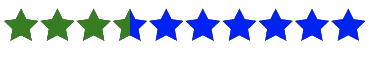
Example:
<am-rating
  reference="rating-widget-1"
  rating="1.5"
  min-rating="0"
  max-rating="10"
  color-on="green"
  color-off="blue"
  color-outline="#666"
  direction="ltr"
  allow-half-ratings="true"
  interactive="true"
/><script>
window.addEventListener('ratingUpdated', (event) => {
const reference = event.detail.reference;
const rating = event.detail.rating;
});
</script>##Contribute If you want to contribute then create a fork, make your changes and create a pull request.
Quick Start
To watch for file changes during develop, run:
npm run devTo build the component for production, run:
npm run buildTo run the unit tests for the components, run:
npm testNeed any more help? Check out the Stencil docs here.