ReactNative-checkbox
Checkbox and CheckboxList Components for React Native. Components uses MaterialIcons from https://github.com/oblador/react-native-vector-icons.
Installation
npm i ReactNative-checkbox --saveiOS
-
Browse to
node_modules/react-native-vector-iconsand drag the folder Fonts (or just the ones you want) to your project in Xcode. -
Edit Info.plist and add:
<key>UIAppFonts</key><array> <string>Entypottf</string> <string>EvilIconsttf</string> <string>FontAwesomettf</string> <string>Foundationttf</string> <string>Ioniconsttf</string> <string>MaterialIconsttf</string> <string>Octiconsttf</string> <string>Zocialttf</string></array>Usage:
import {Checkbox, CheckboxList } from 'ReactNative-checkbox';
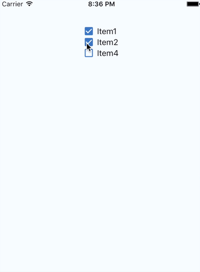
{ const Items = name: 'Item1' done: true name: 'Item2' done: true name: 'Item4' done: false ; return <View => <CheckboxList = ='done' ='#4078c0' ='check-box' ='check-box-outline-blank' /> </View> ;}Example
Props:
Checkbox
checked: BooleaniconUnchecked: Name for unchecked icon from MaterialIcons (https://design.google.com/icons/) ex. "radio-button-unchecked".iconChecked: Name for checked icon from MaterialIcons (https://design.google.com/icons/) ex. "radio-button-checked".iconColor: String ex. "#305dc1".iconSize: Numbertext: Text that will be displayed along the checkbox.textSize: Number - fontSize value.onChange: Function that will be executed after click on checkbox.checkboxStyles: StyleSheet abstraction ex. { flexDirection: 'row', flexWrap: 'wrap', alignItems: 'center'}iconStyles: StyleSheet abstraction ex. { marginRight: 5 }
CheckboxList
checked: String - Name of the object property which stands for checked (boolean).name: String - Name of the object property which stands for name. It will be displayed along the checkbox.data: Array of objects ex. [{name: 'Female', checked: true}, {name: 'Male', checked: false}]iconUnchecked: Name for unchecked icon from MaterialIcons (https://design.google.com/icons/) ex. "radio-button-unchecked".iconChecked: Name for checked icon from MaterialIcons (https://design.google.com/icons/) ex. "radio-button-checked".iconColor: String ex. "#305dc1".iconSize: NumbertextSize: Number - fontSize value.onChange: Function that will be executed after click on checkbox.checkboxStyles: StyleSheet abstraction ex. { flexDirection: 'row', flexWrap: 'wrap', alignItems: 'center'}iconStyles: StyleSheet abstraction ex. { marginRight: 5 }checkboxListStyles: StyleSheet abstraction ex. { flex: 1 }