Sass Yoonit Style

A SASS lib to help you with:
- Atomic Design System
- Created using BEM methodology
- Diverse variables and mixins to improve your awesome layout
- Responsive grid and flex system
- Diverse theme range
- Components styles
- Possibility of creating themes

Installation
npm i -s @yoonit/styleUsage
To access all the features of yoonit/style, import the SASS theme that you want in your project globally.
@import '@yoonit/style'If you want to import somenthing especific of this project, for example, the button style, you can import that directy.
@import '@yoonit/style/atoms/YooButton'Themes
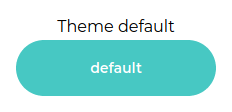
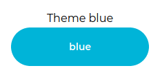
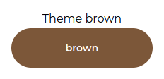
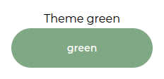
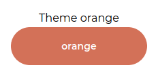
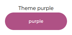
These are all the themes available for now.
Creating themes
Yoonit Style has global root variables, with a default theme. In addition to the default theme, we have 5 more themes available, as shown above in the images.
The default theme has the following variables:
  --font-family-primary: 'Montserrat', 'sans-serif'
  --font-family-second: 'Arial', 'sans-serif'

  --primary-darkest: #008080
  --primary-dark: #1DBABA
  --primary-base: #47C8C3
  --primary-light: #B0E7E5
  --primary-lightest: #C3ECEb
  --danger-darkest: #CB0A22
  --danger-dark: #E83C4B
  --danger-base: #F4596C
  --danger-light: #FF7888
  --danger-lightest: #FF99A5
  --grey-darkest: #212325
  --grey-dark: #5A5F67
  --grey-base: #8F959F
  --grey-light: #D6DBE2
  --grey-lightest: #F5F6F7
  --color-white: #FFFFFF
  --color-black: #111111
  --color-transparent: rgba(255, 255, 255, 0)
To use the variable in your sass file, just use var(VariableName), for example:
.myClass
  color: var(--grey-base)
To create a custom theme, in your project create a sass file and overwrite the root variables, involved in a "data-composition", let's see an example:
MyTheme.sass
$font-base: 16;

@import '@yoonit/style'

/*==== Import Quarks ====*/

[data-composition="myTheme"]
  --primary-darkest: #49260a
  --primary-dark: #623b1c
  --primary-base: #7c5739
  --primary-light: #caad8c
  --primary-lightest: #f6eddd

  --font-tn: 8px
  --font-xs: 10px
  --font-sm: 12px
  --font-md: 14px
  --font-lg: 16px
  --font-xl: 20px
  --font-hg: 32px

  --spacing-tn: 2px
  --spacing-xs: 4px
  --spacing-sm: 8px
  --spacing-md: 16px
  --spacing-lg: 24px
  --spacing-xl: 32px
  --spacing-hg: 64px
Now, in your template, add a div wrapped in the elements you want to change the theme to, and add in this div the data-composition="myTheme" attribute
Template.vue
<div data-composition="myTheme">MyContainer</div>So the root variables will be overridden with the theme you made for this added condition.
Helpers
| Name | Input/Format | Usage (sass) | Description |
|---|---|---|---|
| flex | flex-direction, flex-wrap, justify-content, align-content/align-items | +flex($flex-direction, $flex-wrap, $justify-content, $align-content/align-items |
Helps in the spacial organization on the interface |
| durationAnimation | 'slow' or 'normal' or 'fast' or 'very-fast' | +durationAnimation($modifier) |
Sets the duration of the animation |
| stateAnimation | 'paused' or 'played' | +stateAnimation($state) |
Sets the state of the animation |
| delayAnimation | 'slow' or 'normal' or 'fast' | +delayAnimation($delay) |
Sets the animation delay |
| animation | animation-name, animation-iteration-count, animation-direction, animation-timing-function, 'slow' or 'normal' or 'fast' or 'very-fast', 'paused' or 'played', 'slow' or 'normal' or 'fast' | +animation($animation-name, $animation-iteration-count, $animation-direction, $animation-timing-function, $animation-duration, $animation-play-state, $animation-delay |
Mixin to build an animation with all properties |
| border-radius | 'sm' or 'md' or 'lg' or 'pill' or 'circular' or 'none' | +border-radius($modifier) |
Defines a rounding for the bordered element |
| border | 'xs' or 'sm' or 'md' or 'lg' or 'none', border-color, border-style, 'sm' or 'md' or 'lg' or 'pill' or 'circular' or 'none' | +border($border-width, $border-color, $border-style, $border-radius) |
Mixin to build a border with all properties |
| text-color | $primary or $danger or $grey, $colorVariation | +text-color($variation, $color) |
Sets the color of the text with its respective variation, according to the colors of the theme. |
| background-color | $primary or $danger or $grey, $colorVariation | +background-color($variation, $color) |
Sets the background color with its respective variation, according to the colors of the theme. |
| border-color | $primary or $danger or $grey, $colorVariation | +border-color($variation, $color) |
Sets the color of a border with its respective variation, according to the colors of the theme. |
| box-shadow | 'soft' or 'low' or 'mid' or 'high' or 'veryHigh' or 'none', color | +box-shadow($level, color) |
Sets a shadow for the desired element. You can choose the intensity and color of the shadow |
| text-shadow | 'soft' or 'low' or 'mid' or 'high' or 'veryHigh' or 'none', color | +text-shadow($level, color) |
Sets a shadow for text. You can choose the intensity and color of the shadow |
| font-size | 'tn' or 'tn' or 'sm' or 'md' or 'lg' or 'xl' or 'hg' | +font-size($font-size) |
Set font size |
| font-family | 'font-primary' or 'font-second' or font-family | +font-family($font-family) |
Set the family to font |
| font-weight | 'bold' or 'semi-bold' or 'medium' or 'regular' | +font-weight($font-weight) |
Set a font weight |
| font | font-color, 'tn' or 'tn' or 'sm' or 'md' or 'lg' or 'xl' or 'hg', 'font-primary' or 'font-second' or font-family, 'bold' or 'semi-bold' or 'medium' or 'regular' | +font($font-color, $font-size, $font-family, $font-weight) |
Mixin to assist in the construction of the font css with all the properties |
| pxToRem | $target, $baseValue | +fpxToRem($target, $baseValue: $font-base) |
Function that helps convert from px to rem. $target is the value chosen to be converted. $baseValue is the base value to perform the conversion and has the default value that is defined in the variable $font-base
|
Classes
We have tons of classes in Yoonit Style, but let's talk about the two main ones, that can be used to set margin and padding.
The margin class .m and the padding class .p have elements and modifiers.
The elements are the position of the margin or padding (left, top, bottom or right) and the modifiers are the size of the margin or padding (extra small, small, medium, large, extra large or none).
| Param | Input/Format | Description |
|---|---|---|
| element | 'l' or 't' or 'b' or 'r' | Position of the margin or padding |
| modifier | 'xs' or 's' or 'm' or 'l' or 'xl' or 'none' | Size of the margin or padding |
To use them, in your html code, set the .m or .p, then do __element, then --modifier.
Example:
.m__b--l //meaning: margin__bottom--large

.m__l--s //meaning: margin__left--small

.p__t--m //meaning: padding__top--medium

.p__r--xl //meaning: padding__right--extra-large
To contribute and make it better
Clone the repo, change what you want and send PR. For commit messages we use Conventional Commits.
Contributions are always welcome!
Code with