The library allows you to use the login widget or Login SDK API methods separately. Currently, SDK supports the following types of authorization:
- via login/password
- via social networks
This page contains:
- Connecting SDK
- Widget 2.0 preview
- Integrating widget 2.0
- Using additional features
- Integrating login API
- Connecting JSON with widget settings
See Login documentation to find more.
Connect Xsolla Login widget SDK using one of the following methods:
- If the project uses
npm, launch the console and run
npm i @xsolla/login-sdk- If the package is not connected, add the following code to the
<head>tag of the HTML-page where the widget will be placed:
<script src="https://login-sdk.xsolla.com/latest/">
</script>Before you integrate the Xsolla Login widget, you can see it in the preview mode. The preview uses default settings, style, and language. To see it, use the following URL with your own values for query parameters:
https://login-widget.xsolla.com/latest/?projectId={LOGIN_PROJECT_ID}&login_url={CALLBACK_URL}You can also add the locale query parameter to the URL. Possible values are available in the preferredLocale parameter.
This library allows you to quickly integrate Xsolla Login widget with your website in following steps:
Add the widget initialization code to the <body> tag.
<script>
const xl = new XsollaLogin.Widget({
  projectId: '[Login ID]',
  preferredLocale: 'en_US'
});
</script>
Version for npm:
import { Widget } from '@xsolla/login-sdk';
const xl = new Widget({
  projectId: '[Login ID]',
  preferredLocale: 'en_US'
}); string
Login project ID from Publisher Account. Required.
string
URL to redirect the user to after registration/authentication/password reset. Must be identical to one of the Callback URL specified in Publisher Account in Login settings. Required if there are several Callback URLs.
You can pass several URLs of the local server to make the widget available to the local build. For example https://localhost:9000.
string
Your custom data. The value of the parameter will be returned in the user JWT > payload claim.
string
Language of the widget interface and region in the <language code>_<country code> format where:
- language code: language code in the ISO 639-1 format;
- country code: country/region code in the ISO 3166-1 alpha-2 format. The following locales can be specified: Arabic (ar_AE), Bulgarian (bg_BG), Czech (cz_CZ), German (de_DE), Spanish (es_ES), French (fr_FR), Hebrew (he_IL), Indonesian (id_ID), Italian (it_IT), Japanese (ja_JP), Khmer (km_KM), Korean (ko_KR), Lao (lo_LO), Burmese (my_MY), Nepali (ne_NE), Filipino (ph_PH), Polish (pl_PL), Portuguese (pt_BR), Romanian (ro_RO), Russian (ru_RU), Thai (th_TH), Turkish (tr_TR), Vietnamese (vi_VN), Chinese Simplified (zh_CN), Chinese Traditional (zh_TW). Also used for sorting social networks by the frequency of use in the chosen region.
string
Widget background color in the fullscreen mode. The value can be in any of the CSS color formats. Default is RGBA(50, 150, 150, 0.1).
string
The stack order of the widget in the fullscreen mode. Default is 9000.
Choose the widget placing on the website start page:
Add the button with the on-click event and the xl.open() function to the site.
<div id="xl_auth" style="display: none"></div>
<button onclick="showFullscreen()">Fullscreen widget</button>
Add the code for inserting the widget into the block.
!! Please use the same id for both div & querySelector !!
<script type="text/javascript">
  xl.mount('xl_auth');

  function showFullscreen() {
    const myDiv = document.querySelector('#xl_auth');
    myDiv.style.display = 'block';

    xl.open();
  }
</script>
Version for npm:
xl.mount('xl_auth');

const showFullscreen = () => {
  const myDiv = document.querySelector('#xl_auth');
  myDiv.style.display = 'block';

  xl.open();
}
The fullscreen mode is closed by clicking outside the widget area.
Add the block with the widget to the <body> tag and set the block ID.
<div id="xl_auth" style="height: 700px"></div>Add the code for inserting the widget into the block.
<script type="text/javascript">
  xl.mount('xl_auth');
</script>
Version for npm:
xl.mount('xl_auth');If you have already integrated Login, you can also try additional features of Xsolla Login widget:
- Babka Login Popup on a new window
- Customizing widget 2.0 style
- Tracking widget 2.0 events
- Connecting OAuth 2.0 protocol
- Prioritize Apple ID social login
- Opening widget 2.0 pages
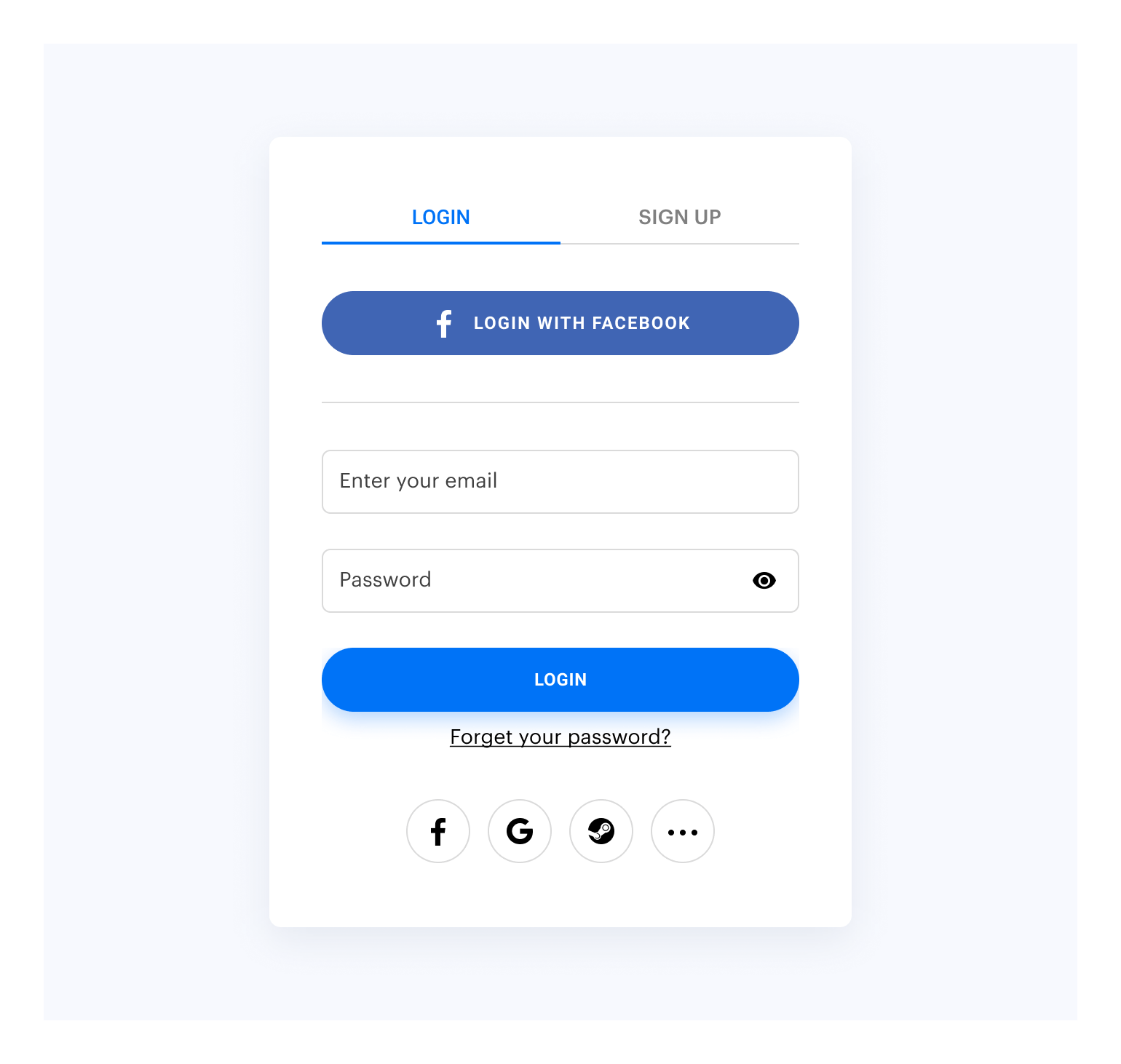
By default, the widget looks like this:
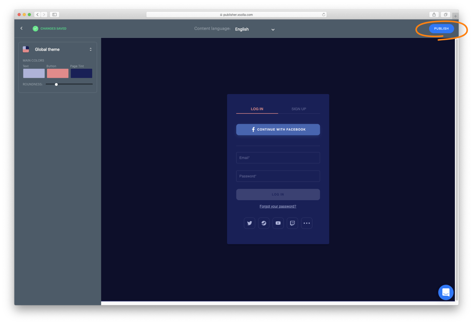
Customize the widget style by changing the following parameters in Publisher Account:
- Roundness
- Text color
- Buttons color
- Background color
To customize:
-
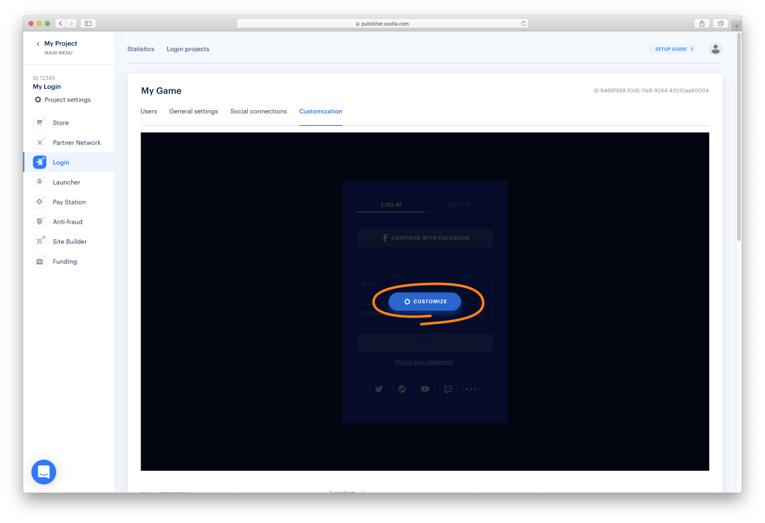
Go to the Customization page in Publisher Account.
-
Move your mouse cursor to the editing area and click Customize. It will open the widget builder.
NOTE
After publication, the widget will be changed for all the projects it was connected to.
You can collect widget statistics on the following events:
To start tracking the event, initialize and process the action as described below.
xl.on(xl.events.Open, function () {
    console.log('user has opened the widget');
});xl.on(xl.events.Close, function () {
console.log('user has closed the widget');
});xl.on(xl.events.Dimensions, function(e) {
// Event will contain height and width data in pixels
const { height, width } = e.dimensions;
console.log('Height: ', height);
console.log('Width: ', width);
})If you would like to change your container based on these values, we also recommend to add CSS transitions to make resizing smoother.
.widget-container {
    transition: height 300ms ease-out 0s;
}Xsolla Login widget supports the OAuth 2.0 protocol-based user authentication. Follow the Connecting OAuth 2.0 instruction to set it up.
You can show Apple ID social login option at the first position by enabling the parameter below:
import { Widget } from '@xsolla/login-sdk';
const xl = new Widget({
  appleIdPriority: true
});You can open Xsolla Login widget on other pages, in addition to the authentication (Login) page.
There are two ways of opening Login widget page:
- Before initializing - Login widget will open a selected page instead of Login page (default)
- After initializing - Login widget will switch current page to the selected page. Login widget must be already initialized.
The following pages are available:
Before the widget initialization:
  const pages = XsollaLogin.WidgetPages;

  const xl = new XsollaLogin.Widget({
     // Other settings
    page: pages.SignUpPage
  });
After the widget initialization:
  const pages = XsollaLogin.WidgetPages;
  const page = pages.SignUpPage;
xl.setPage(page);Before the widget initialization:
  const pages = XsollaLogin.WidgetPages;

  const xl = new XsollaLogin.Widget({
     // Other settings
    page: pages.SocialsPage
  });
After the widget initilization:
  const pages = XsollaLogin.WidgetPages;
  const page = pages.SocialsPage;
xl.setPage(page);Before the widget initialization:
  const pages = XsollaLogin.WidgetPages;

  const xl = new XsollaLogin.Widget({
     // Other settings
    page: pages.ResetPasswordPage
  });
After the widget initilization:
  const pages = XsollaLogin.WidgetPages;
  const page = pages.ResetPasswordPage;
xl.setPage(page);Before the widget initilization: no action required, since it is a default page.
After the widget initilization:
  const pages = XsollaLogin.WidgetPages;
  const page = pages.LogInPage;
xl.setPage(page);You can work with the Login widget SDK API calls separately from the Login widget if you want to:
- use your own widget design
- partly implement the Login widget flow
Detailed information is provided in the instruction.
The widget settings are contained in the following JSON files:
-
settingsJSON— main settings -
socialsJSON— social login settings -
themeJSON— theme settings
You can reuse the settings in the files and display the same widget on different settings. The settings URL is specified in the widget initialization code. To connect JSON with widget settings, follow the instruction.


