Metadata
Status
The current approach to versioning is still under debate, specifically what is considered a version 1 (the current specification is pre-v1). The expectation is that the metadata will follow Semantic Versioning and track changes to the spec in a manner that conforms to Keep a Changelog.
In addition to the actual version being in flux, the official name of this specification outside of "metadata" has neither been decided nor discussed.
Introduction
Metadata is a JSON object that provides an abstract specification of UI forms both in their included elements and layout.
The metadata API is designed to abstract the development of CRUD forms away to a specification of its parts, leaving the layout to a rigidly enforced design system or other renderer. The metadata API will not enforce the method by which it is rendered.
Conventions
The key words “MUST”, “MUST NOT”, “REQUIRED”, “SHALL”, “SHALL NOT”, “SHOULD”, “SHOULD NOT”, “RECOMMENDED”, “MAY”, and “OPTIONAL” in this document are to be interpreted as described in RFC 2119.
Document Structure
This section describes the content of a metadata document. Metadata documents are defined in JavaScript Object Notation (JSON).
Unless otherwise noted, objects defined by this specification MUST NOT contain any additional members. Client implementations MUST ignore members not recognized by this specification.
Top Level
A JSON object MUST be at the root of every metadata document. This object defines a document’s “top level”.
A document MUST contain at least the following top-level members:
-
layouts: An array of layouts. -
rows: An array of rows. -
fields: An object of fields keyed by thefieldId.
A document MAY contain any of the following top-level members:
-
actions: An action object that contains information about the population of form buttons in the renderer -
template: A template object that contains information about the structure of the page outside of the form in the renderer i.e. the presence of a TOC
Layouts
Layouts collect rows and organize them in macro-columns.
Type: Layouts is an array of layout objects.
A layout MUST contain the following top-level members:
-
columns: A two dimensional array where each inner array represents amacro-column, and each item in the inner array is arow identifier. -
id: A unique identifier for thelayouta.k.a. thelayout identifier.
A layout MAY contain any of the following top-level members:
-
order: A number greater than or equal to0indicating the layout's order within the overall structure. This may be valuable if you are creating a wizard or tabbed form.
Example:
  "layouts": [
    {
      "id": "layout1",
      "columns": [
        [
          "row-1",
          "row-2"
        ],[
          "row-3"
        ]
      ]
    }
  ]
Rows
Rows collect fields and arrange them in columns.
Type: Rows is an array of row objects.
A row MUST contain at least the following top-level members:
-
columns: An array in which every member is afield identifieror".". -
id: A unique identifier for therowa.k.a. therow identifier.
-- Note that rows that appear in a [layout].columns will map to the unique identifier id.
A row MAY contain the following top-level member:
-
indent: A number indicating the number of units from the left the row should be indented. For example, a value of1would be the equivalent of one tab stop in a standard document. Defaults to0.
Example:
  "rows": [
    {
      "id": "row-1",
      "columns": [
        "fieldA",
        ".",
        "fieldC"
      ]
    }
  ]
Fields
Fields are the actionable form elements. A field serves as a wrapper that provides the underlying component communication with the overall form.
Type: Fields is an object in which the keys are fieldId's and the values are field objects.
[row].columns will map to the unique fieldId key.
A field MUST contain the following top-level members:
-
label: A string label describing the purpose of the field. The field label MUST be sentence-cased. -
name: A string unique to this field. The field name MUST be camel-cased. -
type: A field type identifier.
A field MUST contain the following top-level member when field.type is one of select, multiselect, radio-group, switch-group, list-order or switchiepoo:
-
options: An array of option objects whose members areidandlabel. These may be overwritten usingexternalOptionsand will key off offield.name.
A field MAY contain the following top-level field properties.
-
disabled: Whether the field should be set as disabled. This can be either abooleanor an MQL statement. -
hidden: Whether the field should be displayed. This can be either abooleanor an MQL statement. -
readOnly: Whether the field should be set as read-only. This can be either abooleanor an MQL statement. -
required: Whether the field should be set as required. This can be either abooleanor an MQL statement. -
skip: Whether the field should be skipped in the tab order. This can be either abooleanor an MQL statement. -
value: This MUST be a valid MQL statement containing a SET_VALUE operator.
A field MAY contain any of the following top-level members:
-
props: An object whose member can be used to include non-standard component properties/attributes. These are key-value pairs where the key is the attribute/prop. Exactly what members are required respective to thefield.typeis dictated by the component library being used. -
info: An info object specifying an information tooltip. -
range: A boolean indicating that adate,date-time, ortimefield denotes a range. This will cause the field to display two inputs, and the type will be a range. -
tabIndex: A number greater than0that can be used to directly control the order in which tabbing is nagivated through a form.
Example:
  "fields":{
    "fieldA": {
      "type": "form.input",
      "name": "fieldA",
      "label": "Example Input"
    },
    "fieldC": {
      "type": "form.checkbox",
      "name": "fieldC",
      "label": "Example Checkbox"
    }
}-
Adding {
data-lpignore:true} to a fields's prop object will make LastPass overlook that field. -
A field with a
typeoflayout.headerSHOULD be present in each layout.
Field Types
The following fields are recognized metadata fields. The fields listed in the HTML Tag are the functional equivalent of the field definition in semantic HTML.
| ID | HTML Tag | Description |
|---|---|---|
action.button |
<button type="button" /> |
A standard button element. Further Reading |
action.icon |
<button type="button" /> |
A styled, circular HTML button containing only an icon (no text) element. Further Reading |
advanced.locator |
N/A | |
advanced.xref |
N/A | |
form.checkbox |
<input type="checkbox" /> |
|
form.currency |
<input type="number" step=".01" /> |
|
form.date |
<input type="date" /> |
A date input (or inputs) with format 'YYYY/MM/DD' (or 'YYYY/MM/DD'[]) |
form.date-time |
<input type="date" /><input type="time" /> |
A date and time input (or in the case of range two of each) side by side which output an ISO standard date string or array thereof |
form.email |
<input type="text" /> |
|
form.list-order |
<Order>{children}<Order/> |
A reorderable list |
form.switchiepoo |
<Switchiepoo>{children}<Switchiepoo/> |
A double column transfer selector |
form.input |
<input /> |
|
form.mask |
<input type="text" /> |
A standard text input that receives patterns, displays masked text, and outputs unmasked text. |
form.multiselect |
<select multiple></select> |
|
form.number |
<input type="number" /> |
|
form.password |
<input type={"text" or "password"} /> |
|
form.percent |
<input type="number" max="100" /> |
|
form.radio-group |
<input type="radio" /> |
|
form.select |
<select></select> |
|
form.switch-group |
Group of <input type="checkbox" />
|
|
form.textarea |
<textarea></textarea> |
|
form.time |
<input type="time" /> |
A time input (or inputs) with format 'hh:mm' (or 'hh:mm'[] ) |
layout.header |
<h2></h2> |
|
layout.subheader |
<h3></h3> |
Reserved Field Names
The following strings are reserved words and MUST NOT be used as field keys or name values:
-
@submit: Reserved for internal handling of the submit button.
Info Object
The info object specifies an informational tooltip that can be added to a field's label.
The info object MUST have the following top-level members:
-
title: The title of the informational tooltip.
The info object MAY have the following top-level members:
-
content: The text to display in the tooltip. -
link: a link object specifying a link to add to the bottom of the tooltip.
If the link property is present, it MUST have the following sub-properties:
-
url: The url the link should redirect to. -
label: The link's display text.
Example:
{
  "info": {
    "title": "Informational Tooltip",
    "content": "This is the tooltip description.",
    "link": {
      "url": "https://www.dmsi.com/",
      "label": "Learn More!"
    }
  }
}
Actions
When specified, the actions object can be used to customize the form action buttons for the needs of the application. The actions object MAY have the following top-level members:
-
submit: submit object -
top: array of action field names -
bottom: array of action field names
Example:
  "actions": {
    "submit": {
      "domain": "primary",
      "label": "Save Changes"
    },
    "top": ["back", ".", "cancel", "@submit"],
  },
  "fields": {
    "backButton": {
      "label": "Back",
      "name": "back",
      "type": "action.button"
    }
  }
Submit
When specified, the submit object can customize the submit button on the form. Regardless of changes made, the submit button will always call the onSubmit callback when pressed. The submit object MAY have the following top-level members:
-
domain: 'primary' | 'success' | 'warning' | 'danger' | 'default' | 'white' -
icon: Indicates that the submit button should be an icon. If defined, it must be a string which is a valid icon name in @wedgekit/icons -
iconLabel: A boolean which indicates whether the label should appear to the right of the icon. Only has an effect ificonis specified. -
label: A string which customizes the submit button label. Default: "Submit" - MQL is supported in the following
fieldstate properties:disabledandhidden.
Action Rows
When specified, top and bottom indicate that an Action Row should be rendered at the top and/or bottom of the form. A row is specified by an array of action item identifiers. An action item identifier is one of the following:
- "@submit" - Submit button
- "." - Spacer
- [string] - Name of an
action.button
If one or more action rows are specified, at least one MUST contain a @submit.
Action Buttons
Specified in the top-level fields property, action.button field types may be customized in a similar manner to the submit button.
actionCallbacks prop provided to the renderer will map to the unique field.name of an action.button
The action.button object MAY have the following top-level members:
-
label: A string which customizes the button label. Theaction.buttonlabel MUST be title-cased.
And MAY have the following props members:
-
domain: 'primary' | 'success' | 'warning' | 'danger' | 'default' | 'white' -
icon: Indicates that the button should contain an icon. If defined, it must be a string which is a valid icon name in@wedgekit/icons -
variant: 'neutral' | 'noFill' | 'outline'
Action Icons
Specified in the top-level fields property, action.icon field types display a circular HTML button. The action.icon MUST contain an icon defined in @wedgekit/icons.
actionCallbacks prop provided to the renderer will map to the unique field.name of an action.button
The action.icon object MUST have the following top-level members:
-
label: A string which customizes the button label. Theaction.iconlabel is meant to be displayed as a tooltip - whether or not the tooltip is displayed can be controlled with the 'tooltip' prop. -
props: an object of props members
The action.icon object MUST have the following props members:
-
icon: Icon string determines which icon to be displayed. Full list found here
And MAY have the following props members:
-
domain: A string denoting the styling domain theaction.iconadheres to. Defaults todefault. -
iconColor: Icon string determines icon color. Defaults toN600. -
inline: Optional prop for rendering inline. (24x24px rather than 40x40px). -
noFill: Creates theaction.iconwithout a background-color property. -
tooltip: Indicates that the label should display as a tooltip over theaction.iconwhen hovered. -
variant: A string denoting the styling variant theaction.iconadheres to.
Template
Template communicates information to the renderer in regards to components or functionality exteraneous to the form.
Type:
template: {
  toc: boolean;
}
A template object MAY contain the following top-level members:
-
toc: A boolean denoting whether or not the renderer should render a table of contents made up of thelayout.headerfields andlayout.subheaderfields.
MQL
Each of the field state properties (skip, disabled, required, readOnly, hidden) MAY use an internal query syntax in favor of a boolean to denote dynamic state changes.
The field state property value MUST use an internal query syntax containing a SET_VALUE operator.
The query syntax is called MQL, and is designed to aid in readability for a non-developer user, while avoiding a subset of an existing language.
The left side of each MQL argument MUST be a reference to the form state or the state of another field defined in the metadata document. MQL can be configured to evaluate many aspects of the form and field state.
To evaluate a field's value, MQL simply needs to be configured as "<field-name> <operator>".
Example:
{
  "hidden": "checkboxHide TRUTHY"
}
For any other field state property, MQL should be configured as "<field-name>$<field-state> <operator>".
Example:
{
  "skip": "name$dirty TRUTHY"
}
To evaluate form state, MQL should be configured as "@<form-state> <operator>"
Example:
{
  "disabled": "@touched FALSY"
}
The right side of the argument, when the operator requires it, MUST be a string that is not enclosed by any encapsulation characters. The inclusion of any encapsulation characters, escaped or otherwise, will be considered part of the evaluated string.
Example:
{
  "readOnly": "privileges NOT_EQUAL admin"
}
Note that when using the GREATER_THAN, GREATER_THAN_OR_EQUALS, LESS_THAN, and LESS_THAN_OR_EQUALS operators the MQL parser will first attempt to compare them as numbers. If unable to do so, it will then compare both sides as strings.
Example:
{
  "required": "installers$length GREATER_THAN 2"
}
An MQL statement MAY include the following characters for creating compound conditions:
-
&&: Read as "and." Creates a conjunction where the statement to the left and right of symbol must evaluate totruein order to pass. -
||: Read as "or." Creates a disjunction where either the statement to the left or the statement to the right must evaluate totruein order to pass, both need not. -
'(',')': Used to encapsulate alogic level. The innermostlogic levelwill be evaluated first.
A compound condition MUST be comprised of conditions or compound conditions seperated by a logic operator i.e. && and ||.
Combining two conditions into a compound condition:
"fieldA TRUTHY && fieldB FALSY"
Combining a compound condition and a condition into a compound condition:
"(fieldA TRUTHY && fieldB TRUTHY) || fieldC TRUTHY"
Combining two compound conditions into a compound condition:
"(fieldA TRUTHY && fieldB TRUTHY) || (fieldC TRUTHY && fieldD TRUTHY)"
The MQL parser makes no assumptions in regards to order of operations, so a compound condition MUST NOT have different operators in the same logic level. Consider the following example:
"conditionA || conditionB && conditionC"This MQL query is INVALID. The query can result in two different results based on which operation is validated first. MQL requires that one of these operations be grouped into a logic level that will be evaluated first.
"conditionA || (conditionB && conditionC)"The MQL query does NOT need to be simplified. Redundant parentheses are allowed and will be cleaned up before parsing.
Operators
The field types column contain each of the field types that a given operator MAY be associated with. Note that the field type here refers to the type of the field on the left side of the statement. That is, in the case of: customerID EQUALS 12, customerID is the field to which the type refers.
| Name | Description | Syntax | Parsed (JS) | Field Types |
|---|---|---|---|---|
EQUALS |
Whether the value of the field on the left matches the value on the right. |
<field.name> EQUALS 22 |
<field.name> === '22' |
All form fields except form.multiselect; form.switch-group; form.list-order; form.switchiepoo
|
NOT_EQUALS |
Whether the value of the field on the left does not match the value on the right. |
<field.name> NOT_EQUALS 22 |
<field.name> !== '22' |
All form fields except form.multiselect; form.switch-group; form.list-order; form.switchiepoo
|
TRUTHY |
Whether the value of the field on the left is truthy. |
<field.name> TRUTHY |
!!<field.name> |
All form fields except form.number; form.percent; form.currency
|
FALSY |
Whether the value of the field on the left is falsy. |
<field.name> FALSY |
!<field.name> |
All form fields except form.number; form.percent; form.currency
|
GREATER_THAN |
Whether the value of the field on the left is greater than the value on the right. |
<field.name> GREATER_THAN 10 |
<field.name> > 10 |
A form.input serving as a number; form.date; form.date-time; form.time; form.number; form.percent; form.currency
|
GREATER_THAN_OR_EQUALS |
Whether the value of the field on the left is greater than or equal to the value on the right. |
<field.name> GREATER_THAN_OR_EQUALS 10 |
<field.name> >= 10 |
A form.input serving as a number; form.date; form.date-time; form.time; form.number; form.percent; form.currency
|
LESS_THAN |
Whether the value of the field on the left is less than the value on the right. |
<field.name> LESS_THAN 10 |
<field.name> < 10 |
A form.input serving as a number; form.date; form.date-time; form.time; form.number; form.percent; form.currency
|
LESS_THAN_OR_EQUALS |
Whether the value of the field on the left is less than or equal to the value on the right. |
<field.name> LESS_THAN_OR_EQUALS 10 |
<field.name> <= 10 |
A form.input serving as a number; form.date; form.date-time; form.time; form.number; form.percent; form.currency
|
BEFORE |
An alias for LESS_THAN. It is primarily designed to respond to date inputs where the value would be an ISO-8601 date string, thus allowing for a normal string comparison. |
<field.name> BEFORE 2020-01-01T09:30:00Z |
<field.name> < '2020-01-01T09:30:00Z' |
form.date; form.date-time; form.time
|
AFTER |
An alias for GREATER_THAN. It is primarily designed to respond to date inputs where the value would be an ISO-8601 date string, thus allowing for a normal string comparison. |
<field.name> AFTER 2020-01-01T09:30:00Z |
<field.name> > '2020-01-01T09:30:00Z' |
form.date; form.date-time; form.time
|
BETWEEN |
Whether the value of the field on the left is between the first and second values on the right. |
<field.name> BETWEEN 12 34 |
<field.name> > 12 && <field.name> < 34 |
A form.input serving as a number; form.date; form.date-time; form.time; form.number; form.percent; form.currency
|
CONTAINS |
Whether the value of the field on the left contains the value on the right. |
<field.name> CONTAINS kittens |
<field.name>.includes('kittens') |
All form fields in which the value is a string; form.email; form.input; form.mask; form.password; form.radio-group; form.select; form.textarea; |
STARTS_WITH |
Whether the value of the field on the left starts with the value on the right. |
<field.name> STARTS_WITH kit |
<field.name>.startsWith('kit') |
All form fields in which the value is a string; form.email; form.input; form.mask; form.password; form.radio-group; form.select; form.textarea
|
ENDS_WITH |
Whether the value of the field on the left ends with the value on the right. |
<field.name> ENDS_WITH ten |
<field.name>.endsWith('ten') |
All form fields in which the value is a string; form.email; form.input; form.mask; form.password; form.radio-group; form.select; form.textarea
|
SET_VALUE |
When the MQL expression on the left evaluates to true, sets the value of the field to the value or expression on the right. |
<field.name> TRUTHY SET_VALUE 100 |
<field.value> = 100 |
All form fields except form.multiselect; form.switch-group; form.list-order; form.switchiepoo ` |
THEN |
When the SET_VALUE expression on the left evaluates to true, returns the value on the right to update the field. |
...SET_VALUE <field.name> TRUTHY THEN 100 |
All form fields except form.multiselect; form.switch-group; form.list-order; form.switchiepoo
|
|
ELSE |
Separator for multiple SET_VALUE expressions. If the expression on the left does not evaluate to true, the expression on the right is evaluated. |
...SET_VALUE <field.name> TRUTHY THEN 100 ELSE <field2.name> TRUTHY THEN 200 |
All form fields except form.multiselect; form.switch-group; form.list-order; form.switchiepoo
|
SET VALUE Operators
The SET_VALUE operator SHALL only appear within the field state value property and MUST be preceeded by a valid MQL expression.
The THEN and ELSE operators SHALL only appear within the context of a SET_VALUE expression.
When a field or form state property evaluates to true, the SET_VALUE expression is evaluated. If a valid value is returned, the value of the field is set to the returned value.
THEN values MAY be a string value or one of TRUE, FALSE, or NULL. The latter three values will be set to their corresponding javascript primitives, rather than a string.
Example
A. The following JS arrow function:
const assignInstaller = () => {
  if( installersNeeded) {
    if( installerAHours < 40 ){
      return 'installerA'
    } else if ( installerBHours < 40){
      return 'installerB'
  }
};
would roughly equate to the following MQL statement:
{
  "name": "availableInstaller",
  "type": "form.input",
  "value": "installersNeeded TRUTHY SET_VALUE installerAHours LESS_THAN 40 THEN installerA ELSE installerBHours LESS_THAN 40 THEN installerB"
}
Glossary
Terms
| Name | Locations | Description |
|---|---|---|
| column | rows.columns |
rows |
| component | fields |
fields |
| field | fields |
fields |
| layout | layouts |
layouts |
| macro column | layouts.columns |
layouts |
| row | rows |
rows |
Layout Example
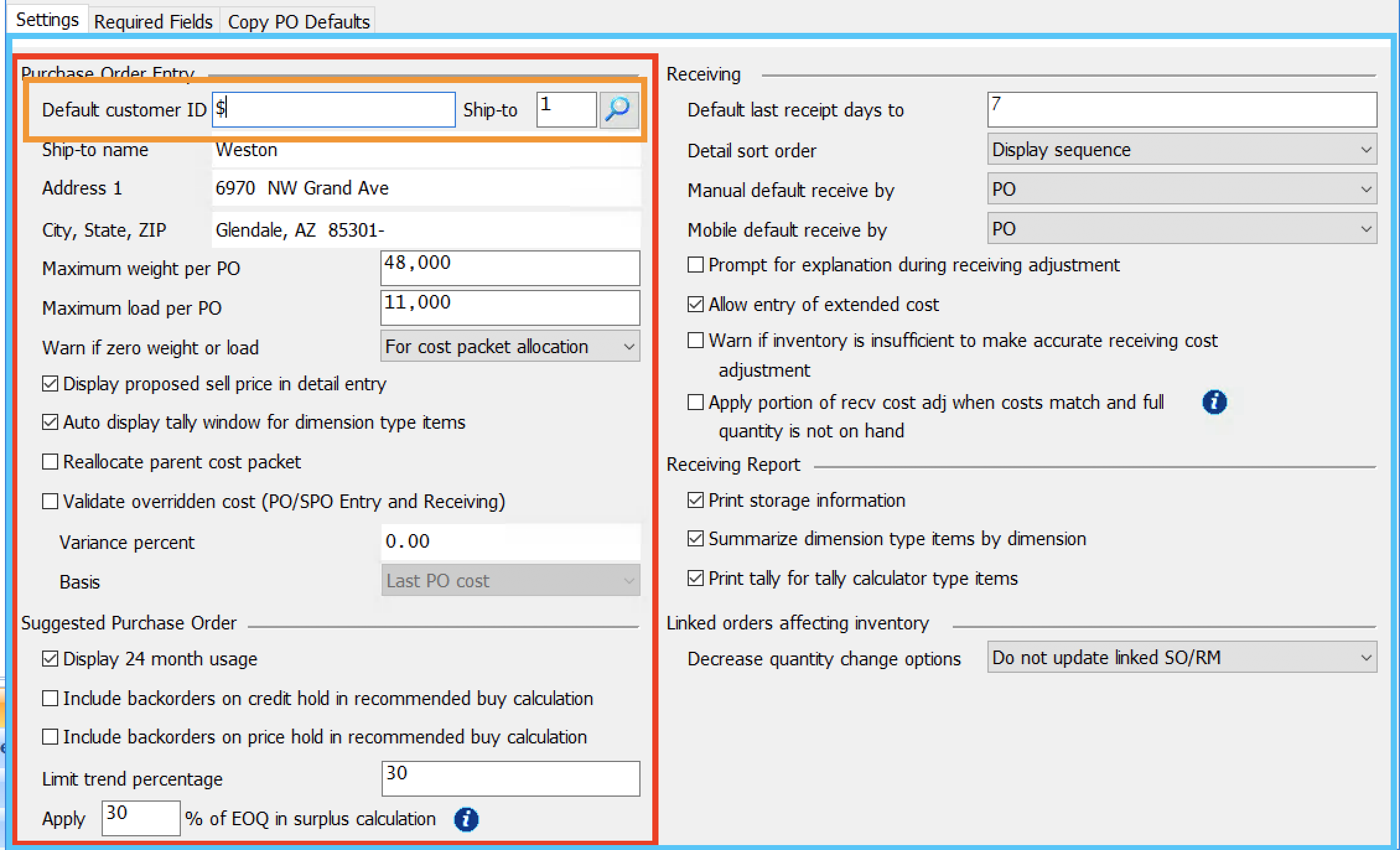
In the figure above, the blue outline is a single layout.
The red outline is a macro-column. Each macro-column is a collection of rows.
The second row in this macro-column is outlined in orange. Each row is a collection of columns each containing one field.
There are three columns present in the orange row. One for each of the two text inputs and a third for the locator button.