Date Picker / Date Range Picker
This is a date picker web component which can be plugged in any framework (angular, react, vue etc.)
Install:
npm install @web-comp/core
npm install @web-comp/date-picker
Date picker depends on @web-comp/core to work.
Usage:
<div class="container" style="position: relative;">
    <img src="calendar-icon.png" id="calendar-icon" />
    <wc-date-picker switch="calendar-icon" id="picker"></wc-date-picker>
</div>
const picker = document.getElementById("picker");
picker.addEventListener('date-click', (e) => {
 console.log(e.detail); // it will contain the dates selected.
})

You can use viewChild in angular and ref in React to access picker component and attach event listener.
Set the position property of container element of date picker. 'start' and 'end' attributes are optional if you want to initialize or control the picker your way.
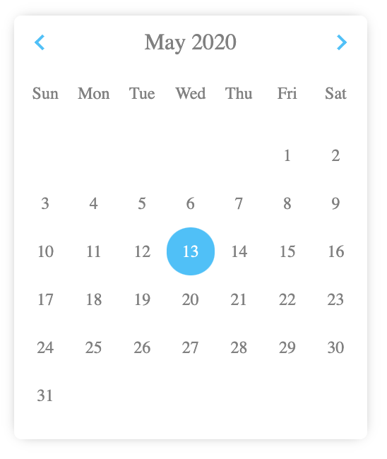
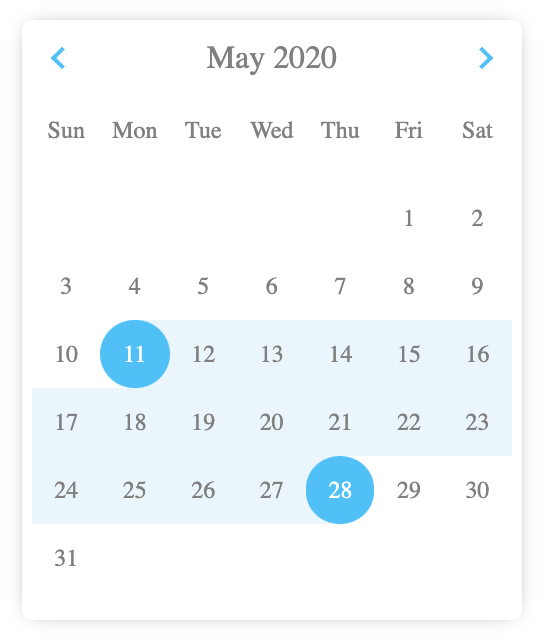
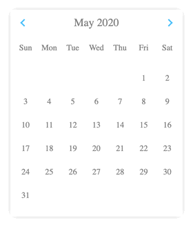
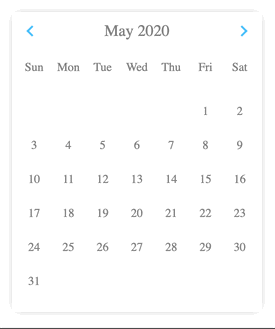
Screenshots -
...............................................................................................
Usage with Angular -
npm install @web-comp/core @web-comp/date-picker- set
schemas: [CUSTOM_ELEMENTS_SCHEMA]in the module where you are using date picker. this is a module property just like providers.
import '@web-comp/core';
import '@web-comp/date-picker';
- use in template
<wc-date-picker
    range="true" #picker
    switch="date-switch"
    [attr.start]="confg.start"
    [attr.end]="conf.end">
</wc-date-picker>
- listen to date-click event in ts file.
@ViewChild('picker') picker;
....
this.picker.nativeElement.addEventListener('date-click', (e) => {
  console.log(e.detail); // it will contain the dates selected.
});
Since its not an angular component, if you want to provide dynamic values from ts file you will need to use attribute binding like this [attr.start] and access ts value. You can set the dates conf values to null in ts file if you want to remove that attribute. It won't work like normal angular {{ }}.
Usage with React -
Mostly same as angular, install and import modules (core and date picker).
<div style={{position: 'relative'}}>
    <img src="calendar-icon.png" id="picker-switch" />
    <wc-date-picker
      switch="picker-switch"
      range="true"
      start={new Date(2020, 4, 17)}
      end={new Date(2020, 4, 29)}>
    </wc-date-picker>
</div>

// in JS
componentDidMount() {
    this.pickerRef.current.addEventListener('date-click', (e) => {
      console.log(e.detail);
    });
}
In React all values can be given in curly braces.
...............................................................................................
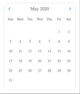
Screens in action -
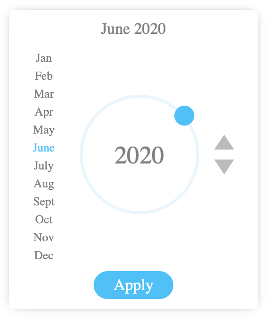
You can use circular slider for going really far in years or single increment buttons.
...............................................................................................
Creative usage - selecting a week or a period on clicking a date in picker
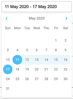
I'm doing this in angular.
<div class="input-container">
    <input class="input-field" id="date-switch" readonly [value]="weekInputValue"/>
    <wc-date-picker
        #datePicker
        switch="date-switch"
        [attr.start]="conf.start"
        [attr.end]="conf.end"
        range="true"></wc-date-picker>
</div>
@ViewChild('datePicker') datePicker;
conf = {
    start: null,
    end: null,
};
...
...

this.datePicker.nativeElement.addEventListener('date-click', (e) => {
  if (e.detail.start && !e.detail.end) {
    const period = this.getWeek(e.detail.start); // it will return {weekStart: date1, weekEnd: date2} where the date lies.
    this.conf.start = period.weekStart;
    this.conf.end = period.weekEnd;
  }
});
...............................................................................................
Parameters / attributes / props
All attributes must be in string format. in case of date object, pass any string version of date provided by Date class.
set position of parent element to (relative, absolute etc.)
range
"true" if you want range selection.
<wc-date-picker range="true"></wc-date-picker>

any other value won't work. "true" in string as an attribute will enable the range selection.
readonly
"true" will disable any kind of date selection. You'll still be able to navigate through the calendar.
<wc-date-picker readonly="true"></wc-date-picker>
year
year in number to initialize the date picker with that year. By default it is initialized with current year.
<wc-date-picker year="2015"></wc-date-picker>
month
month in number to initialize the date picker with that month. By default it is initialized with current month.
<wc-date-picker month="5"></wc-date-picker>

this will open the date picker with month June. since months are from 0 to 11.
start
This is the selected date in case of single date selection and start date in case of range. This is null by default.
<wc-date-picker start="2020-05-25T15:10:28.022Z"></wc-date-picker>
<wc-date-picker start="Mon, 25 May 2020 15:11:21 GMT"></wc-date-picker>
end
This is the end date in case of range selection. This is null by default.
<wc-date-picker end="2020-05-25T15:10:28.022Z"></wc-date-picker>
<wc-date-picker end="Mon, 25 May 2020 15:11:21 GMT"></wc-date-picker>
switch
This is the id of the element you want to act as click handler for date picker to open. It can be anything like an icon, image, or the input box itself. If you don't provide this, date picker will be opened by default and you have to handle the logic yourself.
<input type="text" id="date-picker-switch" />
<wc-date-picker switch="date-picker-switch"></wc-date-picker>
// this will make the date picker handle the show and hide functionality for you on click in that input.

or

<img src="calendar-icon.png" id="picker-switch" />
<wc-date-picker switch="picker-switch"></wc-date-picker>
position
"manual" to position the date picker yourself. By default it will be absolute positioned below its parent with position property specified.
<wc-date-picker position="manual"></wc-date-picker>