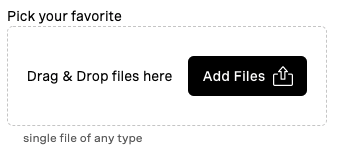
vwc-file-picker
vwc-file-picker is a composite component that enables to perform files selection on from the users environment.
vwc-file-picker allows to pick files either by opening a file selection dialog of the operating system, or via drag'n'drop of the file onto the component's surface.
Example:
<vwc-file-picker label="Avatar image" helper="select image of max 1Mb">
  <input type="file" name="some-file" />
</vwc-file-picker>
Structure
vwc-file-picker's structure is quite flexible and customizable.
In general we have the following particles:
- label, text to appear above the component ('Pick your favorite' in the picture above)
- helper message, textual hint with optional error icon; located below the component ('single file of any type' in the picture above)
- drag'n'drop surface (the dashed area in the picture above)
- drag'n'drop textual hint, which appears centered within the surface ('Drag & Drop files here' in the picture above)
- button, triggering file input dialog
The component structure can be simple to rich, as following list (in the ascending order of complexity):
- drag'n'drop surface only: only drag and drop files allowed here; can optionally add a textual hint via the
dd-hintslot (see API slots section below):<vwc-file-picker label="Avatar image" helper="select image of max 1Mb"> <p slot="dd-hint">Drop the amazing files here!</p> <input type="file" name="some-file" /> </vwc-file-picker>
- button only: providing a custom
vwc-buttonvia thebuttonslot (see API slots section below) and disabling drop zone (see API properties section below); the button then triggers the file input operating system dialog:<vwc-file-picker label="Avatar image" helper="select image of max 1Mb" drop-zone="false"> <vwc-button slot="button">Upload</vwc-button> <input type="file" name="some-file" /> </vwc-file-picker>
- drag'n'drop surface with button: this flavor has both, the drag'n'drop surface and the button; here, as well, the drag'n'drop hint text can be customized or removed:
 <vwc-file-picker label="Avatar image" helper="select image of max 1Mb">
 	<vwc-button slot="button">Upload</vwc-button>
 	<input type="file" name="some-file" />
 </vwc-file-picker>
In addition to those major variations, there are the label and the helper message, mentioned above, which are customizable as well.
API
Properties
| Property | Attribute | Type | Default | Description |
|---|---|---|---|---|
label |
label |
string |
'' |
label text, if any |
helper |
helper |
string |
'' |
text to be shown in helper message in normal (non-errorneous) state |
drop-zone |
boolean |
true |
attribute controlling whether the drop zone should be rendered or not | |
no-counter |
boolean |
false |
attribute controlling whether counter badge should be always hidden | |
validationMessage |
validationmessage |
string |
'' |
text to be shown in helper message when component is in erroneous state, when empty, the component falls back to the default messages as below |
notAFileError |
notafileerror |
string |
'only file/s drop allowed' |
text to be shown specifically when drag'n'drop of not-a-file attempted |
tooManyFilesError |
toomanyfileserror |
string |
'only one file allowed' |
text to be shown specifically when multiple files droped while slotted input has no multiple attribute defined |
Slots
Most of the slots below are for the customization purposes, but one of them, input-file-slot is essential, required and is worthy a special treatment here.
Thus, input-file-slot requires provision of the input element (native) from the consumer.
This element MUST have type="file".
This element MAY have name, multiple and accept attributes, all as specced out here.
Moreover, consumer will use this, his own provided input, in order to listen to change events and/or take the file/s when needed.
| Name | Required | Description |
|---|---|---|
dd-hint |
textual hint for the drag'n'drop component | |
button |
button component to add to the components structure | |
input-file-slot |
yes | input element of type file that will be actually used as a file collector |
CSS Custom Propertis
| Name | Default | Description |
|---|---|---|
--vvd-file-picker-min-height |
140px |
minimum height of the file picker |
--vvd-file-picker-min-width |
320px |
minimum width of the file picker |

