

A react table generator compatible with all design systems, just stay focus on your UX/UI.
View Demo
Report Bug
·
Request Feature
.
Contributing
BespokeTable is a flexible and extensible React library base on grid css for generate tables. Designed to seamlessly integrate with any design system, it allows developers to focus on styling and user experience while efficiently managing the table's structure and functionality.
Designed with flexibility in mind, this component is perfect for developers who want full control over their table's appearance and behavior without the bloat of heavier solutions.
Be careful, it's not recommended to use Bespoke-Table for SEO purpose. The table generated is base on div and css grid. That give you a lot of flexibility but it's not SEO friendly.
- Flexible: Integrates with any design system for custom styling.
- Extensible: Easily extendable with custom features as per project requirements.
- Type-safe: Fully typed with TypeScript for an enhanced development experience.
- React-friendly: Utilizes the latest React features for seamless integration.
- Performant: Optimized for fast performance, even with large data sets.
You can install Bespoke-Table using npm or yarn:
npm i @sroueche/bespoketableor
yarn add @sroueche/bespoketableTo start using Bespoke-Table, this is a simple example of how to use it :
import React from 'react';
import BespokeTable, { TableHeaderProps } from '@sroueche/bespoketable';
const MyTable = () => {
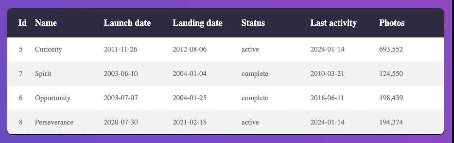
const data = [{
rowId: 'row-1',
cells: [
{
headerId: 'col-id',
cellData: {
value: 'rover-curiosity',
},
},
{
headerId: 'col-name',
cellData: {
value: 'Curiosity',
},
},
{
headerId: 'col-status',
cellData: {
value: 'active',
},
},
{
headerId: 'col-photos-count',
cellData: {
value: '693,552',
},
},
],
}, {
rowId: 'row-2',
cells: [
{
headerId: 'col-id',
cellData: {
value: 'rover-perseverance',
},
},
{
headerId: 'col-name',
cellData: {
value: 'Perseverance',
},
},
{
headerId: 'col-status',
cellData: {
value: 'active',
},
},
{
headerId: 'col-photos-count',
cellData: {
value: '194,374',
},
},
],
}];
const headers: TableHeaderProps<string>[] = [
{
id: 'col-id',
title: 'Id',
isFirstColumn: true,
width: '50px',
},
{
id: 'col-name',
title: 'Name',
},
{
id: 'col-status',
title: 'Status',
},
{
id: 'col-photos-count',
title: 'Photos',
isLastColumn: true,
},
];
return (
<BespokeTable headers={headers}
headerCellRender={(header) => <span>{header.title}</span>}
data={data}
cellRender={(header, rowProps, cell) => <span>{cell?.value}</span>}
/>
);
}
export default MyTable;An array of object TableHeaderProps (API link) defining headers and columns how they should be
rendered.
A function that returns a ReactNode to render the header cell.
| Name | Type | Default | Description |
|---|---|---|---|
header* |
TableHeaderProps (API link) |
||
sortComponent |
ReactNode |
| Name | Type | Default | Description |
|---|---|---|---|
headerHeight |
Size (API link) |
1fr | Specify the header cell height |
An array of objects TableDataProps representing the data for each row.
A function that returns a ReactNode to render the cell.
| Name | Type | Default | Description |
|---|---|---|---|
header* |
Header |
||
rowProps |
RowProps (API link) |
||
value |
C |
An optional ReactNode rendered when the table is loading.
A optional ReactNode rendered when there is no data.
| Name | Type | Default | Description |
|---|---|---|---|
isLoading |
boolean |
false |
An object defining pagination options.
| Name | Type | Default | Description |
|---|---|---|---|
initialPage |
number |
||
rowsPerPage |
number |
||
itemsPerPage |
number[] |
||
enablePagination |
boolean |
A function that returns a ReactNode to render the pagination.
(pagination) => <YourPaginationComponent {...pagination} />| Name | Type | Default | Description |
|---|---|---|---|
currentPage* |
number |
||
handleChangeRowsPerPage* |
(rowsPerPage: number) => void |
||
handlePageSelectChange* |
(page: number) => void |
||
dataLength* |
number |
||
pageCount* |
number |
A ReactNode to render the sort icon in the header.
headerSortComponent: (onClick, isSortActive, orderDirection) => ReactNode| Name | Type | Default | Description |
|---|---|---|---|
onClick* |
() => void |
||
isColumnSortActive* |
boolean |
||
orderDirection* |
asc or desc
|
A function that returns a ReactNode to render when an error occurs.
fallbackRender: (rowId, header, lastRow, cell) => ReactNode| Name | Type | Default | Description |
|---|---|---|---|
rowId* |
string |
||
header* |
Header |
||
lastRow* |
boolean |
||
cell |
TableCellProps (API link) |
A string to add a css class to the container element.
| Name | Type | Default | Description |
|---|---|---|---|
rowId* |
string |
The id row | |
rowHeight |
Size |
undefined | Define a row height |
className |
string |
undefined | Add a css class to the row element |
meta |
Record<string, unknown> |
undefined | Add any more information you want to use during the cell rendering |
cells* |
TableCellProps<C>[] (API link) |
Cells data, C is your value type |
Object representing the data for each cell.
The cellData can be any type you want, a string, an object, an array etc....
| Name | Type | Default | Description |
|---|---|---|---|
headerId* |
string |
||
cellData |
string, object, array
|
String value in px, fr, %, em, rem, vh or vw
asc or desc
| Name | Type | Default | Description |
|---|---|---|---|
rowId* |
string |
||
firstRow* |
boolean |
||
lastRow* |
boolean |
||
className |
string |
undefined | |
meta |
Record<string, unknown> |
undefined |
| Name | Type | Default | Description |
|---|---|---|---|
id* |
string |
||
title |
string |
undefined | |
propertyKeyToOrder |
keyof C |
undefined | |
defaultSortDirection |
Order (API link) |
undefined | |
width |
Size |
undefined | |
isLastColumn |
boolean |
undefined | |
isFirstColumn |
boolean |
undefined |
Bespoke-Table is designed to be highly customizable. You can use custom components for column headers, cells, sorting and even pagination. For more information on customization, please refer to the documentation.
For more detailed examples on how to integrate and use Bespoke-Table in your projects, please visit our storybook.
- @MidoAhmed/rollup-react-library-starter : Big thanks for 1this starter kit
- IconBuddy : For the icon used in the storybook
- othneildrew/Best-README-Template : For the inspiration about the README template
- ChakraUI : For the inspiration about the README and the CONTRIBUTION template
MIT.