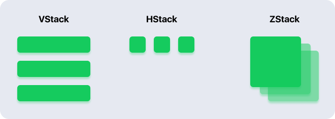
react-native-stacks
Installation
  npm install @snelusha/react-native-stacks
  yarn add @snelusha/react-native-stacks
Usage
import React from "react";
import { Text } from "react-native";
import { VStack } from "@snelusha/react-native-stacks";

export default function App() {
  return (
    <VStack spacing={10}>
      <Card />
      <Card />
      <Card />
    </VStack>
  );
}
import React from "react";
import { Text } from "react-native";
import { HStack } from "@snelusha/react-native-stacks";
export default function App() {
return (
<HStack spacing={10}>
<Card />
<Card />
<Card />
</HStack>
);
}import React from "react";
import { Text } from "react-native";
import { ZStack } from "@snelusha/react-native-stacks";
export default function App() {
return (
<ZStack>
<Card />
<Card />
<Card />
</ZStack>
);
}Documentation
<VStack />
A view that arranges its children in a vertical line.
Props:
spacing
The amount of space between each item in the stack
required: no
type: number
default: 0
alignment
The horizontal alignment for the stack items
- leading: left align
- center: center align
- trailing: right align
required: no
type: leading | center | trailing
default: "center"
<HStack />
A view that arranges its children in a horizontal line.
Props:
spacing
The amount of space between each item in the stack
required: no
type: number
default: 0
alignment
The vertical alignment for the stack items
- leading: top align
- center: center align
- trailing: bottom align
required: no
type: leading | center | trailing
default: "center"
<ZStack />
A view that overlays its children, aligning them in both axes.
Props:
alignment
The horizontal and vertical alignment for the stack items. Since a ZStack overlays items on top of one another, we are able to align them both vertically and horizontally:
Veritcal
-
leading: top align -
center: center align -
trailing: bottom align
Horizontal
-
leading: left align -
center: center align -
trailing: right align
type Alignment = "leading" | "center" | "trailing";required: no
type: { vertical: Alignment, horizontal: Alignment }
default: "{ vertical: "center", horizontal: "center" }"
<Spacer />
A component to provide space between stack items. Adding a Spacer to the bottom of a stack will shift all of the previous stack items up, and opposite for the top. Adding a Spacer between views in a stack will push them apart.

