Quickly generate or send styled email notifications from your NodeJS applications.
Table of Contents
- Install Package
- Getting Started
- Options
- Create styled email HTML & Text
- Sanitizing your input
- Using Content Blocks
- How do I send my email?
Install Package
NPM:
npm install --save @sendfern/mailYarn:
yarn add @sendfern/mailGetting started
Use this example, and modify the name field to be your company/team/sender name:
import { emailHtml } from '@sendfern/mail';

const html = emailHtml({
  content: [
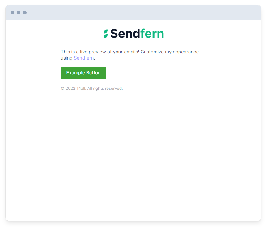
    'This is a live preview of your emails! Customize my appearance using <a target="_blank" href="https://sendfern.com">Sendfern</a>.',
    {
      type: 'button',
      link: 'https://example.com',
      label: 'Example Button',
    },
  ],
  name: "* Sender name *",
});

// Use nodemailer or a similar solution to send this html to your recipient, or consider checking out our service https://sendfern.com if you don't want to send your own emails.
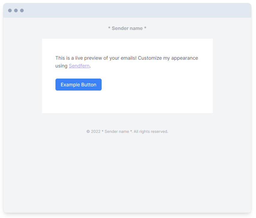
Becomes:
Options
Type: object
content
Required
Type: array | string
The contents of your email, this can a basic string of text, or an array of content blocks. Examples of content blocks provided below.
name
Required
Type: string
The name of your company, team, or sender. This will show in the email footer, and at the top of the email if no logo is provided.
disableDarkMode
optional
Type: boolean
Default: false
If set to true, the dark-mode specific styling will be disabled.
footerContent
optional
Type: string
Add text or HTML to the email footer.
preview
optional
Type: string
If provided, we will include this as the email preheader.
logo
optional
Type: string
The https URL to your logo image. Will show at the top of the email.
website
optional
Type: string
The https URL to your website. If provided. The email header will be wrapped in a link to this URL.
brandColor
optional
Type: string
Default: #3b82f6
The hex color used for styled elements such as buttons and links.
logoWidth
optional
Type: number
Default: 200
The width of the logo in pixels.
theme
optional
Type: string
Possible Values: plain | modern | minimal | basic
Default: basic
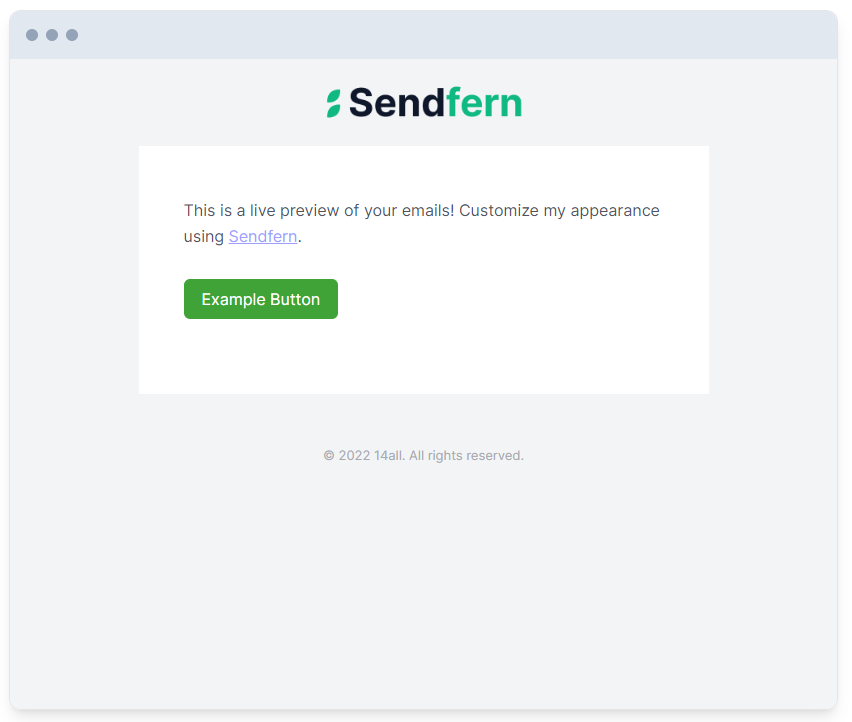
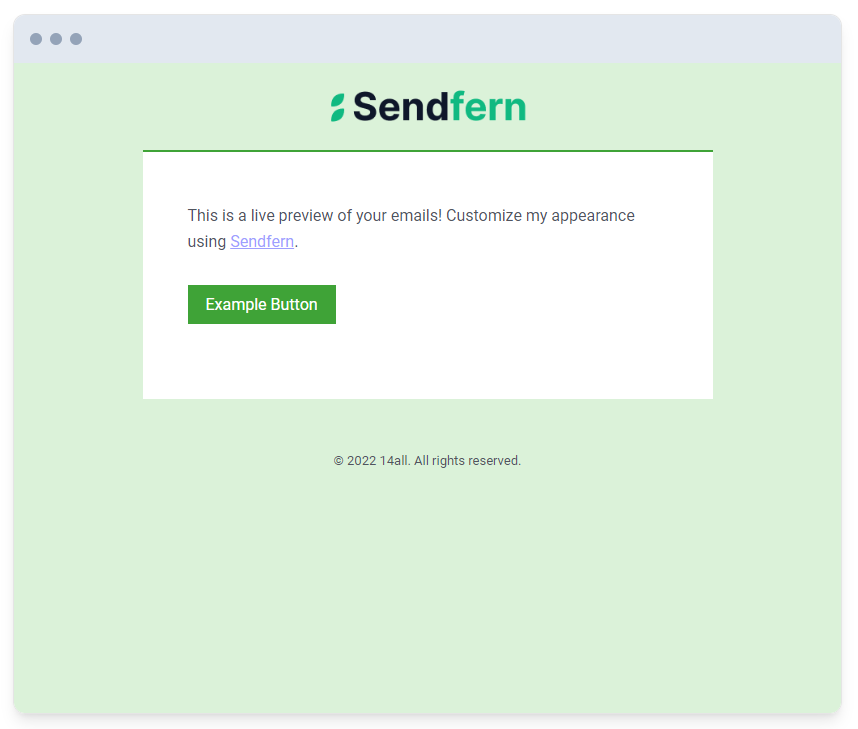
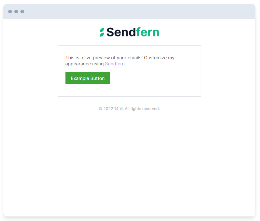
The theme determines how your email is styled:
basic
modern
minimal
plain
More themes will be added over time :)
hasMarketing
optional
Type: boolean
Default: false
If set to true, your business address and unsubscribe link will be shown in the email footer. We recommend enabling this if you intend to send marketing/promotional emails.
streetAddress1
optional
Type: string
First line street address. Will be used if hasMarketing = true.
streetAddress2
optional
Type: string
First line street address. Will be used if hasMarketing = true.
city
optional
Type: string
City. Will be used if hasMarketing = true.
region
optional
Type: string
Region. Will be used if hasMarketing = true.
zip
optional
Type: string
Zip/postal code. Will be used if hasMarketing = true.
country
optional
Type: string
Country. Will be used if hasMarketing = true.
unsubscribeLink
optional
Type: string
The URL to direct users to if they opt to unsubscribe from your mailing. Will be used if hasMarketing = true.
showReferrer
optional
Type: string
Default: false
Adds "Powered by Sendfern" to your email footer.
Create styled email HTML & Text
You can generate the text version of your email as well
import { emailHtml, emailText } from '@sendfern/mail';

const html = emailHtml({
  content: "This is an example email notification!",
  name: "* Sender name *",
});

const text = emailText({
  content: "This is an example email notification!",
  name: "* Sender name *",
});
Sanitizing your input
Use formatEmailData to sanitize your options:
import { emailHtml, formatEmailData } from '@sendfern/mail';

const html = emailHtml(formatEmailData({
  content: "This is an example email notification!",
  name: "* Sender name *",
}));
Using Content Blocks
To use content blocks, pass an array instead of a string into the content field. This array can either include objects representing content blocks or a string (shorthand for a text block)
import { emailHtml, formatEmailData } from '@sendfern/mail';

const html = emailHtml(formatEmailData({
  content: [
    'This is a live preview of your emails! Customize my appearance using <a target="_blank" href="https://sendfern.com">Sendfern</a>.',
    {
      type: 'button',
      link: 'https://example.com',
      label: 'Example Button',
    },
  ],
  name: "14all",
}));
Becomes:
Text block
Displays basic text.
type
required
Value: text
content
required
Type: string
The text to display
subdued
optional
Type: boolean
Default: false
If set to true, the text block will be a smaller font size and slightly lighter color.
{
  type: 'text',
  content: 'Example text block',
}
or
"Shorthand text block"Button block
Displays a button. Will use the brandColor as the background color for the button.
type
required
Value: button
label
optional
Type: string
Default: Learn More
The button text.
link
optional
Type: string
Default: #
The https URL for the button link.
{
  type: 'button',
  label: 'Click Me',
  link: 'https://example.com'
}
Image block
Displays an image.
type
required
Value: image
width
optional
Type: number
The width of the image in pixels. If not set, will default to 100%.
link
optional
Type: string
If the provided, the image will be wrapped in the provided https URL.
source
required
Type: string
The https URL link to the image.
alt
optional
Type: string
The alternative text for the image.
{
  type: 'image',
  source: 'https://example.com/image.png',
  width: 280,
  alt: 'My image alternative text',
  link: 'https://example.com'
}
Divider block
Displays a divider (hr element).
type
required
Value: divider
{
  type: 'divider'
}
Spacer block
Adds empty space
type
required
Value: spacer
{
  type: 'spacer'
}
Code block
Adds a highlighted code block for pin codes, secret phrases, etc.
type
required
Value: code
content
required
Type: string
The text to display
{
  type: 'code',
  content: 'my-magic-code'
}
Heading block
Adds a text heading
type
required
Value: heading
content
required
Type: string
The text to display
headingType
optional
Type: string
Default: h2
Possible Values: h1 | h2 | h3 | h4 | h5 | h6
The heading type/size to use.
{
  type: 'heading',
  content: 'My Heading',
  headingType: 'h4'
}
List block
Adds a list.
type
required
Value: list
ordered
optional
Type: boolean
Default: false
Whether or not to show the list as ordered or unordered.
items
required
Type: array
An array of string values for each bullet point.
{
  type: 'list',
  ordered: true,
  items: [
    'List item 1',
    'List item 2',
    'List item 3'
  ]
}
How do I send my email?
If you don't want to handle sending your emails with nodemailer or similar solutions, consider checking out our email service at Sendfern.
