Handy everyday library. More to come.
npm install @rtjs/rtjs
...
import {RTJS_lightbox} from '@rtsoft/rtjs'
or
<script src="https://unpkg.com/@rtsoft/rtjs@latest/lib/RTJS.js"></script> - multile elements can be linked to one gallery by
data-rt-lightbox-gallery - path to image is determined by
href|data-rt-lightbox-src - title is determined by
title|data-rt-lightbox-title - path to thumbnail is determined by
data-rt-lightbox-thumbnail-src| innersrc
<div>
    <a href="[path_to_big_image]" class="lightbox" data-rt-lightbox-gallery="[gal_id]" data-rt-lightbox-title="[title]">
        <img src="[path_to_thumbnail]" />
    </a>
    <a href="[path_to_big_image]" class="lightbox" data-rt-lightbox-gallery="[gal_id]" title="[title]">
        no thumbnail
    </a>
    <a href="[path_to_big_image]" class="lightbox" data-rt-lightbox-gallery="[gal_id]" data-rt-lightbox-title="[title]">
        <img src="[path_to_thumbnail]" />
    </a>
</div>RTJS_lightbox('.lightbox', {
closeLabel: 'close',
showTitle: true,
showArrows: true,
showThumbnails: true,
debug: false,
imageErrorLabel: 'Image could not be loaded',
withoutBorder: false,
titlePlacement: 'top'
onOpened: (index) => {
console.log('opened', index)
},
onClosed: (index) => {
console.log('closed', index)
},
onItemChanged: (index) => {
console.log('changed', index)
}
})or data can be provided directly while initing
<span id="data-lightbox">click me</span>RTJS_lightbox('#data-lightbox', {
data: [
{bigSrc: "[path_to_big_image]", title: "[title]", smallSrc: "[path_to_thumbnail]"},
{bigSrc: "[path_to_big_image]", title: "[title]", smallSrc: "[path_to_thumbnail]"},
{bigSrc: "[path_to_big_image]", title: "[title]", smallSrc: "[path_to_thumbnail]"},
]
})- do not use content types that are already handled by the application when writing your handlers (such as image, iframe, ...)
- customItemsProvider is an array of custom content type handlers (js objects with specific fields)
- each content type handler is an object with the following properties:
- (required) contentType - the name of your custom content type, the lightbox will throw an exception when it encounters the content type of a gallery item that is not handled by the default providers or through one of your providers
- (optional) onItemMount - called when the user opens a gallery item with this content type (either through opening the gallery at this item or through switching to an item of this content type from another item), useful for mounting your own components into the lightbox by querying for the rt-gallery-item div which is created by the lightbox before onItemMount is called
- (optional) onItemUnmount - called after the user exists the gallery or moves onto another item - useful for other logic that should be done after unmounting (note the component created by createRoot is removed automatically from the DOM)
- true/false/null/undefined (default: undefined)
- if set to anything other than null or undefined, overrides the default closer showing behaviour where the closer will be shown only if the closer has text to show (either the closer symbol is shown or there is a label) and the item is loaded
- true/false (default: true)
- determines, whether to show the X symbol left of the label
- values (string): bottom, right
- determines the placement of the thumbnails strip
- you can also pass an array to change the value based on breakpoints
- values: true/false (default: true)
- determines whether the item counter should be shown
- if true, the item counter will be shown if there is more than one item in the gallery
- values "sides", "hug-image" (default: "sides")
- determines the position of the arrows that switch between items
- values: true/false (default: false)
- set this variable to true when you are using your own custom images for the next/previous arrows to remove the default ">"/"<" text
example of mounting custom component onto the data-rt-content-type="360-renderer":
customItemsProvider: [
    {
        // our custom content type
        contentType: "360-renderer",
        // mounting method called when the user gets to a gallery
        // item of this content type
        onItemMount: (index, item) => {
            console.log("360 mount", index, item);
            // mount our component
            mount3dComponent();
        },
        // cleanup method
        onItemUnmount: (index, item) => {
            console.log("360 unmount", index, item);
            // no need for additional logic here
            // but some could be added later
        },
    }
]

// Our custom mount function (React is used in this example)
const mount3dComponent = () => {
    // mount onto the element that was created by the lightbox
    // the element looks something like:
    // <div id="rt-gallery-item"></div>
    const mountPoint = document.getElementById("rt-gallery-item");
    const root = createRoot(mountPoint);
    root.render(<CustomContainer />);
}- item contains all the original mapped fields of the lightbox element alongside a special field called dataset that contains all the original dataset data coming from the elements
- this is useful for adding your custom dataset fields and accessing them within the mount component
-
determines the content type (such as an image or an iframe video) of this gallery item
-
values:
- image
- iframe
- (or your custom content types provided they are handled)
-
implicitly set to image when no value is explicitly specified
-
you can specify a custom content type with any value as long as you provide a custom handler for your new content type by passing a customItemsProvider object to the RTJS_lightbox function
-
the lightbox will throw an error when it encounters an element with an unsupported content type (one that is not handled by the application or your own custom handlers)
-
To set this value through the DOM use data-rt-content-type attribute on the <a> element representing the gallery item
- the title of the gallery item
- DOM: data-rt-lightbox-title on the element representing the gallery item
- the description of the gallery item to be shown under the title in the gallery
- DOM: data-rt-lightbox-description on the element representing the gallery item
- path to the small thumbnail image (if there is any) in the gallery lightbox display
- if you are using an iframe with youtube videos, then you do not need to specify the thumbnail as it will be taken directly from the yt thumbnail URL at maximum quality (specifying the thumbnail src for custom images is fine as well)
- To set this value through the DOM either specify data-rt-lightbox-thumbnail-src or provide an <img> element with a src tag under the main <a> element
- If both data-rt-lightbox-thumbnail-src is specified and there is an <img> element with a src attribute under the main <a> tag, then data-rt-lightbox-thumbnail-src takes precedence, this is done even if the attribute is set to an empty string "" - in that case either the placeholder will be used or possibly the default placeholder value (such as an automatically fetched thumbnail for iframe youtube videos)
- path to the image shown in the opened gallery lightbox display
- To set this value through the DOM either use the href attribute or the data-rt-lightbox-src attribute on the main <a> element
- if provided, a small button will be shown in the image in the bottom left corner that when clicked on, will display this text
- it is also possible to provide this value through the DOM with data-rt-lightbox-info on the main element or through providing a element with the class rt-lightbox-info-content under the main element whose innerHTML will be the content displayed within the info box - be aware that the element will be hidden by default so you don't need to hide the content element yourself
- path to the iframe source (for youtube videos use www.youtube.com/embed/VIDEO_ID)
- To set this value through the dom use data-rt-source-url on the <a> element representing the gallery item (or use href)
- defaults to true
- takes a boolean value
- DOM: data-rt-allow-fullscreen - takes "true" or "false" in the DOM
- used for applying allow="..." to the iframe
- defaults to "accelerometer; autoplay; clipboard-write; encrypted-media; gyroscope; picture-in-picture; web-share"
- DOM: data-rt-iframe-allow
- used for applying frameborder="..." to the iframe
- defaults to 0 when not provided
- DOM: data-rt-iframe-frameborder
<a
    className="lightbox"
    data-rt-lightbox-gallery="1"
    data-rt-lightbox-title="Secret ingredient noodle soup"
    data-rt-lightbox-description="Secret ingredient noodle soup description"
    data-rt-content-type="iframe"
    data-rt-source-url="https://www.youtube.com/embed/cee6883w2Nk"
>
    == WORKING VID ==
</a>
iframe example - same video but with a custom thumbnail (only the thumbnail in the bottom bar has changed with the previous example)
const FOOD_TABLE = require("./../images/food-table.webp").default;

// ...

<a
    className="lightbox"
    data-rt-lightbox-gallery="1"
    data-rt-lightbox-title="Video with a custom thumbnail"
    data-rt-content-type="iframe"
    data-rt-source-url="https://www.youtube.com/embed/cee6883w2Nk"
    // newline
    data-rt-lightbox-thumbnail-src={FOOD_TABLE}
>
    Custom thumbnail on a video using data-rt-lightbox-thumbnail-src
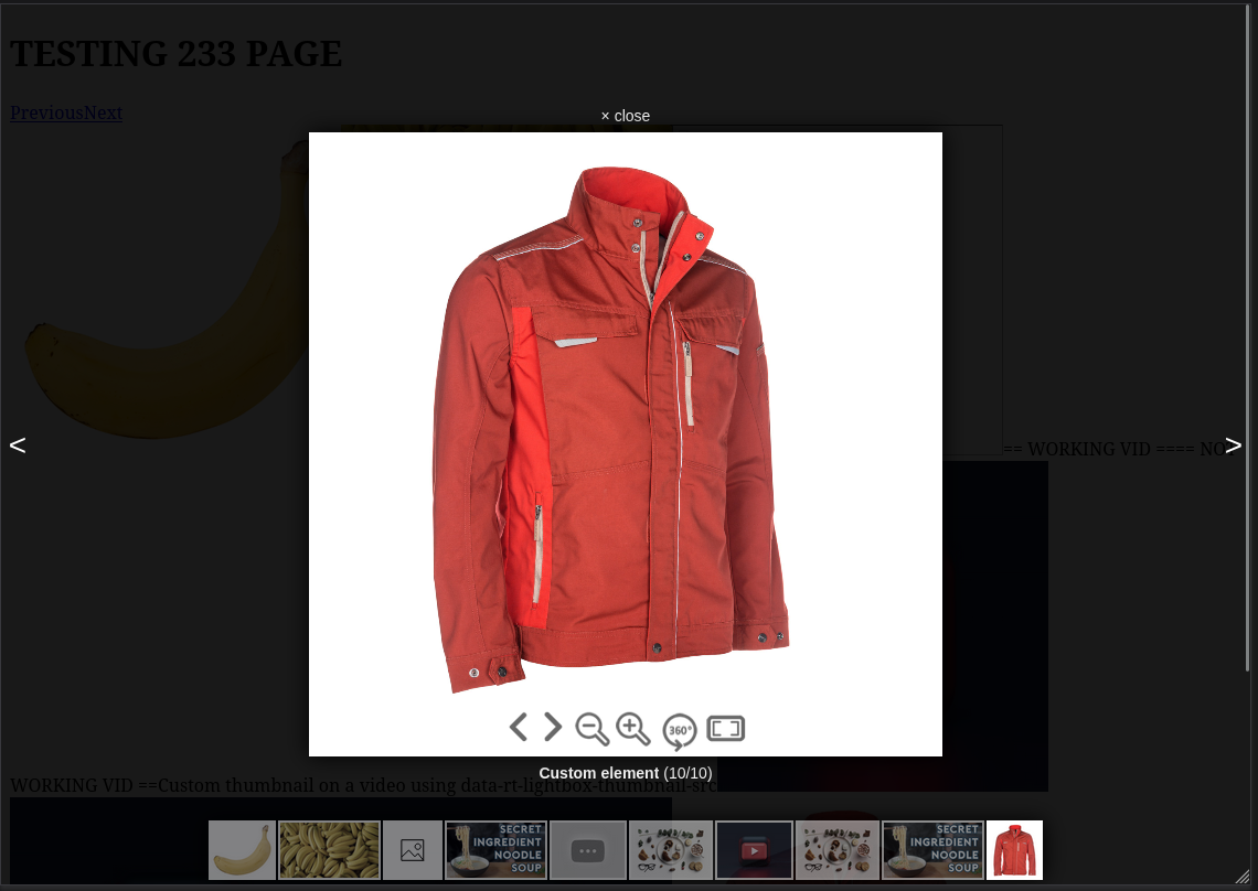
</a>// gallery element
// custom content type 360-renderer
<a
className="lightbox"
data-rt-lightbox-gallery="1"
data-rt-content-type="360-renderer"
data-rt-lightbox-title="Custom element"
>
<img style={{ width: 300, height: 300 }} src={JACKET_IMAGE} />
</a>
// start of our react component
// state variables used for managing gatsby script dependencies
const [loaded1, setLoaded1] = useState(false);
const [loaded2, setLoaded2] = useState(false);
// mounting function
const mount3dComponent = () => {
const mountPoint = document.getElementById("rt-gallery-item");
const root = createRoot(mountPoint);
// mount or custom react component onto the gallery item (rt-gallery-item)
root.render(<CustomContainer />);
}
// RTJS_lightbox with custom handler
RTJS_lightbox(".lightbox", {
...
customItemsProvider: [
{
contentType: "360-renderer",
onItemMount: (index, item) => {
console.log("360 mount", index, item);
mount3dComponent();
},
onItemUnmount: (index, item) => {
console.log("360 unmount", index, item);
},
}
]
})
// ...
// dependent scripts
<Script src="http://localhost:8000/skin.js" onLoad={() => setLoaded1(true)} />
{loaded1 && <Script src="http://localhost:8000/object2vr_player.js" onLoad={() => setLoaded2(true)} />}
{loaded2 && <Script id="3" dangerouslySetInnerHTML={{__html: `
function hideUrlBar() {
}
console.log("adding event listener...");
// Called inside <CustomContainer />
document.addEventListener("rtjs:load", function() {
console.log("rtjs is loading...");
// create the object player with the container
obj=new object2vrPlayer("container");
// add the skin object
skin=new object2vrSkin(obj);
// load the configuration
obj.readConfigUrl("./index_out.xml");
// hide the URL bar on the iPhone
setTimeout(function() { hideUrlBar(); }, 10);
});
`}} />}
// custom-container.js
import { useMediaQuery } from '@uidotdev/usehooks';
import React, { useEffect } from 'react';
const CustomContainer = () => {
const isSmaller = useMediaQuery('(max-width: 900px)');
useEffect(() => {
// dispatching the event to load the library
console.log("dispatching event...");
document.dispatchEvent(new CustomEvent('rtjs:load'));
}, []);
return (
<div id="container" style={{
margin: "0px auto",
width: isSmaller ? "80vw" : "50vw",
maxHeight: "70vh",
aspectRatio: 1,
}}>
This content requires HTML5 & Javascript or Adobe Flash Player Version 9 or higher.
</div>
);
}
export default CustomContainer;


