A React Material Drawer component that works on the Web, Android, iOS, Electron, and anywhere else React Native is supported. This component is a part of the React Universal ecosystem of universal React and React Native components. Checkout the React Universal docs to learn more.
Storybook Demos
Installation
npm i @reactuniversal/drawer --saveModal Drawer


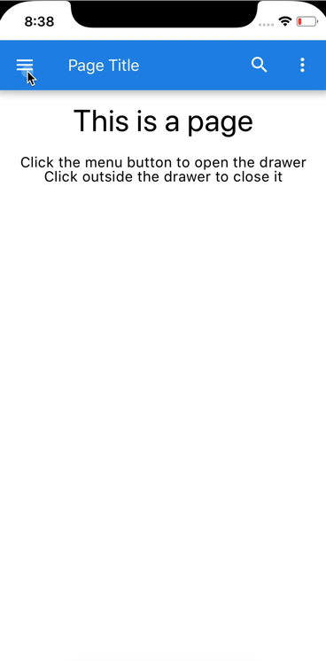
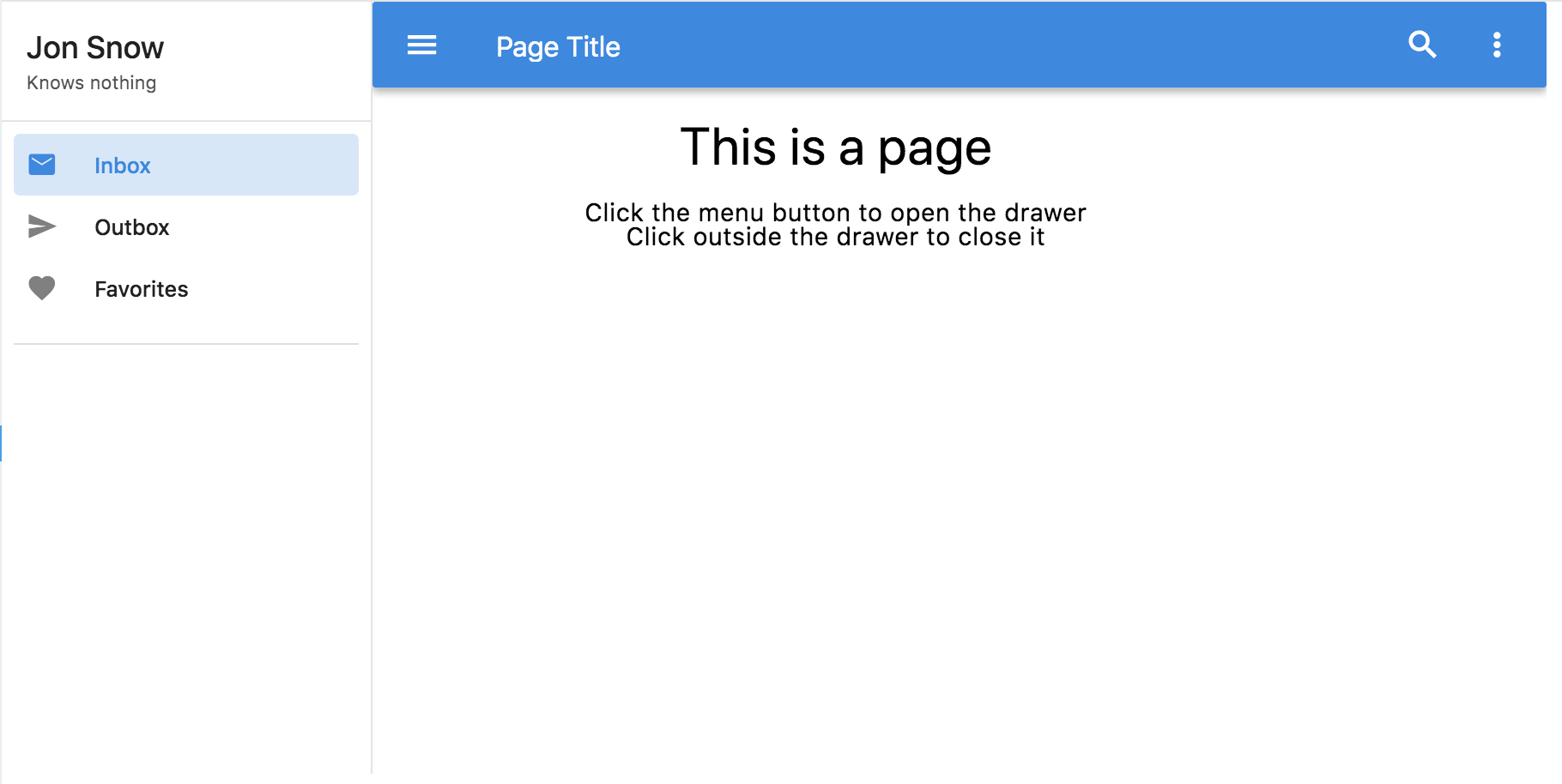
Push Drawer

Permanent
Usage
import React, {Component} from 'react';
import {View, Text, TouchableOpacity} from 'react-native';
import {Drawer} from '@reactuniversal/drawer';

const styles = {
  container: {
    width: '100%',
    height: '100vh',
  },
  body: {
    backgroundColor: '#eee',
    height: '100vh',
  },
};

export default class App extends Component {
  state = {
    isOpen: false,
  };

  render() {
    return (
      <View style={styles.container}>
        <Drawer
          open={this.state.isOpen}
          drawerContent={
            <View>
              <Text>Drawer Content</Text>
            </View>
          }
          onClose={() => this.setState({isOpen: false})}
          animationTime={250}>
          <View style={styles.body}>
            <View
              style={{
                marginTop: 20,
                alignItems: 'center',
                width: '100%',
                flex: 1,
              }}>
              <Text style={{marginBottom: 20}}>This is a page</Text>
              <TouchableOpacity
                onPress={() => this.setState({isOpen: !this.state.isOpen})}>
                <Text>Toggle</Text>
              </TouchableOpacity>
            </View>
          </View>
        </Drawer>
      </View>
    );
  }
}
Props
| Name | Description | Type | Default |
|---|---|---|---|
| animationTime | How long the drawer animation should be, in ms | number | 200 |
| appbar | Render appbar above drawer and page content for clipping purposes | node | |
| contentContainerStyle | Styles wrapper around page content | object | |
| drawerContent | Components displayed inside the drawer | node | |
| drawerStyle | Styles drawer | object | |
| fullHeight | Drawer takes up full height of the page so conent is not scrolled | bool | false |
| onClose | Callback when clicking outside of drawer | func | |
| pageHeight | Override calculated pageHeight, useful for demos as shown | number | ScreenHeight |
| pageWidth | Override calculated pageWidth, useful pages that do not take up full space | number | ScreenWidth |
| position | Position of drawer | string | absolute |
| direction | Where should the drawer open: left or right
|
string | left |
| open | Whether drawer is shown or hidden | bool | false |
| style | Styles container element | object | |
| scrim | Whether scrim is shown | bool | true |
| scrimColor | Color of scrim | object | black |
| scrimOpacity | The ending opacity for the scim | number | .4 |
| type | Determines the type of drawer from modal, push, and permanenent | string | modal |
| width | Specific drawer width in pixels, will override widthPercentage | number | 240 |
| widthPercentage | Percentage of pageWidth the drawer should take up | 0-1 | .40 |