Qui is Neumorphic design system for Web
Written in TypeScript with Composition API
A component's library helping us build great products for our customers. This library for Vue 3.x
Qui for Vue 2.x is here!
What is it?
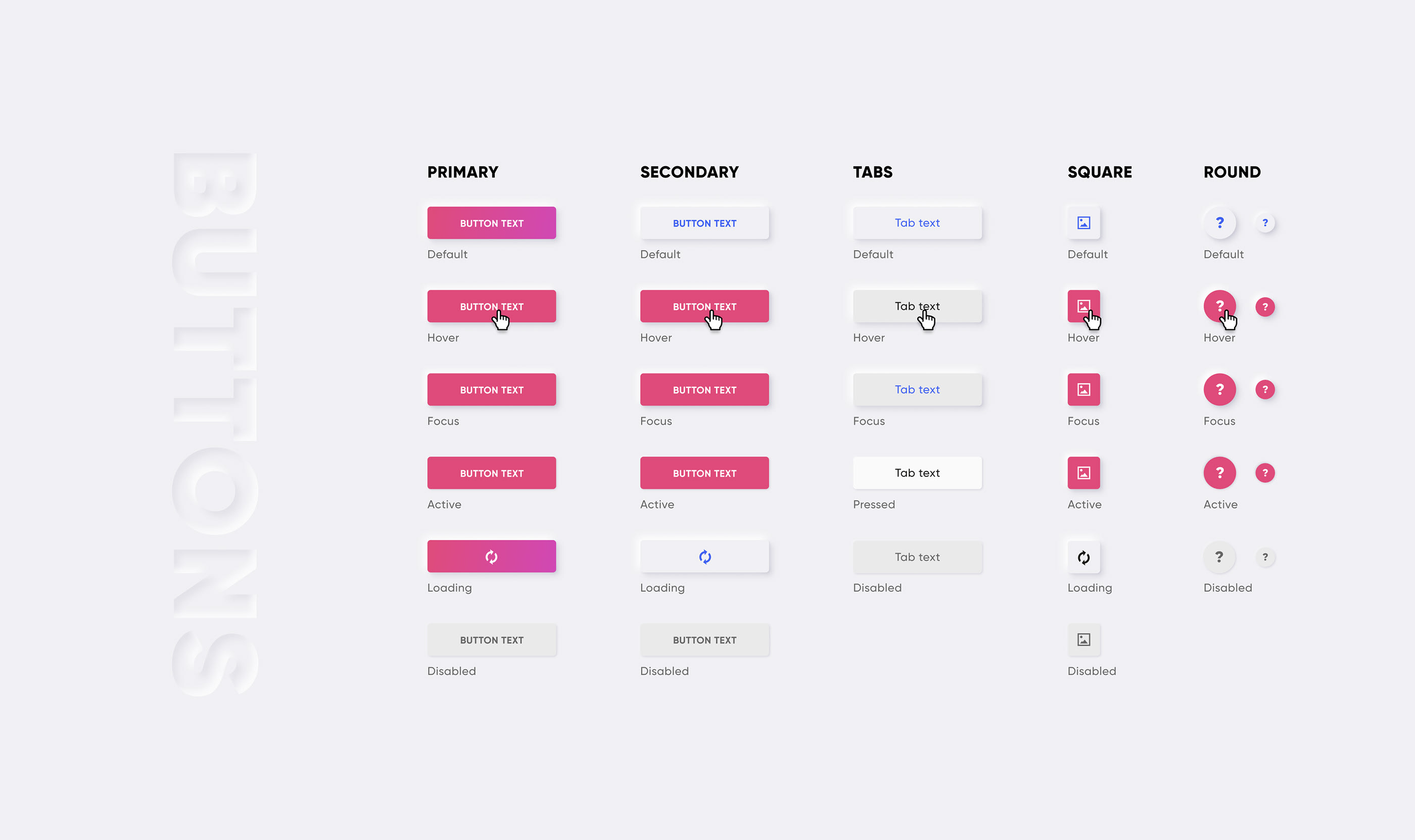
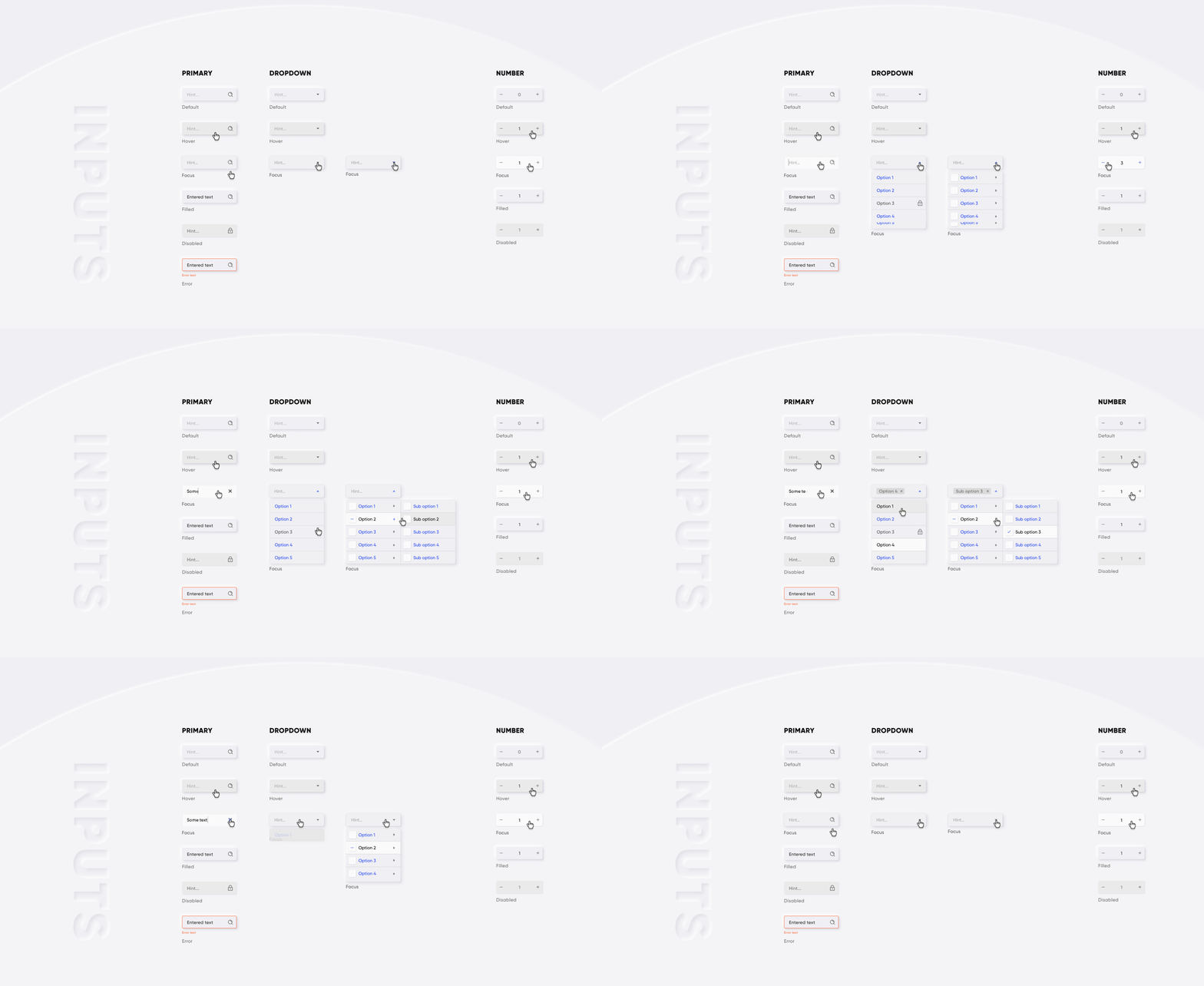
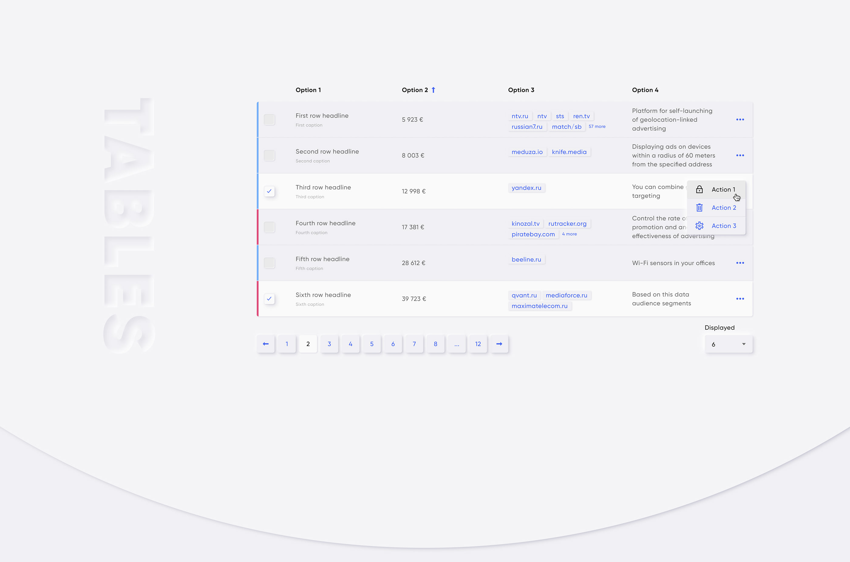
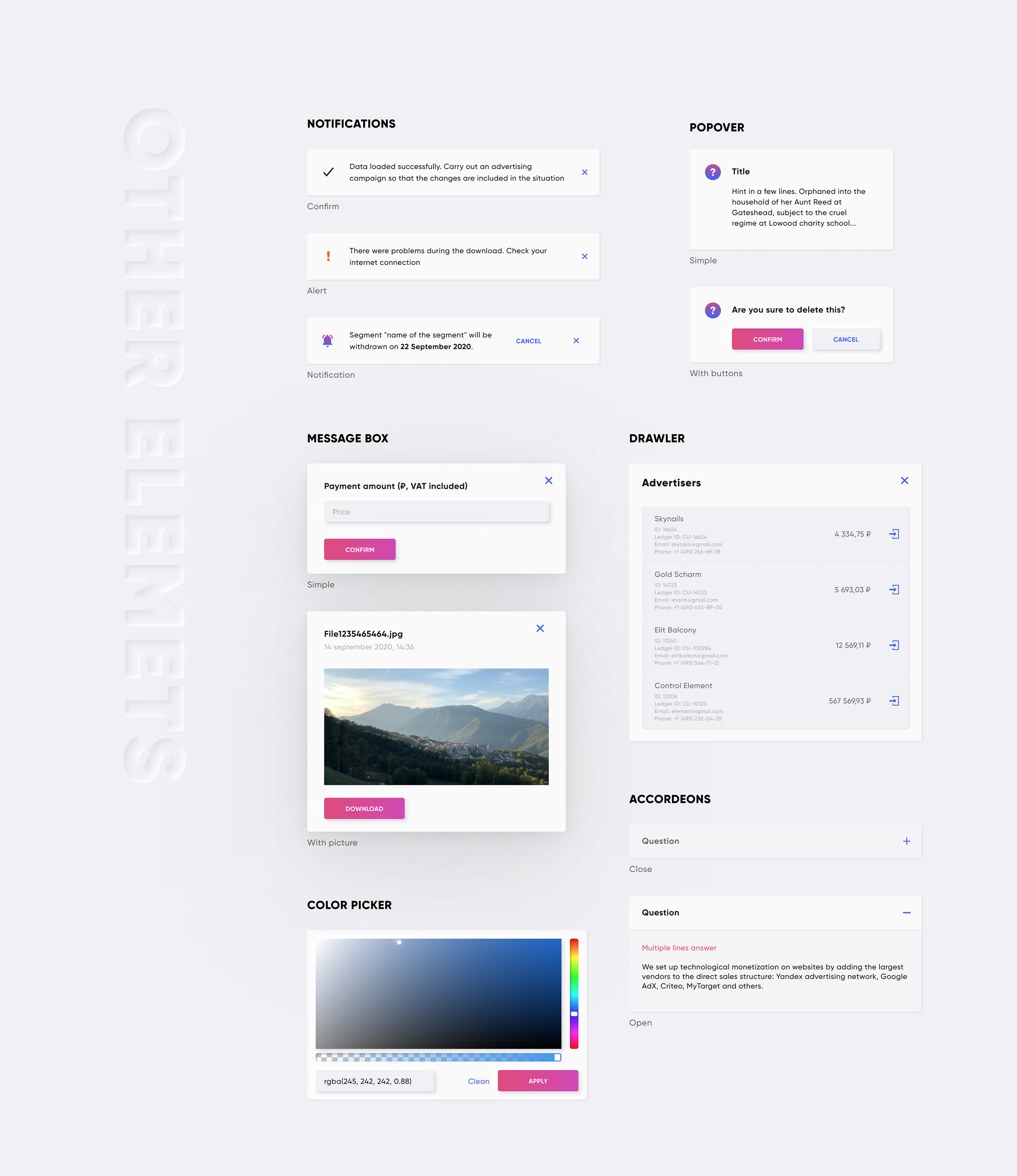
🔩 30+ Vue 3 components🔥 Fully written with Composition API🔑 Typescript📦 icons pack🏳️🌈 colors & grid🥷 neumorphism styles- 📚 storybook sandbox
Some examples below:
Install
npm install @qvant/qui-max -S
yarn add @qvant/qui-max
You can import Qui entirely, or just import what you need. Let's start with fully import.
Quick setup
In main.js:
import { createApp } from 'vue';
import Qui from '@qvant/qui-max';
import '@qvant/qui-max/styles';

const app = createApp(App);
// Setup all components
app.use(Qui);
// that's it! All components will be imported with styles
in YourComponent.vue: (Example)
<template>
  <q-input v-model="value" />
</template>
<script>
import { ref } from 'vue';

export default {
  setup() {
    const value = ref('');
    return { value };
  }
};
</script>
Configure setup:
- import styles separately to avoid unused css
- set
localization.messagesto support any language for components - change zIndex of appeared components (e.g Dialogs, Notifications, Dropdowns etc.)
- control setup of components
In main.js:
import { createApp } from 'vue';
import {
  createQui,
  QButton,
  QProgressIndicatior,
  // import default messages for different locales
  localeRu
} from '@qvant/qui-max';

// import required styles
import '@qvant/qui-max/css/main';
import '@qvant/qui-max/fonts';
import '@qvant/qui-max/icons';

// import the only styles of component you gonna use
import '@qvant/qui-max/css/q-button';
import '@qvant/qui-max/css/q-progress-indicatior';

const Qui = createQui({
  localization: {
    // English language by default, but we have two more locales out-of-the-box: 'ru' | 'zh'
    // set 'ru' - for Russian, set 'zh' - for Chinese
    locale: 'ru',
    messages: {
      ru: {
        // import and merge default messages for different locale
        ...localeRu,
        // rewrite default texts, see the source: src/qComponents/constants/locales or set your custom messages
        QDatepicker: {
          placeholder: 'Выберите дату рождения'
        }
      }
    },
    // zIndexCounter is being used by some components (e.g QPopover, QSelect, QDialog ...etc)
    // 2000 by default
    zIndexCounter: 3000
  }
});

app.use(Qui);
app.use(QButton);
app.use(QProgressIndicatior, {
  trickle: true,
  trickleSpeed: 200,
  stackable: true
});
Now you have implemented Vue and Qui Max to your project, and it's time to write your code. Please refer to each component's Stories to learn how to use them.
Supported languages
- Russian
✅ - English ✅
- Also you can use any language by setting texts for components via
localization.messagesproperty in the Qui instance. See the example above.
Using with Nuxt 3
Create a file in your plugins folder:
// plugins/qui.ts
import { defineNuxtPlugin } from '#app';
import Qui from '@qvant/qui-max';

export default defineNuxtPlugin(nuxtApp => {
  nuxtApp.vueApp.use(Qui);
});
Add configuration to your nuxt.config.ts file:
import { defineNuxtConfig } from 'nuxt3';

export default defineNuxtConfig({
  css: ['@qvant/qui-max/styles'],
  build: {
    transpile: ['@qvant/qui-max']
  }
});
Browser Support
Modern browsers are recomended:
- safari: >11
- chrome: >=61
- firefox: >=58
- opera: >=62
- edge: >=16
- yandex: >=18
Development
Clone repository and run storybook
yarn storybook
npm run storybook
LICENSE
MIT


