@oscbco/text-toggle
A react toggle
Props
-
style: This is an object containing the styles to be applied to the control -
leftItem: This is represents the item on the left-
value: This is an id, it will be passed to the onChange callback -
label: JSX element to be rendered on this item (Can also include styling of its own or be a simple string) -
style: This is an object containing the styles to be applied to this item
-
-
rightItem: This prop is the same as the left one. -
onChange: This is an callback that will be called when the control changes its value -
defaultItem: This is string containing the value of the item selected by default
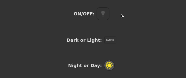
Example
<TextToggle defaultItem='dark'
  leftItem={{
    value: 'dark',
    label: 'DARK'
  }}
  rightItem={{
    value: 'light',
    label: 'LIGHT'
  }}
  onChange={this.onChange}
/>
To run the examples:
  $ git clone https://github.com/oscbco/text-toggle.git
  $ cd select
  $ npm install
  $ npm start
Visit http://localhost:9002 to see and edit the examples. The development server is set up to be available from everywhere, even your mobile phone in your LAN.