@oscbco-select
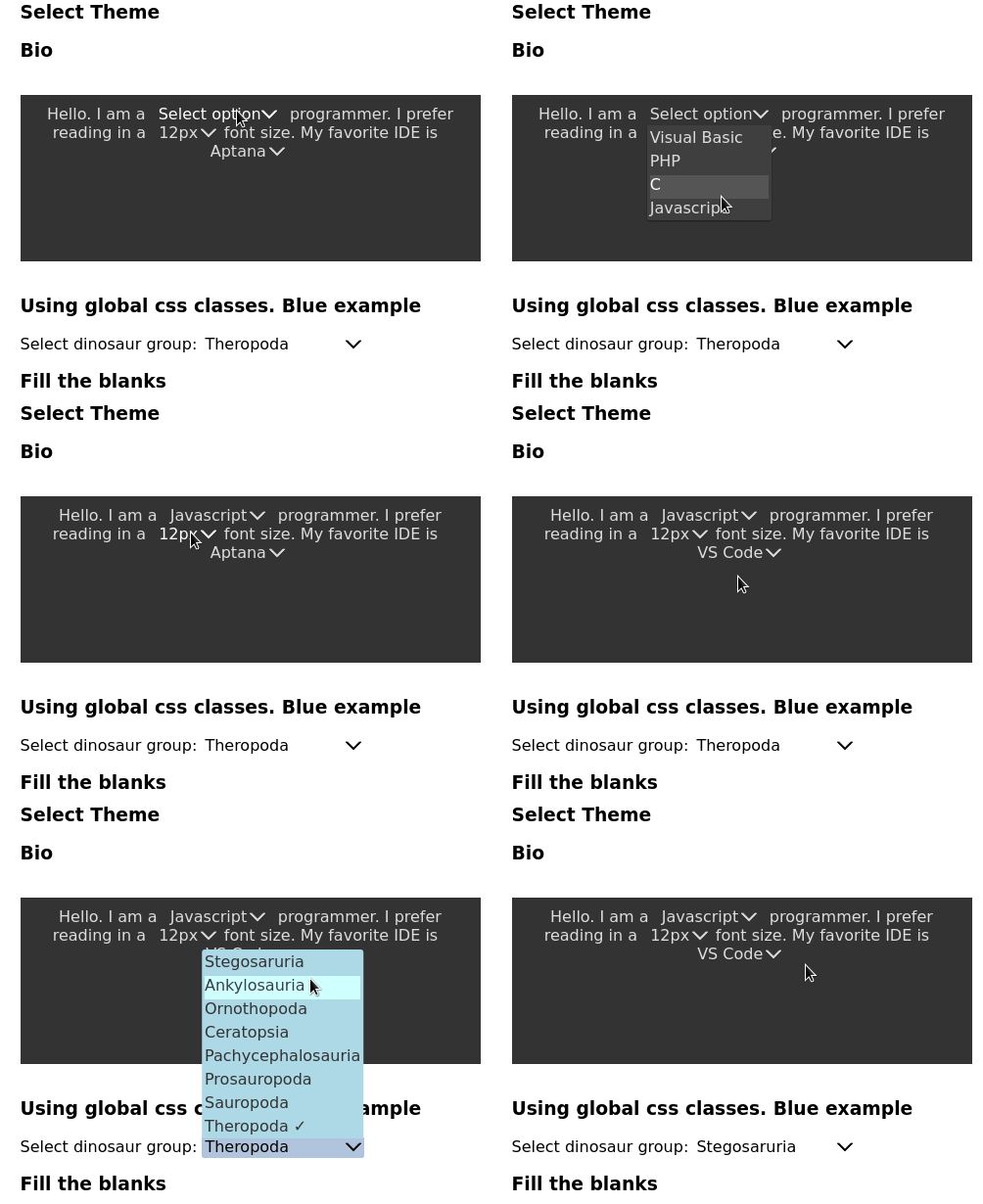
A React select control you can inline.
If you need a multi-select (or tag select) please check out @oscbco/multi-select, or a select that can be used with flexbox use @oscbco/block-select
Installation
npm install @oscbco/selectProps
-
items: This is an array of items available to select, it consists of objects with at least the property:value. Additionally an item object can have the following property:-
label: This is the text presented to the user, if it's not present then thevalueis title cased and used instead.
Future versions may also support:
-
fg: Text color of the item -
bg: Background color of the item -
icon: svg icon to be placed next to the label -
image: image element to be placed next to the label
-
-
defaultItem: This is the item that the control will mark as selected -
placeholder: Text that will be presented to the user when no item has been selected yet -
onChange: Callback that will be executed every time the user selects an item. It is passed thevalueproperty of the selected item. This is meant for side-effects such as storing the selected item to local storage for example -
classes: This is an object containing the css classes that will be assigned to the various elements of the control. They are as follows:-
select: Outermost element that contains the control. Defaults to "oscbco-select" -
title: Contains the placeholder or the selected item label (or value as previously discussed). Defaults to "oscbco-select-title" -
itemContainer: This is the element that provides the curtain effect of growing and shrinking when the control is opened or closed respectively. Defaults to "oscbco-select-item-container" -
items: The actual element holding the items, this element does not change size. Defaults to "oscbco-select-items" -
item: The element holding an individual item. Defaults to "oscbco-select-item"
-
Justification for the classes prop
Note that passing css classes like this fits very well with the css modules technique where a file containing classes is imported and assigned to a variable, in this case it's ok to just pass the imported variable to the classes prop (Extra classes will be ignored).
Also, classes are very powerful, for example you can add a hover effect on the items or extra padding to the first and last items only. It is possible to change even the duration of the growing and shrinking transition
Example
<p>
  Select dinosaur group: <InlineSelect
    placeholder='Dinosaur group'
    items={data.dinosaurGroups}
    defaultItem={{ value: 'theropoda' }}
    classes={{
      select: 'blue-select',
      title: 'blue-title',
      itemContainer: 'blue-item-container',
      items: 'blue-items',
      item: 'blue-item'
    }} />
</p>
To run the examples:
  $ git clone https://github.com/oscbco/select.git
  $ cd select
  $ npm install
  $ npm start
Visit http://localhost:9000 to see and edit the examples. The development server is set up to be available from everywhere, even your mobile phone in your LAN.
Features:
- Opens dropdown with the down key
- Opens dropdown upwards if there is not space up
- Select item with the enter key
- Close dropdown with the escape key
- Can receive focus but can't be reached with tab,
- Completely customizable with the classes prop.
- It can be inlined with sibling elements and even used multiple times inside a paragraph
Tests
npm test