
elem-select
安装
-
首先安装 Element v2.x
-
接着安装组件
$ npm i @onemin-table/elem-table
# OR
$ yarn add @onemin-table/elem-table
用法
在 HTML 中以 UMD 的形式使用:
<!DOCTYPE html>
<html lang="en">
<head>
<meta charset="UTF-8">
<meta name="viewport" content="width=device-width, initial-scale=1.0">
<link href="https://cdn.bootcdn.net/ajax/libs/element-ui/2.15.0/theme-chalk/index.min.css" rel="stylesheet">
</head>
<body>
<main id="app">
<elem-table
ref="table"
:data="data"
:columns="columns"
/>
</main>
<script src="https://cdn.bootcdn.net/ajax/libs/vue/2.6.12/vue.min.js"></script>
<script src="https://cdn.bootcdn.net/ajax/libs/element-ui/2.15.0/index.min.js"></script>
<script src="./packages/elem-table/dist/elem-table.min.js"></script>
<script>
new Vue({
el: '#app',
components: {
ElemTable,
},
data() {
return {
data: [{
id: 1,
name: 'a',
age: '',
}, {
id: 2,
name: 'b',
}],
};
},
computed: {
columns() {
return [{
label: '名字',
prop: 'name',
}, {
label: '年龄',
prop: 'age',
type: 'input',
attrs: {
type: 'number',
append: '岁',
popoverSlotRender: (h) => {
return h('div', null, [
h('i', { style: 'color: #F46A6A;margin-right: 10px;', class: 'el-icon-error' }),
h('span', null, '错误'),
]);
},
},
listeners: {
input: (rowIndex, val) => {
const ref = this.$refs.table;
if (ref) {
const error = +val > 1000;
ref.setCellAttrs('age', rowIndex, {
borderColor: error ? 'red' : '',
popoverVisible: error,
});
}
},
}
}];
},
},
});
</script>
</body>
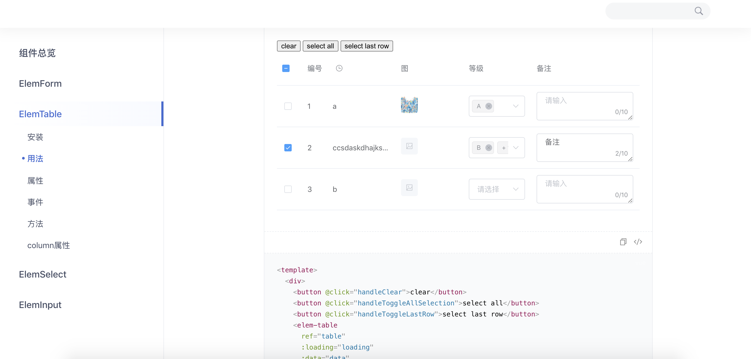
</html>在工程项目中以 CommonJS / ESM 的形式使用:
<template>
  <div>
    <button @click="handleClear">clear</button>
    <button @click="handleToggleAllSelection">select all</button>
    <button @click="handleToggleLastRow">select last row</button>
    <elem-table
      ref="table"
      :loading="loading"
      :data="data"
      :columns="columns"
      :selection="selection"
      selection-key="id"
      @selection-change="onSelectionChange"
      @cell-click="handleCellClick"
      @on-change="onDataChange"
    />
  </div>
</template>

<script>
  export default {
    data() {
      return {
        loading: false,
        data: [],
        selection: [],

        selected: false,
      };
    },

    computed: {
      columns() {
        return [{
          prop: 'selection',
          type: 'selection',
        }, {
          label: '编号',
          prop: 'index',
          type: 'index',
        }, {
          label: '名称',
          prop: 'name',
          headerSlotRender: (h) => <i class="el-icon-time el-input__icon" />,
        }, {
          label: '图',
          prop: 'image',
          type: 'image',
          popoverAttrs: {
            placement: 'left',
          },
        }, {
          label: '等级',
          prop: 'item.level',
          type: 'select',
          options: [{
            label: 'A',
            value: 1,
          }, {
            label: 'B',
            value: 2,
          }, {
            label: 'C',
            value: 3,
          }],
          listeners: {
            'change': (rowIndex, evt) => {
              console.warn(rowIndex, evt);
            },
          },
        }, {
          label: '备注',
          prop: 'item.remark',
          type: 'input',
          minWidth: 160,
          // 或者
          // 'min-width': 160,
          attrs: {
            type: 'textarea',
            maxlength: 10,
            'show-word-limit': true,
            // 或者
            // showWordLimit: true,
          },
          listeners: {
            input: (rowIndex, val) => {
              console.warn(rowIndex, val);
              const ref = this.$refs.table;
              if (ref && !rowIndex) {
                ref.setCellAttrs('item.remark', rowIndex, {
                  borderColor: val.length > 2 ? 'red' : '',
                });
              }
            },
          },
        }];
      },
    },

    mounted() {
      this.fetchMockData();
    },

    methods: {
      handleToggleLastRow() {
        const ref = this.$refs.table;
        this.selected = !this.selected;
        if (ref) ref.toggleRowSelection(this.data.length - 1, this.selected);
      },

      handleClear() {
        const ref = this.$refs.table;
        if (ref) ref.clearSelection();
        console.warn(this.selection);
      },

      handleToggleAllSelection() {
        const ref = this.$refs.table;
        if (ref) ref.toggleAllSelection();
        console.warn(this.selection);
      },

      handleSelect(e) {
        console.error(e, this.selection);
      },

      handleCellClick({ colProp, rowIndex }) {
        console.warn(colProp, rowIndex);
      },

      fetchMockData() {
        this.loading = true;
        setTimeout(() => {
          this.data = [{
            id: 1,
            name: 'a',
            image: 'https://static.zhihu.com/heifetz/assets/sign_bg.db29b0fb.png',
            item: {
              level: [1],
              remark: '',
            },
          }, {
            id: 2,
            name: 'ccsdaskdhajksbdajksdbakdbksadbsjdbkda',
            image: 'https://hbimg.huabanimg.com/89297c2da26b240448fd7aa7d884d9f57bd30ae21b90a-cj33e7_fw658/format/webp',
            item: {
              level: [2, 3],
              remark: '备注',
            },
          }, {
            id: 3,
            name: 'b',
            image: 'https://hbimg.huabanimg.com/89297c2da26b240448fd7aa7d884d9f57bd30ae21b90a-cj33e7_fw658/format/webp',
            item: {
              level: [],
              remark: '',
            },
          }];
          this.selection = [this.data[1]];
          this.loading = false;
        }, 300);
      },

      onSelectionChange(e) {
        this.selection = e;
        console.warn(e);
      },

      onDataChange({ colProp, rowIndex, value }) {
        const ref = this.$refs.table;
        if (!ref) return;

        if (rowIndex === 2) {
          ref.setCellAttrs(colProp, rowIndex, value.includes(1) ? {
            popoverVisible: true,
            popoverContent: '提示',
            borderColor: 'red',
          } : {});
        }
      },
    },
  };
</script>
代码预览
属性
| 参数 | 说明 | 类型 | 默认值 |
|---|---|---|---|
| data(必填) | 双向绑定的表格数据值, 存在表单元素时会随其绑定数据值变化 | Array | [] |
| columns(必填) | 表格列schema | Array | [] |
| loading | 表格是否加载中 | Boolean | false |
| selection | 表格全局选中列表 | Array | [] |
| selection-key(部分必填) | 表格全局选中列表主键, 当声明selection必需指定 |
String | '' |
| stack-selection | 为true时先选中的在全局选中列表的后面(栈), 默认先选中的在全局选中列表的前面(队列) | Boolean | false |
| align | 全局单元格对齐方式 | left/center/right | 'left' |
| header-align | 全局表头对齐方式 | left/center/right | 'left' |
| show-overflow-tooltip | 当内容过长被隐藏时显示 tooltip | Boolean | true |
| min-width | 全局列最小宽度 | Number | 100 |
| image-preview | 图片类型的列是否启用预览 | Boolean | true |
| image-popover | 图片类型的列是否显示Popover | Boolean | true |
其他继承自el-table的表格属性见element-ui文档
事件
| 参数 | 说明 | 参数 |
|---|---|---|
| cell-mouse-enter | 当单元格 hover 进入时会触发该事件 | rowIndex, colProp, row, column, cell, event |
| cell-mouse-leave | 当单元格 hover 退出时会触发该事件 | rowIndex, colProp, row, column, cell, event |
| cell-click | 当某个单元格被点击时会触发该事件 | rowIndex, colProp, row, column, cell, event |
| cell-dblclick | 当某个单元格被双击击时会触发该事件 | rowIndex, colProp, row, column, cell, event |
其他继承自el-table的表格事件见element-ui文档
方法
| 参数 | 说明 | 参数 |
|---|---|---|
| toggleRowSelection | 用于多选表格,切换某一行的选中状态,如果使用了第二个参数,则是设置这一行选中与否(selected 为 true 则选中) | rowIndex, selected |
其他继承自el-table的表格方法见element-ui文档
column属性
| 参数 | 说明 | 类型 |
|---|---|---|
| type | 对应列的类型, 继承类型: selection/index/expand, 其他类型见下文 | String |
| attrs |
<elem-select>等内置类型组件的属性 |
Object |
| listeners |
<elem-select>等内置类型组件的事件 |
Object |
| headerSlotRender | 自定义表头的内容渲染函数. 参数为 { column, $index }, 相当于el-table-columnheader slot |
Function |
| errorSlotRender |
type为image时, 加载失败的内容渲染函数 |
Function |
| placeholderSlotRender |
type为image时, 图片未加载的占位内容渲染函数 |
Function |
其他继承自el-table-column的属性见element-ui文档, 同时支持和中划线写法(kebab case)和小驼峰(camel case)写法
支持的列的类型(type)
- image
- select/single-select: 属性和事件见
<elem-select /> - input: 属性和事件见
<elem-input />