
elem-input
el-popover组件,实现关注点集中的反馈模式.
安装
-
首先安装 Element v2.x
-
接着安装组件
$ npm i @onemin-table/elem-input
# OR
$ yarn add @onemin-table/elem-input
用法
在 HTML 中以 UMD 的形式使用:
<!DOCTYPE html>
<html lang="en">
<head>
  <meta charset="UTF-8">
  <meta name="viewport" content="width=device-width, initial-scale=1.0">
  <link href="https://cdn.bootcdn.net/ajax/libs/element-ui/2.15.0/theme-chalk/index.min.css" rel="stylesheet">
</head>
<body>
  <main id="app">
    <elem-input
      v-model="foo"
      :border-color="foo === 'a' ? 'red' : ''"
      :width="foo === 'a' ? 200 : 300"
      append=".com"
    />
  </main>
  <script src="https://cdn.bootcdn.net/ajax/libs/vue/2.6.12/vue.min.js"></script>
  <script src="https://cdn.bootcdn.net/ajax/libs/element-ui/2.15.0/index.min.js"></script>
  <script src="./node_modules/@onemin-table/elem-input/dist/elem-input.min.js"></script>
  <script>
    new Vue({
      el: '#app',
      components: {
        ElemInput,
      },
      data() {
        return {
          foo: '',
        };
      },
    });
  </script>
</body>
</html>
在工程项目中以 CommonJS / ESM 的形式使用:
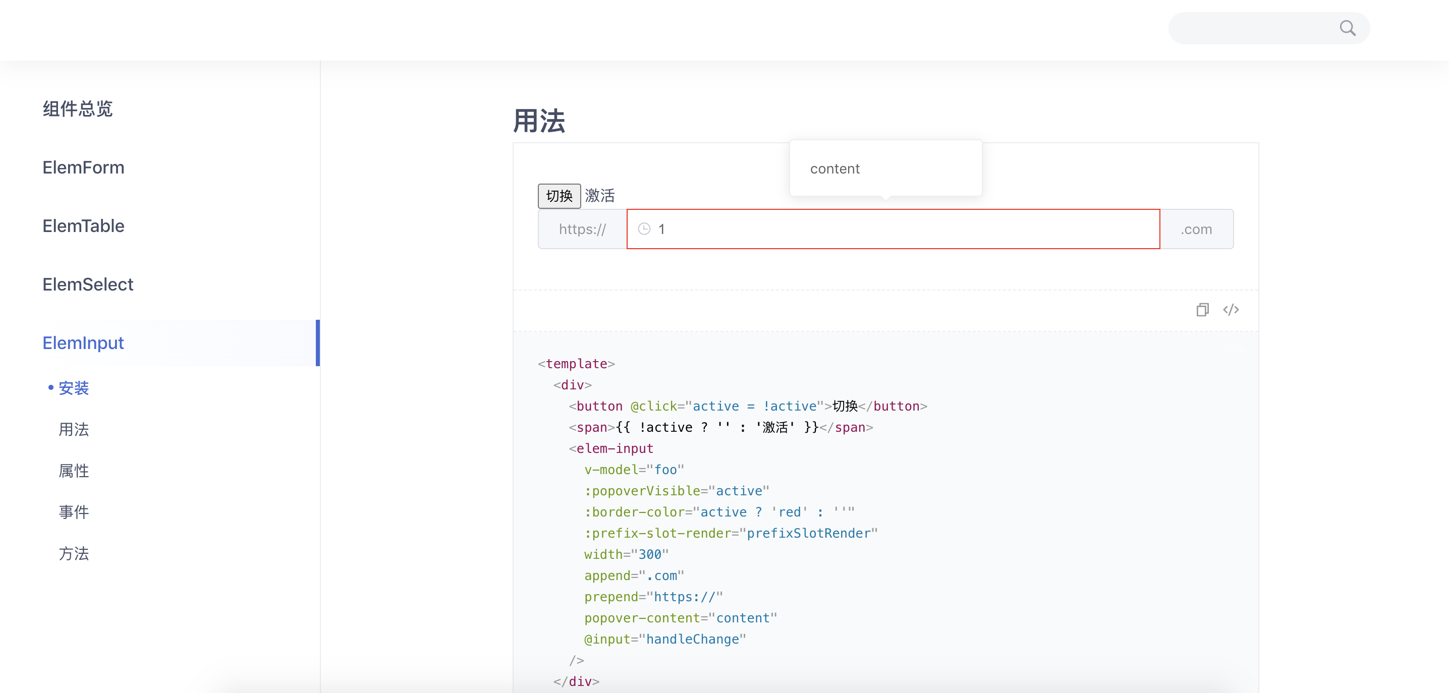
<template>
  <div>
    <button @click="active = !active">切换</button>
    <span>{{ !active ? '' : '激活' }}</span>
    <elem-input
      v-model="foo"
      :popoverVisible="active"
      :border-color="active ? 'red' : ''"
      :prefix-slot-render="prefixSlotRender"
      width="300"
      append=".com"
      prepend="https://"
      popover-content="content"
      @input="handleChange"
    />
  </div>
</template>

<script>
  export default {
    data() {
      return {
        foo: '1',

        active: true,
      };
    },

    methods: {
      handleChange(val) {
        console.warn(this.foo, val);
      },

      prefixSlotRender(h) {
        return <i class="el-icon-time el-input__icon" />;
      },
    },
  };
</script>
代码预览
属性
| 参数 | 说明 | 类型 |
|---|---|---|
| prefix-slot-render | 选择器头部内容渲染函数, 相当于el-input的prefix slot |
Function |
| suffix-slot-render | 选择器尾部内容渲染函数, 相当于el-input的suffix slot |
Function |
| append-slot-render | 选择器后置内容渲染函数, 相当于el-input的append slot |
Function |
| prepend-slot-render | 选择器前置内容渲染函数, 相当于el-input的prepend slot |
Function |
| append | 选择器后置内容字符串, 优先级低于appendSlotRender
|
String |
| prepend | 选择器前置内容字符串, 优先级低于prependSlotRender
|
String |
| data-prop | 元素标识,会被绑定到DOM元素的data-prop属性上, 默认为空 |
String |
| border-color | 选择器边框颜色, 可用于校验不通过的提示,设为空字符串可还原 | String |
| background-color | 选择器背景颜色, 可用于校验不通过的提示,设为空字符串可还原 | String |
| color | 选择器字体颜色, 可用于校验不通过的提示,设为空字符串可还原 | String |
| popover-visible |
<el-popover>弹出框是否显示 |
Boolean |
| popover-content |
<el-popover>弹出框内容 |
String |
| popover-attrs | <el-popover>的属性 |
Object |
| popover-listeners | <el-popover>的事件 |
Object |
| popover-slot-render | 弹出框渲染函数, 相当于el-popover的default slot |
Function |
其他继承自el-input的属性见element-ui文档
事件
继承自el-input的事件见element-ui文档
方法
继承自el-input的方法见element-ui文档