
Tooltip


@nodesign/tooltip is a powerful and flexible tooltip pure JS library based on @nodesign/popper.
Install
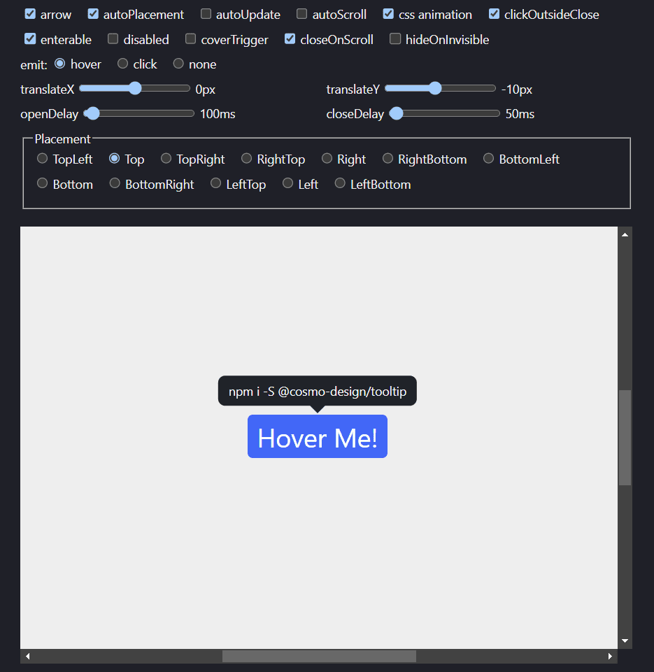
npm i -S @nodesign/tooltip
or via CDN
<link rel="stylesheet" href="https://unpkg.com/@nodesign/tooltip@latest/dist/index.min.css">
<script src="https://unpkg.com/@nodesign/tooltip@latest/dist/index.min.js"></script>
<script>
  console.log(tooltip)
</script>
Usage
import Tooltip from '@nodesign/tooltip'
import '@nodesign/tooltip/es/index.css'
// or import '@nodesign/tooltip/es/index.scss'
// or import '@nodesign/tooltip/dist/index.min.css'

const container = document.querySelector('.container'); // default: document.body
const trigger = document.querySelector('.trigger');
// or virtual element. type: { getBoundingClientRect: () =>  { left: number, top: number, width: number, height: number } }

const tooltip = new Tooltip({
  container,
  trigger, // required
  content: 'It can be a string or a DOM element.', // It will not be displayed when it is an empty string.
})

setTimeout(() => {
  tooltip.updateConfig({ // You can update any parameter using the updateConfig method.
    content: 'xxx'
  })
}, 5000)

// if you don't need it anymore
tooltip.destroy()
You can refer to the documentation of @nodesign/popper for a complete tutorial.
CSS Style
The class names and CSS variables of Tooltip begin with ndt.
--ndt-color: #fff; // font color
--ndt-bg: #1f2329; // background color
--ndt-padding: 8px 12px; // padding
--ndt-radius: 8px; // radius
--ndt-arrow: 12px; // The width and height of the arrow element
--ndt-shadow: 0; // box shadow
You can customize the style by modifying CSS variables.
html[data-theme='dark'] .ndt, html.dark .ndt {
  --ndt-bg: #373739;
}
CSS Animation
Please refer to the @nodesign/popper CSS animation parameters for more information.
Tooltip has added ndt_ani as the default CSS animation name, and you can customize the CSS animation by configuring the cssName parameter.
const tooltip = new Tooltip({
  cssName: 'fade'
})
You can write the following CSS styles:
.fade-enter-from, .fade-exit-to {
  transform: scale(.7);
  opacity: 0;
}
.fade-enter-active, .fade-exit-active {
  transition: transform .1s ease, opacity .1s ease;
}
Arrow
You can configure a custom arrow element using the arrow parameter. By default, a div element with a class name of ndt_arrow will be added as the arrow element.
const arrow = document.createElement('div')
arrow.classList.add('arrow')

const popper = new Tooltip({
  arrow: true, // default
  // arrow: false Do not display the arrow element.
  // arrow: document.createElement('div') Customize the arrow element.
})
API
Please refer to the @nodesign/popper API documentation for the complete API.
Config
| Name | Type | Description |
|---|---|---|
content |
string | Node |
Content to be displayed |
arrow |
boolean | Node |
Arrow element |