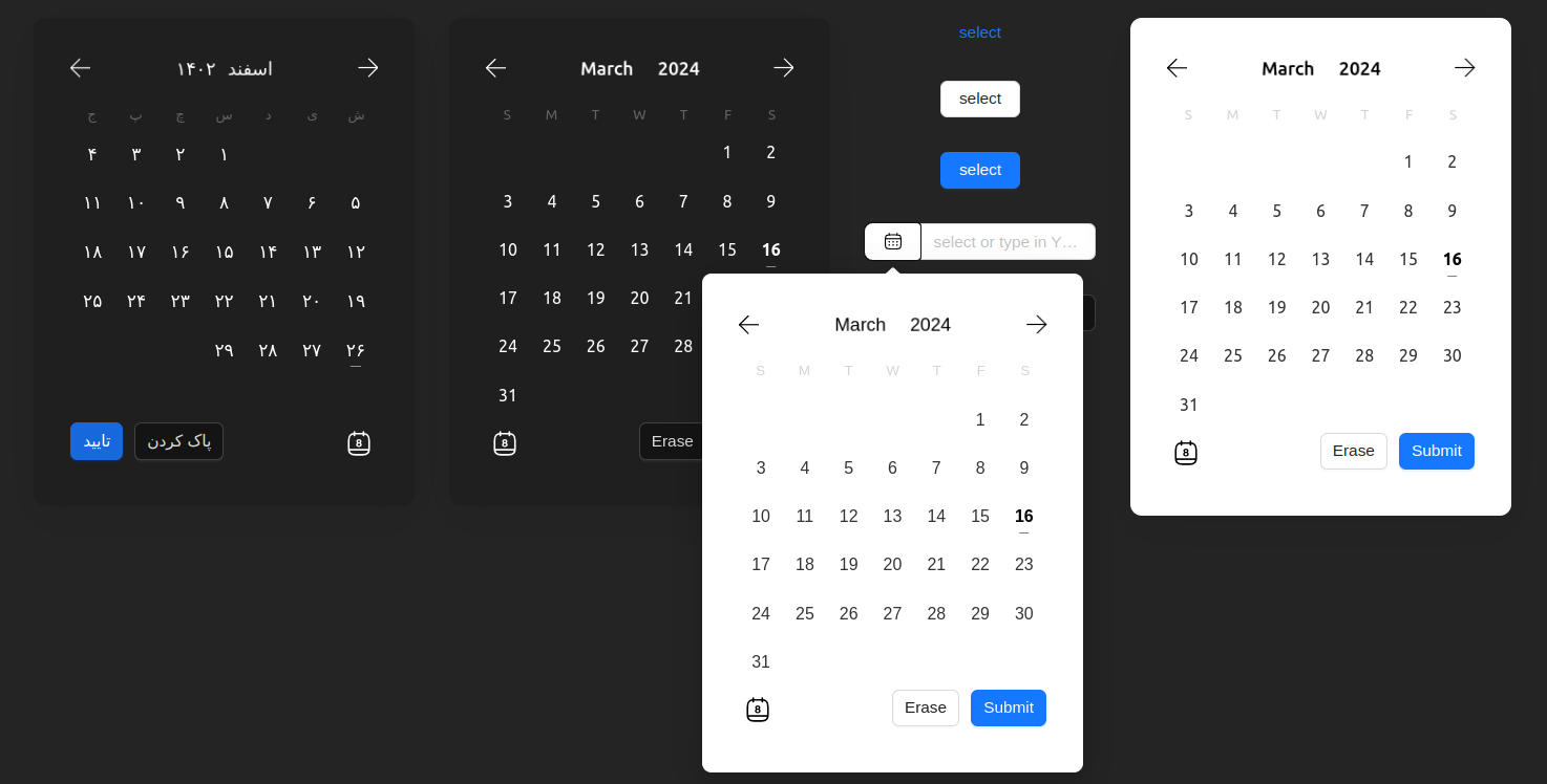
A simple and reusable Datepicker component for React.
This package is an updated version
of react-modern-calendar-datepicker with some
additional features and bug fixes.
npm install @nejadipour/react-modern-datepickerimport Datepicker from "@nejadipour/react-modern-datepicker";
export default function Usage() {
return (
<Datepicker darkMode locale={"fa"}/>
)
}You can find the base documentation here. Some additional features are added to the original package, you can find the properties details in the table below:
| Prop | Type | Default | Description |
|---|---|---|---|
| alwaysOpen | boolean | false | If true, the datepicker will always be open |
| arrow | boolean | true | If true, the arrow will be shown in the Popover |
| calendarClassName | String | '' | Additional CSS class for the calendar element |
| calendarRangeBetweenClassName | String | '' | Additional CSS class for the range-between day(s) in the range date picker |
| calendarRangeEndClassName | String | '' | Additional CSS class for the range end day in the range date picker |
| calendarRangeStartClassName | String | '' | Additional CSS class for the range start day in the range date picker |
| calendarSelectedDayClassName | String | '' | Additional CSS class for the selected day |
| calendarTodayClassName | String | '' | Additional CSS class for today day |
| closedView | String | 'text' | The view that is shown when the date picker is closed. It can be one of 'text', 'button' and 'input'. alwaysOpen should be False |
| closedViewClassName | String | '' | Additional CSS class for the closed view element |
| closedViewProps | Object | {} | Additional props for the closed view element based on Ant Design components. |
| colorPrimary | String | '#1677ff' | The color of selected day in the single date picker and the color of range start and range end in range date picker |
| colorPrimaryLight | String | '#64a9f9' | The color of range-between days |
| customDaysClassName | Array | [] | An array of custom class names for your days. Each item is an object which contains day(number), month(number), year(number), and className(string) properties |
| darkMode | Boolean | False | If True, the date picker will be in dark mode |
| defaultValue | Object | null | The default value of the date picker. It should be an object with year, month, and day or an string of them separated by the delimiter. Based on the selectionMode, it can be an array or object with from and to |
| delimiter | String | '-' | The delimiter that separates year, month, and day in the date string. This is shown when the datepicker is closed |
| disabled | Boolean | False | If True, the date picker will be disabled |
| disabledDays | Array | [] | An array of disabled calendar days. Disabled days won't be selectable, and they can't be included in a day range. If user tries to select/include them onDisabledDayError will be called |
| locale | String | 'en' | Locale language of the calendar. It can be one of 'fa' or 'en' |
| maximumDate | Object | null | Specifies the maximum selectable day by user |
| maximumToday | Boolean | False | If True, the maximum date will be set to today |
| maximumTomorrow | Boolean | False | If True, the maximum date will be set to tomorrow |
| minimumDate | Object | null | Specifies the minimum selectable day by user |
| minimumToday | Boolean | False | If True, the minimum date will be set to today |
| minimumTomorrow | Boolean | False | If True, the minimum date will be set to tomorrow |
| onChange | Function | newValue => null | Gets called when the value of the picker changes |
| onDisabledDayError | Function | disabledDay => null | Gets called when user tries to select/include a disabled day |
| onRenderReady | Function | () => null | Gets called when the date picker render is ready or changed |
| placeholder | String | 'select' for 'en' and 'انتخاب' for 'fa' | The placeholder of the date picker |
| placement | String | 'bottom' | The placement of the date picker. It can be one of 'top', 'bottom', 'left', 'right', 'topLeft', 'topRight', 'bottomLeft', 'bottomRight', 'leftTop', 'leftBottom', 'rightTop' or 'rightBottom' |
| popover | Boolean | true | If true, the date picker will be open in a popover, else it will be replaced with the closed view |
| renderFooter | Function | () => null | Renders a footer for the calendar below the days list. You can use this prop to render a "Go to Today" button or anything you'd like to add there. |
| returnType | String | 'string' | The type of the when calling onChange. It can be one of 'string' or 'object' |
| selectionMode | String | 'single' | The selection mode of the date picker. It can be one of 'single', 'range', or 'multiple' |
| selectorEndingYear | Number | current year + 50 | The maximum selectable year when user opens the year selector |
| selectorStartingYear | Number | current year - 100 | The minimum selectable year when user opens the year selector |
| shouldHighlightWeekends | Boolean | false | Determines whether to mark weekend days with red or not. (weekend days are Saturday and Sunday for locale="en" calendar and Friday for locale="fa" calendar) |
| slideAnimationDuration | String | '0.4s' | Duration of month slide animation. It can be any CSS valid time value |
| trigger | String | "click" | The trigger of the date picker to open/close it. It can be one of "click", "hover", "focus" or "contextMenu" |
| wrapperClassName | String | '' | Additional CSS class for the date picker wrapper element |
