Easy Progress Bar on scroll for react
Add a progress bar on the top of your page to indicate the position of the scroll page
Install
npm i @nadfri/react-scroll-progress-barLive Example
https://npm-react-scroll-progress-bar.netlify.app/
Usage
//Import ProgressBar component
import { ProgressBar } from '@nadfri/react-scroll-progress-bar';
export default function App() {
return (
<div style={{height: "200vh"}}>
<ProgressBar />
{/*or*/}
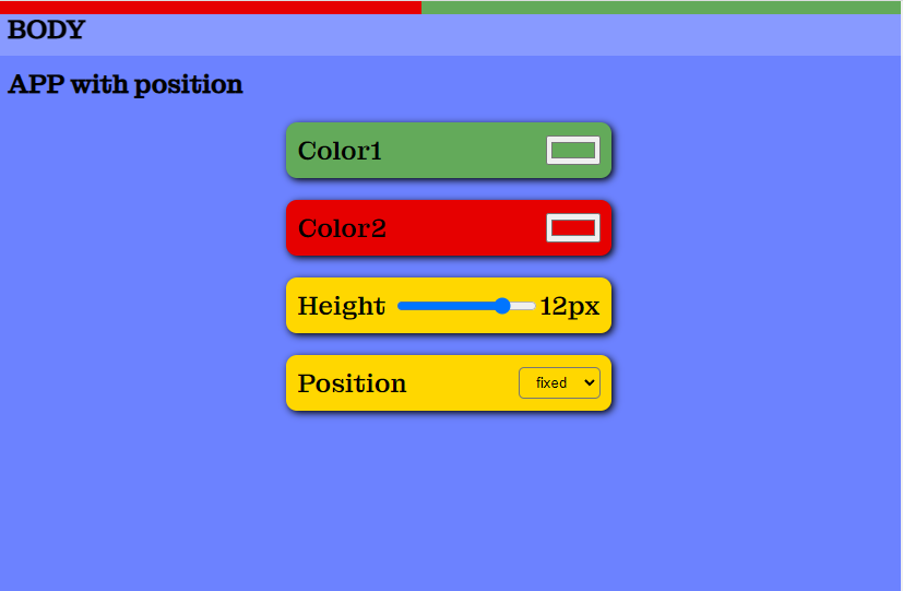
<ProgressBar
color1 = "gray"
color2 = "gold"
height = "4px"
position = "fixed"
/>
</div>
);
}Default Props
If you use <ProgressBar/> without props, default values are:
- color of container will be
gray(color1) - color of bar will be
gold(color2) - position of progress bar will be
fixed(position) - heigth of progress bar will be
4px(height)
Custom Props
-
color1| color of the container (ex:"gray", "#fff') -
color2| color of the progress bar (ex: "red", "rgb(0,0,0)") -
height| height of the progress bar (ex: "10px", "10%", "1vh") -
position| Position of the progress bar (ex: "absolute", "fixed", "sticky", "relative")
You can use all css values for this properties.