morph-tabbar-item
Tab bar item is a fast and lightweight custom web component that morphs for current mobile OS and uses the LitElement base class.
Morph Components are now being updated to use lit-element as base class from the current polymer base class.
morph-tabbar-item component changes its appearance automatically based on whether the platform or device is IOS or Android.
Getting Started
For the information about how to clone the desired repository, running the local server and testing, please refer to Polymorph elements getting started docs at the end of this repository.
Demo
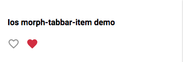
<h3>Ios morph-tabbar-item demo</h3>
<morph-tabbar-item id="first-item" platform="ios" name="favorite" not-selected-image="img/icon.svg" selected-image="img/icon_selected.svg">
</morph-tabbar-item>
<morph-tabbar-item id="second-item" platform="ios" name="favorite" not-selected-image="img/icon.svg" selected-image="img/icon_selected.svg" selected>
</morph-tabbar-item>
<h3>Ios morph-tabbar-item with label</h3>
<morph-tabbar-item id="first-item" platform="ios" name="favorite" not-selected-image="img/icon.svg" selected-image="img/icon_selected.svg" has-label>Favorite
</morph-tabbar-item>
<morph-tabbar-item id="second-item" platform="ios" name="favorite" not-selected-image="img/icon.svg" selected-image="img/icon_selected.svg" selected has-label>Favorite
</morph-tabbar-item>
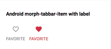
<h3>Android morph-tabbar-item with label</h3>
<morph-tabbar-item id="first-item" platform="android" name="favorite" not-selected-image="img/icon.svg" selected-image="img/icon_selected.svg" has-label>Heart
</morph-tabbar-item>
<morph-tabbar-item id="second-item" platform="android" name="favorite" not-selected-image="img/icon.svg" selected-image="img/icon_selected.svg" selected has-label>Heart
</morph-tabbar-item>-
Here is a quick demo of the morph-tabbar-item element.
<template>
  <h3>Ios morph-tabbar-item</h3>
  <morph-tabbar-item id="first-item" platform="ios" name="Favorite" not-selected-image="../img/icon.svg" selected-image="../img/icon_selected.svg">
  </morph-tabbar-item>
  <morph-tabbar-item id="second-item" platform="ios" name="Favorite" not-selected-image="../img/icon.svg" selected-image="../img/icon_selected.svg" selected>
  </morph-tabbar-item>
</template>
<demo-snippet>
  <template>
    <h3>Android morph-tabbar-item with label demo</h3>
    <morph-tabbar-item id="first-item" platform="android" name="favorite" not-selected-image="../img/icon.svg" selected-image="../img/icon_selected.svg" label>
    </morph-tabbar-item>
    <morph-tabbar-item id="second-item" platform="android" name="favorite" not-selected-image="../img/icon.svg" selected-image="../img/icon_selected.svg" label selected>
    </morph-tabbar-item>
  </template>
</demo-snippet>


Attributes
| Custom Attribute | Type | Description | Default |
|---|---|---|---|
platform |
String | Name of the platform, get assigned automatically by the morph element. |
Either andorid or ios
|
name required
|
String | Parent element uses the name attribute to be able to manipulate the items. |
false |
has-label |
Boolean | To have a tabbar item with label assign it to true. |
false |
not-selected-image |
String | Image source for not selected state of the item. | null |
selected-image |
String | Image source for selected state of the item. | not-selected-image |
selected |
Boolean | If true, item is the selected one. |
false |
Note: When using has-label on the morph-tabbar-item, it is important to put label on the parent morph-tabbar to have proper alignment and/or spacing for the text/label
Styling
- For Android platform
| Custom property | Description | Default |
|---|---|---|
--color |
Color of the tabbar item | #fff |
--ripple-color |
Color of the ripple effect on the item | var(--color) |
--ripple-color-selected |
Ripple effect color of selected item | #fff |
--selected-label-color-android |
Label text color of the selected item | #fff |
-For IOS platform;
| Custom property | Description | Default |
|---|---|---|
--color |
Color of the tabbar item | #8e8e93 |
--selected-label-color-ios |
Label text color of the selected item | #007aff |
Further help
For more information on how to install and run test please go here - Polymorph elements getting started