Responsive React Sliders built with Bootstrap 5. Range slider bar with label or a carousel image slider? No matter what you are looking for, we've got you covered.
Check out React Bootstrap Slider Documentation for detailed instructions & even more examples.
⚠️ Important!:The term "Bootstrap Slider" is currently very ambiguous. There are two distinct components, that are both colloquially referred to as "Slider" by some developers. We created this page to help you find the proper component that you are looking for. You will find more examples of each one in the main documentation pages that are linked below.
Range Slider
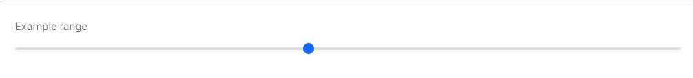
If you were looking for something that looks like the "slider" below, check out the Range Slider documentation, for more examples & customization options for this component.
import React from "react";
import { MDBRange } from "mdb-react-ui-kit";

export default function App() {
  return (
    <MDBRange defaultValue={50} id="customRange" label="Example range" />
  );
}
Carousel Slider
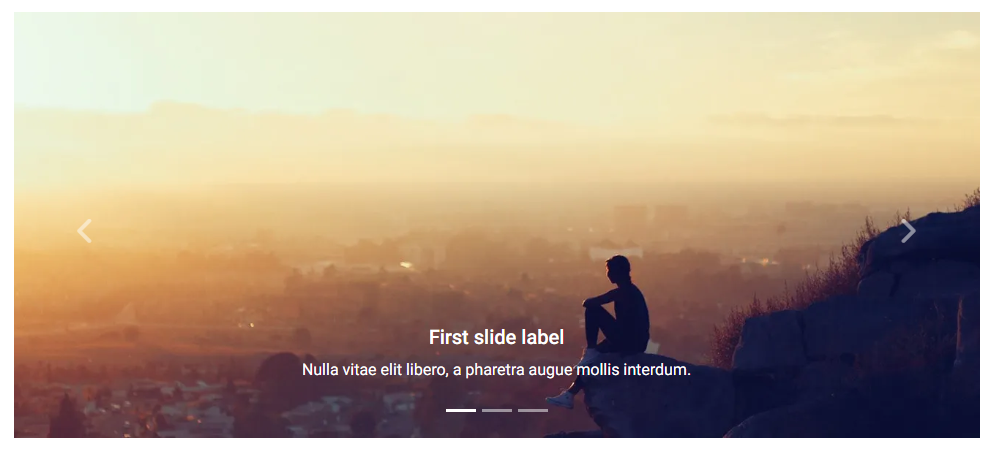
If you were looking for something that looks like the "slider" below, check out the Carousel Slider documentation, for more examples & customization options for this component.
import React from "react";
import { MDBCarousel, MDBCarouselItem } from "mdb-react-ui-kit";

export default function CarouselSlider() {
  return (
    <MDBCarousel showIndicators showControls fade>
      <MDBCarouselItem
        className="w-100 d-block"
        itemId={1}
        src="https://mdbootstrap.com/img/Photos/Slides/img%20(15).jpg"
        alt="..."
      >
        <h5>First slide label</h5>
        <p>Nulla vitae elit libero, a pharetra augue mollis interdum.</p>
      </MDBCarouselItem>

      <MDBCarouselItem
        className="w-100 d-block"
        itemId={2}
        src="https://mdbootstrap.com/img/Photos/Slides/img%20(22).jpg"
        alt="..."
      >
        <h5>Second slide label</h5>
        <p>Lorem ipsum dolor sit amet, consectetur adipiscing elit.</p>
      </MDBCarouselItem>

      <MDBCarouselItem
        className="w-100 d-block"
        itemId={3}
        src="https://mdbootstrap.com/img/Photos/Slides/img%20(23).jpg"
        alt="..."
      >
        <h5>Third slide label</h5>
        <p>
          Praesent commodo cursus magna, vel scelerisque nisl consectetur.
        </p>
      </MDBCarouselItem>
    </MDBCarousel>
  );
}
How to use?
-
Download MDB React - free UI KIT
-
Choose your favourite customized component and click on the image
-
Copy & paste the code into your MDB project
More extended Bootstrap documentation
- React Bootstrap Code
- React Bootstrap Gallery
- React Bootstrap Hamburger Menu
- React Bootstrap Jumbotron
- React Bootstrap Maps
- React Bootstrap Mega Menu
- React Bootstrap Media object
- React Bootstrap Multiselect
- React Bootstrap Masonry
- React Bootstrap Contact form
- React Bootstrap Gradients
- React Bootstrap Pagination
- React Bootstrap Panels
- React Bootstrap Social Media icons & buttons
- React Bootstrap Search
- React Bootstrap Table sort
- React Bootstrap Table responsive
- React Bootstrap Table scroll
- React Bootstrap Table search
- React Bootstrap Textarea
- React Bootstrap Sidebar
- React Bootstrap Profiles
- React Bootstrap Nested Dropdown
- React Bootstrap Address Form
- React Scroll Back to Top button
- React Product Cards
- React Avatar
- React Carousel Slider with Thumbnails
- React Chat
- React Comparison table
- React Comments
- React Drawer
- React FAQ component / section
- React Invoice
- React News feed
- React Offcanvas
- React Order details
- React Page transitions
- React Quotes
- React Payment forms
- React Select with custom Input
- React Square Buttons
- React Testimonial Slider
- React Testimonials / Reviews
- React Survey form
- React Timeline
- React To Do List
- React Padding
- React Modal Size
- React Modal Backdrop
- React CSS Text Animations
- React Video
- React Modal Show, Close, Hide & Toggle
- React Card deck
- React Table filter
- React Slider