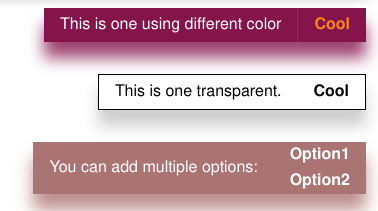
<message-box/>
<message-box/> is a Web component implemented on Lit-Element library.
It is similar to native HTML Element and could runs in mainstream browsers without any difference.
In short, it is a message string box and some buttons, common application scenario is to convey to the website user some information. For example:
<message-box class="colorful" >
  <span slot="message">
    This is an example that contains only one option.
  </span>
  <button slot="button">Okay</button>
</message-box>
It looks like this:
Another common scenario is the progress bar. Message-box has a progress bar via gradient background color:
More examples can be found here.
Usage
Import directly in HTML
npm CDNs like unpkg.com can directly serve files that have been published to npm. This works great for standard JavaScript modules that the browser can load natively.
So recommended ways of importing:
<!-- Importing -->
<script type="module">
  import 'https://unpkg.com/@lit-component/message-box?module';
  ...
</script>
<!-- Using -->
<message-box .../>
Or:
<!-- Importing -->
<script type="module" src="https://unpkg.com/@lit-component/message-box?module"></script>
<!-- Using -->
<message-box .../>
Import in project using Npm & Webpack
- Installation via NPM
npm i @lit-component/message-box- Importing
In webpack entry script, usually, index.js:
import '@lit-component/message-box'In HTML:
<message-box .../>
Create <message-box/> with generator
generator is using for generates a <message-box/> quickly:
import { generator } from '@lit-component/message-box'

const mountPoint = document.body

const $messageBox = generator(
  `
    <span slot="message">
      This is an example that contains only one option.
    </span>
    <button slot="button">Okay</button>
  `,
  { out: 'right' },
  {
    position: 'fixed',
    top: '2vh',
    'z-index': 'max',
  },
  mountPoint
)

mountPoint.appendChild($messageBox)
Attribute & Properties
You can set attributes for <message-box/> elements directly or properties for Web Component MessageBox instances, and they have the same effect:
<message-box min-width="20vw"/>

<!-- Is equal to -->

<message-box/>
<script>
  const $messageBox = document.querySelector('message-box')
  $messageBox.minWidth = '20vw'
</script>| Property | Attribute | Description | Type | Default |
|---|---|---|---|---|
| height | height | The height of component | string | "initial" |
| width | width | The width of component | string | "initial" |
| minWidth | min-width | The min-width of component | string | "initial" |
| border | border | The `border` css property of component | string | "0" |
| color | color | The `color` css property of component | string | "255, 255, 255" |
| radius | radius | The `border-radius` of component | string | "0" |
| shadow | shadow | The `box-shadow` css property of component | string | "0, 1rem, 1rem" |
| out | out | The out method of component. one of "right"|"top". | string | "" |
| timeout | timeout | The display time of the component. | string | "0" |
Slots
| Name | Description |
|---|---|
| message | The 'message' component that needs to be displayed, the most basic such as `SPAN` |
| button | `BUTTON`s that need to be displayed |
CSS Shadow Parts
| Name | Description |
|---|---|
| --message-box-background-color | Set background color of component |
| --message-box-opacity | Set opacity of component |


