
@jaewoong2/modal
Description
Very Simple & Easy Modal For You
Version
-
0.3.0(#2023-04-09) - Be
1.0.0When This Todo will Be Done.
Storybook
Installation
yarn
$ yarn add @jaewoong2/modal
npm
$ npm i @jaewoong2/modal
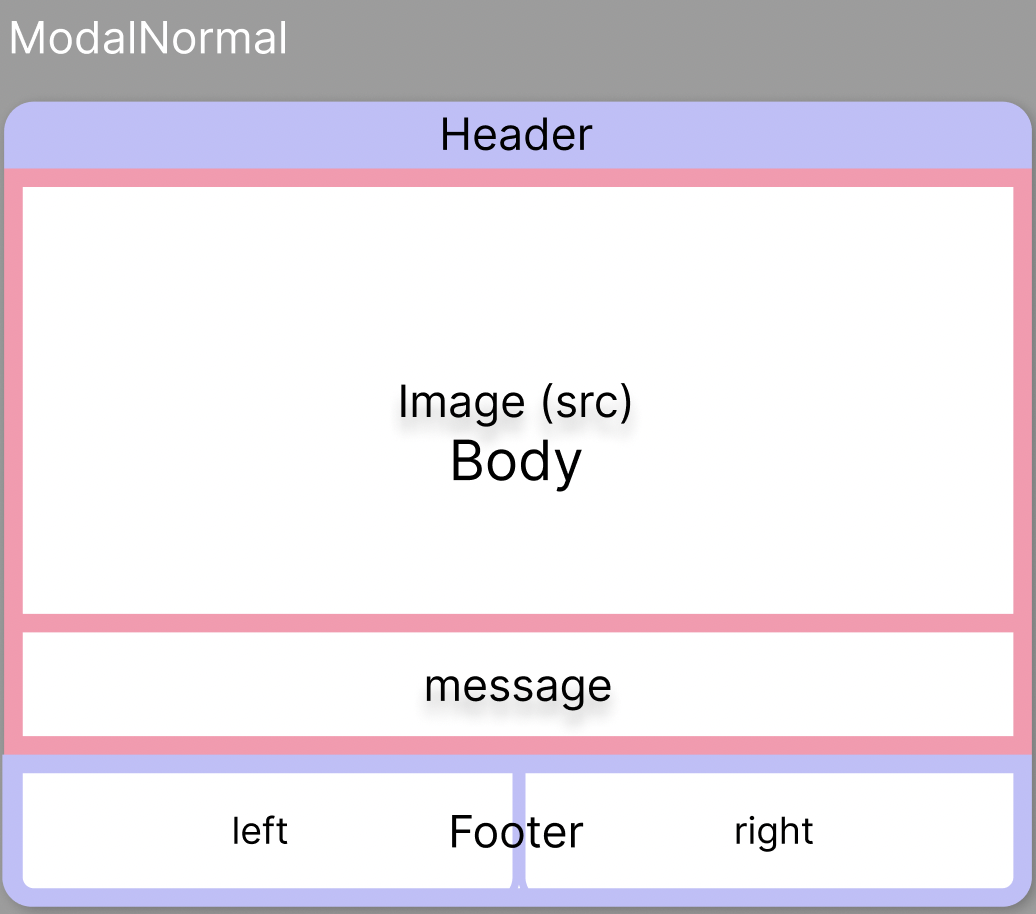
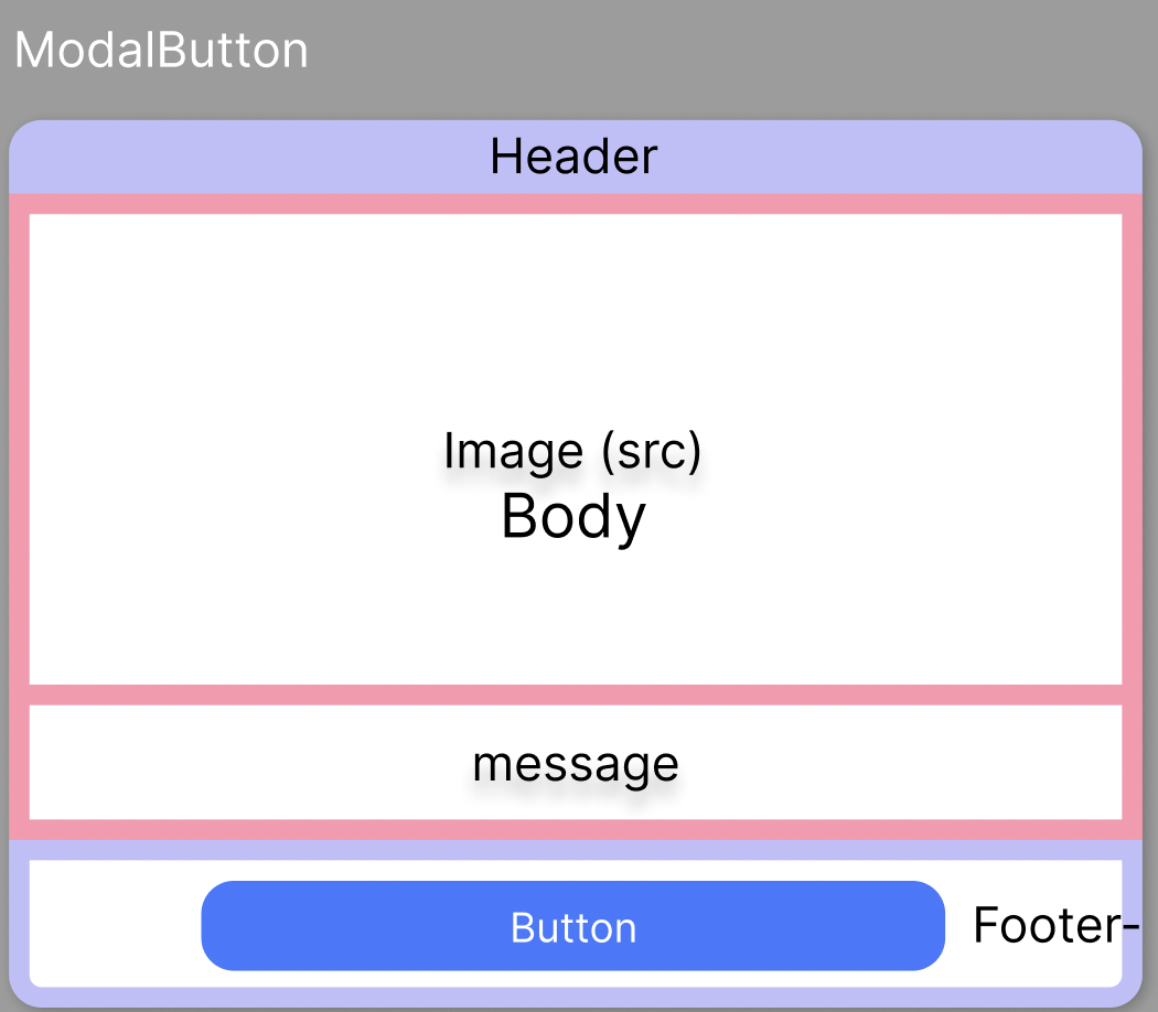
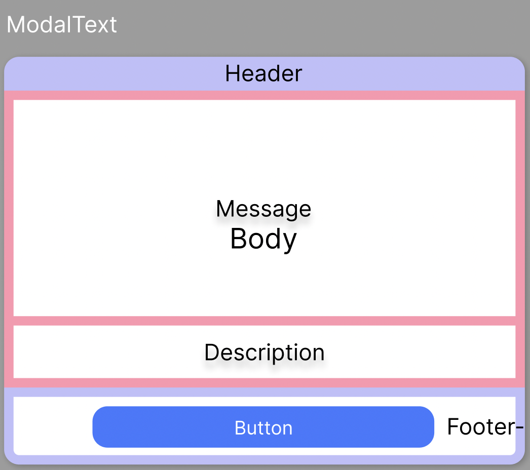
Prototype Image
-
useModal(options) { default }- if not wirte option type, you can use it options.type = "normal"
useModal(options)options.type = "button"
useModal(options)options.type = "text"
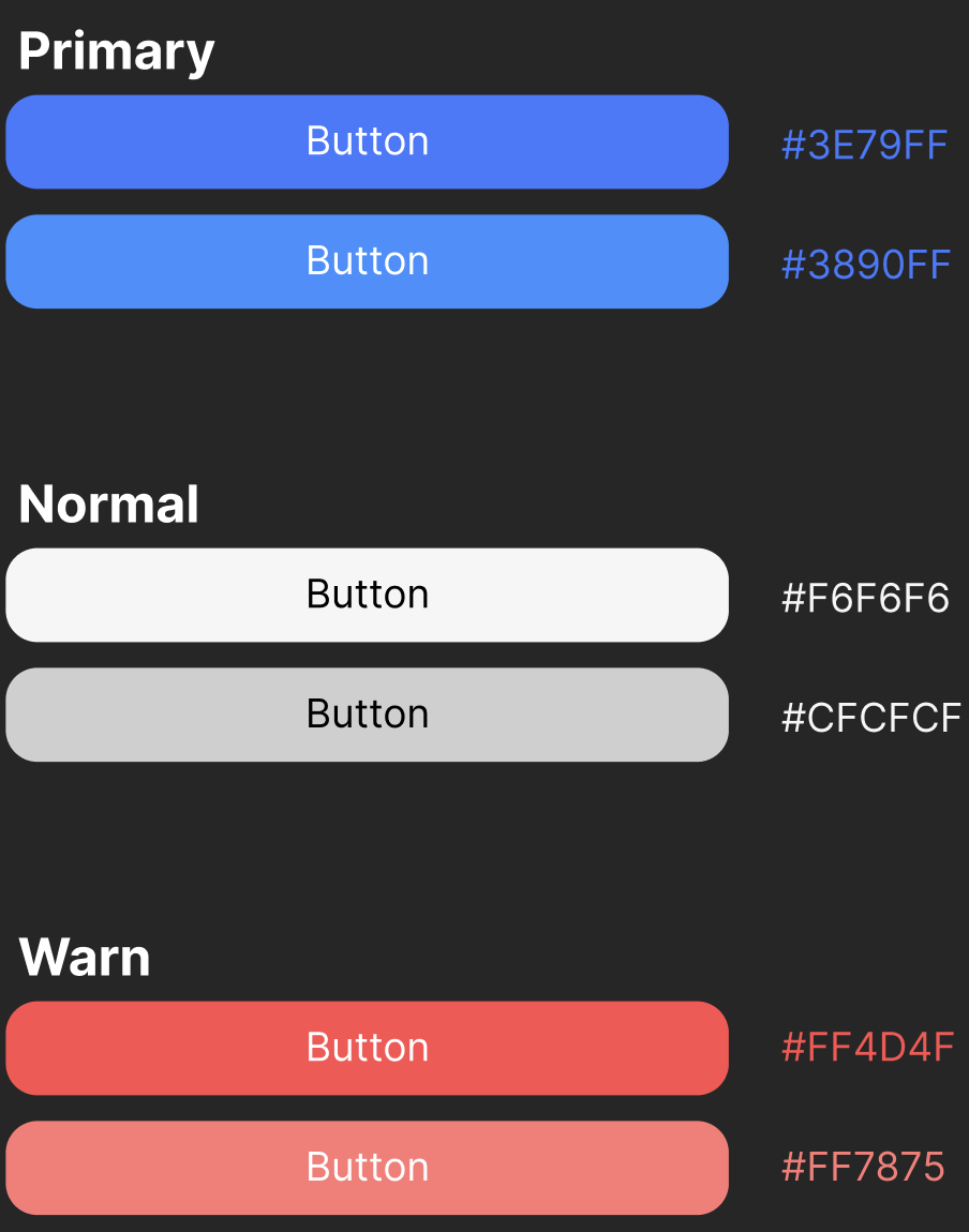
- You Can set Button Type by setting options
{ ...options, buttonType: 'primary' }
Usage
Declaration
import { ModalProvider, useModalButton, useModalNormal, useModalText} from "@jaewoong2/modal"Provider
import { ModalProvider } from '@jaewoong2/modal'

const App = () => {
   return (
      <ModalProvider>
         <RootComponent />
      </ModalProvider>
   )
}
useModalNormal Call
import { useModal } from "@jaewoong2/modal"

/**
 * options: { type: "normal" }
*/
const ChildComponent = ({ options }) => {
   const { show, hide } = useModal({  ...options })

   return (
      <button onClick={show}>SHOW</button>
      <button onClick={hide}>HIDE</button>
   )
}
useModalText Call
import { useModal } from "@jaewoong2/modal"

/**
 * options: { type: "text" }
*/
const ChildComponent = ({ options }) => {
   const { show, hide } = useModal({  ...options })

   return (
      <button onClick={show}>SHOW</button>
      <button onClick={hide}>HIDE</button>
   )
}
useModalButton Call
import { useModal } from "@jaewoong2/modal"

/**
 * options: { type: "button" }
*/
const ChildComponent = ({ options }) => {
   const { show, hide } = useModal({  ...options })

   return (
      <button onClick={show}>SHOW</button>
      <button onClick={hide}>HIDE</button>
   )
}
Modals Options
Modal Basic Options
type ModalBasicOptions = {
  isLoading?: boolean
  borderRadius?: string
  modalWidth?: string
  message?: React.ReactNode
  header?: React.ReactNode
}
useModalNormal Options
type ModalNormalOptions = {
  type?: "normal"
  src?: string

  footerLeftText?: React.ReactNode
  footerRightText?: React.ReactNode

  onClickFooterLeft?: () => void
  onClickFooterRight?: () => void
} & ModalBasicOptions
useModalText Options
type ModalTextOptions = {
  type?: "text"
  buttonType?: ButtonType
  buttonText?: string
  description?: React.ReactNode

  onClickButton?: () => void
} & ModalBasicOptions
useModalButton Options
type ModalButtonOptions = {
  type?: "button"
  buttonType?: ButtonType
  src?: string
  buttonText?: string
  onClickButton?: () => void
} & ModalBasicOptions
UX / A11Y
Defferd Component
- 스켈레톤 이미지가 200ms 보다 짧게 보여지게 된다면, 사용성이 떨어지기 때문에
- 200ms 보다 길게 로딩이 되면, 스켈레톤 이미지가 보여지게 하는 Component
- Reference - https://tech.kakaopay.com/post/skeleton-ui-idea/
Skeleton Component
- Image Skeleton Component
- Message Skeleton Component
- Description Skeleton Component
For A11y Tags and Attributes
- Image(Alt)
- role="dialog"
- aria-label="modal"
- Modal Close Button
- setting tabIndex
Documents
Next Todo
Deployment / PublishStroyBook HostingDocument WritingOptions (By Priority)
-
Patch
- 코드 변경, 버그 수정
-
Minor
- 기능 추가
-
Major
- 정식 출시 및 업데이트 후, 기존 버전과 동일 하게 사용 할 수 없을 경우 Major 업데이트