Copyright © Bentley Systems, Incorporated. All rights reserved.
The Grouping Mapping widget is a UI component for iTwin Viewer applications that simplifies how users (and developers) interface with the Reporting Platform APIs.
The grouping-mapping-widget package provides a UiProvider class - GroupingMappingProvider - which can be passed into the uiProviders prop of the iTwin Viewer's <Viewer /> component.
This is not a standalone UI and requires a parent iTwin Viewer application to work as intended. A guide on how to create a basic iTwin Viewer application can be found here: https://www.itwinjs.org/learning/tutorials/develop-web-viewer/. This package provides a viewer 'widget'. Documentation on how to add a widget to your application can be found here: https://developer.bentley.com/tutorials/itwin-viewer-hello-world/#2-your-first-ui-widget.
The SPA client used by your iTwin viewer must have the itwin-platform scope.
In addition, users must have the imodels_read and imodels_write permissions assigned at either the Project or iModel level. Further instruction on how to create roles and assign permissions can be found in the iTwin Platform Projects API documentation.
import { GroupingMappingProvider } from "@itwin/grouping-mapping-widget";
<Viewer
  ...
  uiProviders={[new GroupingMappingProvider()]}
/>This package provides an interface to define your own custom UI or callback functions in grouping mapping widget. There are different types of custom UIs provided.
You can use your own UI component to define group creation method.
An example of grouping custom UI, ManualGroupingCustomUI helps user to manually define ECSQL query for groups.
In GroupingCustomUIProps:
-
updateQueryis used to run the query and visualize results in the viewer. -
isUpdatingkeeps track of the status of query execution. -
resetViewenables you to reset the viewer state.
To configure your own grouping custom UI, you need to give it:
- a
typeasGroupingMappingCustomUIType.Grouping - a
nameas identifier - a
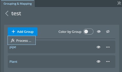
displayLabelwhich will be shown in the 'Add Group' dropdown list - a
uiComponentlike above - an optional
icon
You can define your UI provider as follows in the GroupingMappingProvider:
new GroupingMappingProvider({
  customUIs: [
    {
      type: GroupingMappingCustomUIType.Grouping,
      name: "Manual",
      displayLabel: "Manual Query",
      uiComponent: ManualGroupingCustomUI,
      icon: <SvgDraw />,
    },
  ],
});
After adding the grouping custom UI, it will be presented in the 'Add Group' drop down list.
You can also add custom UI in context menu for each group. This could be UI driven interaction or simply a callback function to execute your own code.
You can use the iModelId, mappingId and groupId in ContextCustomUIProps provided by Grouping Mapping Widget in your UI component or callback.
To configure your own context custom UI, you need to give it:
- a
typeasGroupingMappingCustomUIType.Context - a
nameas identifier - a
displayLabelwhich will be shown in the context dropdown list in each group tile - an optional
uiComponentwhich will be presented in the widget as a UI component - an optional
onClickcallback function where you could make your own API calls - an optional
icon
You can define your context custom UI as following example in the GroupingMappingProvider with an example is to use clash detection in the widget:
const customCB = (groupId: string, mappingId: string, iModelId: string) => {
  toaster.informational(`Called callback for group ${groupId}`);
};

new GroupingMappingProvider({
  customUIs: [
    {
      type: GroupingMappingCustomUIType.Context,
      name: "ClashDetection",
      displayLabel: "Clash Detection",
      uiComponent: ClashDetectionCustomUI,
      onClick: customCB,
      icon: <SvgClash />,
    },
  ],
});
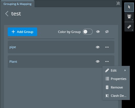
After adding the context custom UI, the context menu item will look like this with additional Clash Detection menu item.


