react-datepicker Demo Live
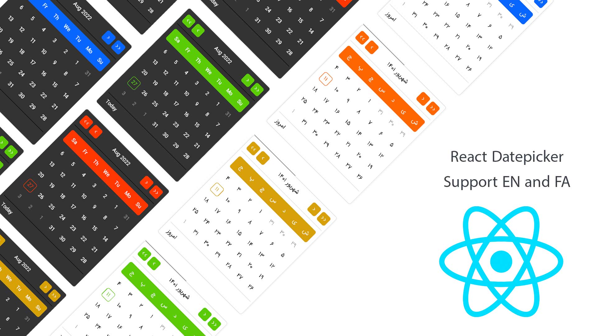
A cool datepicker and calendar for english and persian you can see some features here :
- You can choosing between 5 colors.
- Dark mode and Light mode
- Show loading... and you can change it to whatever you want :)
- You can use any input component for this datepicker
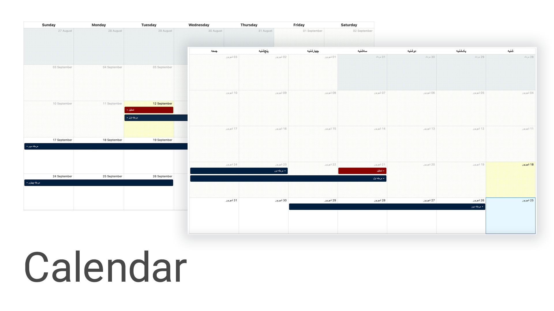
- You can set event for days and make them different vs normal days
- Change your input format
- Disable some date
- Set your custom footer for datepicker
- Auto adjust position
- Calendar
🌟 If you like this Datepicker, please bookmark it on your github with the star button.
Use the package manager npm to install @ijavad805/react-datepicker.
npm install @ijavad805/react-datepickerimport { Datepicker } from '@ijavad805/react-datepicker';
// simple
function AppSimple() {
return <Datepicker />;
}
// full options
function App() {
return (
<Datepicker
footer={(moment, setValue) => {
return (
<>
<div
onClick={() => {
if (setValue) setValue(moment());
}}
>
Today
</div>
</>
);
}}
closeWhenSelectADay={true} // boolean
dayEffects={[
{
day: '2022-09-12',
color: 'red',
dotColor: 'red',
title: 'What ever you want',
},
]}
disabled={false} // disable input
disabledDate={(day) => day === moment()} // today should be disabled
format={'YYYY-MM-DD'}
input={<input placeholder="Select a date" />} // whatever you want
onOpen={() => {
console.log('datepicker is open');
}}
lang={'en'} // en and fa
loading={false} // show loading in datepicker if is open
modeTheme={'dark'} // dark and light
theme={'blue'} // blue , orange , red , green , yellow
defaultValue={moment()}
adjustPosition={'auto'} // auto, right-top, left-top, right-bottom, left-bottom, modal
onChange={(val: any) => {
console.log(val.format());
}}
/>
);
}Calendar ( VERSION 1 ) Demo
The Calendar props interface provides configuration options for customizing the behavior and appearance of the react-datepicker component. Here's a summary of its properties:
| Property | Type | Description |
|---|---|---|
lang |
"en" | "fa" |
Language for the calendar. Either "en" for English or "fa" for Farsi (Persian). |
theme |
"blue" |
Theme for the calendar. Currently, only "blue" is supported. |
events |
IEvent[] |
An array of IEvent objects representing the events to be displayed on the calendar. |
onDay |
(date: string) => { className?: string; } |
A function to customize the appearance of a day. It takes a date string as input and should return an object with an optional className property to apply custom styles. |
disabledDate |
(date: moment.Moment) => boolean |
A function that determines whether a date should be disabled. It takes a Moment.js date object as input and should return true to disable the date or false to enable it. |
onClickEvent |
(item: IEvent) => void |
A function to handle event click events. It receives an IEvent object as its argument. |
onDoubleClickEvent |
(item: IEvent) => void |
A function to handle event double-click events. It receives an IEvent object as its argument. |
onDropEvent |
(item: IEvent) => void |
A function to handle event drop events. It receives an IEvent object as its argument, to enable drag and drop functionality, this prop should not be undefined
|
onDateClick |
(date: string) => void |
A function to handle date click events. It receives a date string as its argument. |
onMonthChange |
(start: string, end: string) => void |
A function to handle month change events. It receives two date strings, start and end, indicating the new visible date range on the calendar. |
style |
React.CSSProperties |
Additional CSS styles to apply to the calendar component. |
allowClear |
boolean |
allow user to clear the value |
These properties allow you to configure and customize the behavior and appearance of the Calendar component in your application.
The IEvent interface represents an individual event that can be displayed on the calendar. It provides details about the event. Here's a summary of its properties:
| Property | Type | Description |
|---|---|---|
id |
number |
A unique identifier for the event. |
title |
React.ReactNode | string |
The title of the event, which can be either a Component or a string. |
date |
DateEvent |
The date of the event, which can be a date string or an object with start and end properties. |
style |
React.CSSProperties |
Additional CSS styles for the event. |
className |
string |
Additional CSS class for the event. |
dotColor |
string |
Color for a dot associated with the event. |
disabled |
boolean |
A flag indicating if the event is disabled. |
icon |
React.ReactNode |
A React node for an icon associated with the event. |
These properties allow you to specify the details and appearance of events to be displayed on the calendar.
const App = () => {
  return (
    <Calendar
      lang="en"
      theme="blue"
      events={[
        {
          id: 1, // it should unique
          title: 'Test',
          date: '2023-09-16',
          className: 'test',
          dotColor: '#000',
          disabled: false,
          icon: '$', // also you can use component
          style: {
            // what ever you want
          },
        },
      ]}
      onDropEvent={(item: IEvent) => { // for enabling drag and drop option you should pass this function
        console.log(item);
      }}
      onClickEvent={(item: IEvent) => console.log(item)}
      onDoubleClickEvent={(item: IEvent) => console.log(item)}
      style={{
        height: 600,
      }}
      onDateClick={(date: moment.Moment) => console.log(date)}
    />
  );
};My friend, if you see any bugs, please tell me:
- Email: ijavad805@gmail.com
- Github issues: https://github.com/ijavad805/react-datepicker/issues


