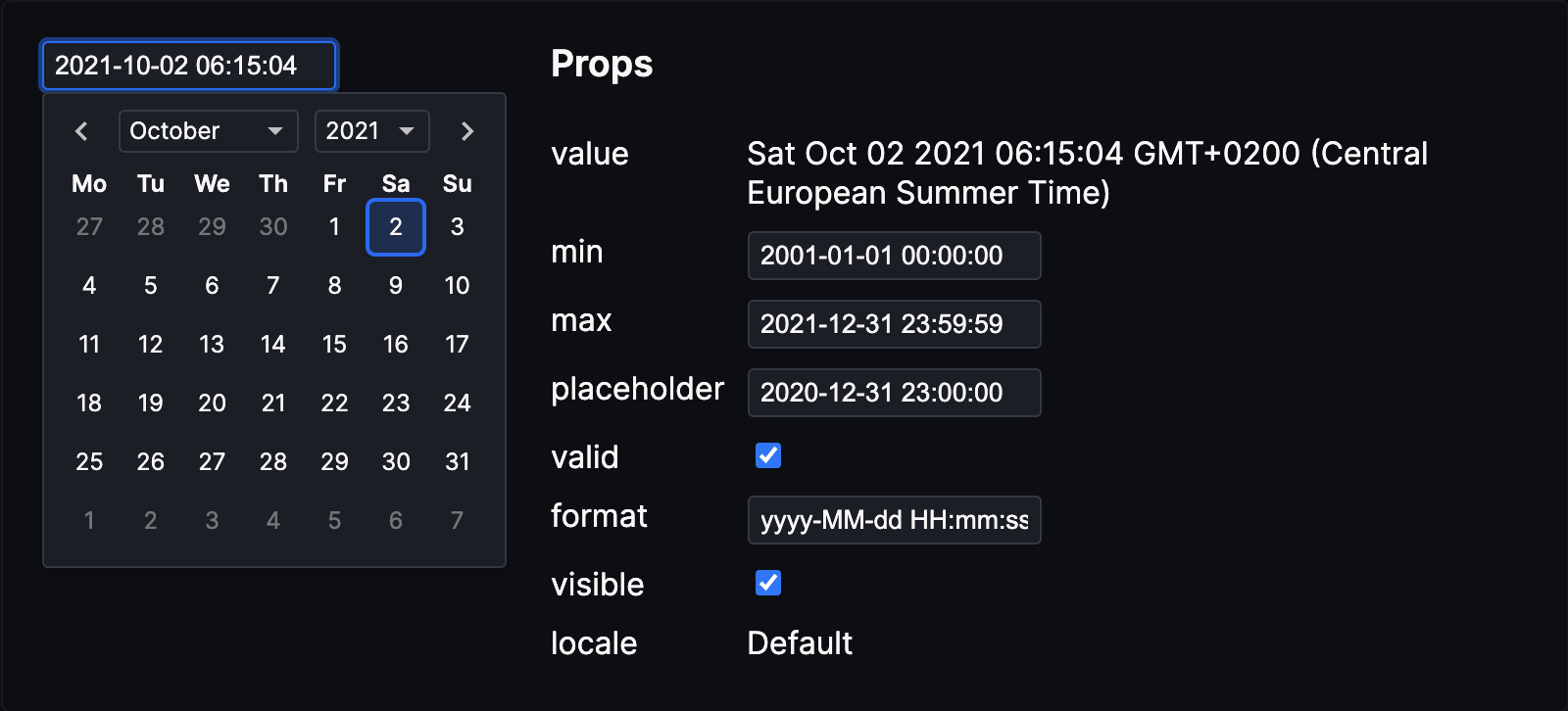
Date and time picker for Svelte
This is an adaptation from date-picker-svelte.
- Expanding
closeOnSelectionto be an object so user can choose which actions to close on (day, month, year) - Expanding
on:changeevent to be an object that includes the date and which field was just change (day, month, year) - Updating
on:changeto fire on every change that happens in the picker (the original version did not fire change on year and month changes)
Goes to original packages demo:
Demo • Documentation • REPL
npm i @gregg-cbs/svelte-date-picker
<script>
  import { DateInput, DatePicker } from 'date-picker-svelte'

  let date = new Date()

  const minDate = new Date()
  minDate.setFullYear(2020)

  const maxDate = new Date()
  maxDate.setFullYear(2026)

  function onChange(e) {
    date = e.detail.value; // value is always a date
    // e.detail.changed tells you whether day, month or year was changed so you can
    // have side effects on these actions if you want
  }
</script>

<!-- input that shows datepicker when clicked on (wraps the DatePicker for you) -->
<DateInput
  bind:value={date}
/>

<!--
DateInput Props

/** Format string */
format = 'yyyy-MM-dd HH:mm:ss'

/** Locale object for internationalization */
locale: Locale = {}

/** Whether the date popup is visible */
visible = false

/** Close the date popup when a date is selected */
closeOnSelection: {
  day?: boolean,
  month?: boolean,
  year?: boolean
}

/** Wait with updating the date until a date is selected */
browseWithoutSelecting = false

/** Show a time picker with the specified precision */
timePrecision: 'minute' | 'second' | 'millisecond' | null = null

/** Automatically adjust date popup position to not appear outside the screen */
dynamicPositioning = false
-->

<!-- standalone date picker/calendar so you can do your own thing -->
<DatePicker
  value={value}
  min={minDate}
  max={maxDate}
  on:change={onChange}
/>

<!--
  DatePicker Props

	/** Date value. It's `null` if no date is selected */
	value: Date | null

	/** Show a time picker with the specified precision */
	timePrecision: 'minute' | 'second' | 'millisecond' | null

	/** The earliest year the user can select */
	min: Date | null

	/** The latest year the user can select */
	max: Date | null

  /** Wait with updating the date until a date is selected */
	browseWithoutSelecting = false

  /** Locale object for internationalization */
  locale: Locale = {}
 -->


<!-- you can also bind value but a note that this will fire a change when the component mounts -->
<DatePicker
  bind:value={value}
  min={minDate}
  max={maxDate}
/>
Check the docs to learn more
- Install Node.js (v14 works)
- Run
npm install
-
npm run dev: Start site in dev mode -
npm run build: Build package and site -
npm run preview: Preview production site -
npm run check: Runsvelte-check -
npm run test: Run tests -
npm run format: Format code
- Update
CHANGELOG.md - Check for errors
npm run lint - Bump the version number
npm version --no-git-tag <version> - Publish
npm publish - Commit with a tag in format "v#.#.#"
- Create GitHub release with release notes


