A Sankey (or flow) diagram for graph visualization.
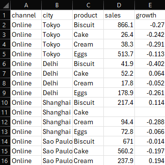
Given this table of sales:
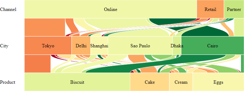
... we can render the following clickable Sankey diagram:
Here is the source code for the diagram above
Install via npm:
npm install @gramex/sankey@1Use locally as an ES module:
<script type="module">
  import { sankey } from "./node_modules/@gramex/sankey/dist/sankey.js";
</script>
Use locally as a script:
<script src="./node_modules/@gramex/sankey/dist/sankey.min.js"></script>
<script>
  gramex.sankey(...)
</script>
Use via CDN as an ES Module:
<script type="module">
  import { sankey } from "https://cdn.jsdelivr.net/npm/@gramex/sankey@1";
</script>
Use via CDN as a script:
<script src="https://cdn.jsdelivr.net/npm/@gramex/sankey@1/dist/sankey.min.js"></script>
<script>
  gramex.sankey(...)
</script>The sankey() function accepts an array of objects, like this:
[
  { "channel": "Online", "city": "Tokyo", "product": "Biscuit", "sales": 866.1, "prev": 1186.4 },
  { "channel": "Online", "city": "Tokyo", "product": "Cake", "sales": 26.4, "prev": 34.8 },
  { "channel": "Online", "city": "Tokyo", "product": "Cream", "sales": 38.3, "prev": 54.0 }
  // ...
]
Pick any categorical columns and use them as categories, like this:
const graph = sankey("#sankey", { data, categories: ["channel", "city", "product"], d3 });You can modify the labels with a categories object, as { "label": "key" }:
const graph = sankey("#sankey", { data, categories: { Channel: "channel", City: "city", Product: "product" }, d3 });The categories object can also have values as functions that return each box's label:
const graph = sankey("#sankey", {
  data,
  categories: { Channel: (d) => d.channel, City: "city", Product: (d) => `${d.product} (${d.subProduct})` },
  d3,
});
Sankey accepts the following inputs options:
-
labelWidth: Width of the category labels on the left -
gap: Vertical gap between boxes as a % of the box height. 0.5 (default) means half the space is used by the gaps. -
size: Box width key or function. Defaults tod => 1, i.e. each row counts as 1. Use"sales"ord => d.salesto use asalescolumn as the box size. -
text: Box label key or function. Defaults to"key". Used => d.key.toUpperCase()to display the category key in uppercase.
The returned graph object has these D3 joins:
-
nodes: The<rect>boxes across all rows. The joined data object has these keys:-
cat: The category name. From keys ofcategories -
key: The box label. The value in the category -
group: Data rows for this box -
size: Box size. Sum of thesizeaccessor ongroup -
range: Box X position as [start, end] with values between 0 and 1 -
width: Box width in pixels when rendered
-
-
links: The<path>links connecting the boxes. The joined data object has these keys:-
source: Source node object. -
target: Target node object. -
group: Data rows for this link, for this source AND target combination -
size: Link size. Sum of thesizeaccessor ongroup -
sourceRange: Link top X position as [start, end] with values between 0 and 1 -
targetRange: Link bottom Xposition as [start, end] with values between 0 and 1
-
-
texts: The<text>labels on top of the boxes-
text: The text label
-
-
labels: The<text>category names on the left-
label: The category name
-
-
nodeData: Array of node data (entries have the same values as thenodesjoin) -
linkData: Array of link data (entries have the same values as thelinksjoin)
You can apply the D3 .attr,
.classed,
.style,
.text,
and any other selection methods to style the elements.
You can use any node/link keys in the styles. For example:
const graph = sankey("#sankey", data, { categories: ["channel", "city", "product"] });
graph.nodes.attr("fill", d3.scaleOrdinal(d3.schemeCategory10));
graph.links.attr("fill", "rgba(0,0,0,0.2)");
The generated SVG has the following structure:
<svg>
  <g class="labels">
    <text class="label"></text>
  </g>
  <g class="links">
    <path class="link"></path>
    <path class="link"></path>
  </g>
  <g class="nodes">
    <rect class="node"></rect>
    <rect class="node"></rect>
    <text class="text"></text>
    <text class="text"></text>
  </g>
</svg>
See how to style nodes and links
You can use Bootstrap tooltips.
- Add a
data-bs-toggle="tooltip" title="..."attribute to each feature usingupdate - Call
new bootstrap.Tooltip(element, {selector: '[data-bs-toggle="tooltip"]'})to initialize tooltips

- Clicking on a node highlights all links connected to it by adding the
.showclass to the links. - If a node already has all links highlighted, clicking on it hides them by removing the
.showclass from the links.
You can style the .show class to make the links more or less visible. For example:
.link {
  opacity: 0.05;
}
.link.show {
  opacity: 1;
}
Here is the source code for the diagram above
- 1.1.0: 28 Oct 2024.
- Clicking a node first shows all nodes if any are missing. (Earlier it would HIDE if any were present.)
- Allow categories to be an array of keys or functions
- Refactor to remove margins
- 1.0.0: 28 Oct 2024. Initial release
- Anand S s.anand@gramener.com