Introduction
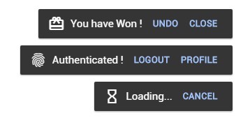
toastedjs is heir of vue-toasted it is responsive, touch compatible, easy to use, attractive and feature rich with icons, actions etc...
Interactive demo
demo here
Installation
| Source | Info |
|---|---|
| npm | npm install toastedjs --save |
| yarn | yarn add toastedjs |
| unpkg (js) | https://unpkg.com/toastedjs/dist/toasted.min.js |
| unpkg (css) | https://unpkg.com/toastedjs/dist/toasted.min.css |
| jsdelivr | https://jsdelivr.com/package/npm/toastedjs |
Basic Usage
ES6
import Toasted from 'toastedjs'

import 'toastedjs/dist/toastedjs.min.css'
//import 'toastedjs/src/sass/toast.scss'

let toasted = new Toasted({ /* your options.. */ })
toasted.show('yo, toasted here !!')
Direct
<!-- pull the css -->
<link rel="stylesheet" href="https://unpkg.com/toastedjs/dist/toasted.min.css">

<!-- pull the js file -->
<script src="https://unpkg.com/toastedjs/dist/toasted.min.js"></script>

<script>
    var toasted = new Toasted({ /* your options.. */ })
    toasted.show('yo, toasted is directly here !!')
</script>
Guide
Actions
Actions are used to make the toasts interactive (save, undo, cancel, close), you can have one or more options on a single toast.
// you can pass multiple actions as an array of actions
action : {
     text : 'Save',
     onClick : (e, toasted) => {
        toasted.delete()
     }
}Icons
Material Icons supported. you will have to import the icon packs into your project.
{
    // pass the icon name as string
    icon : 'check'

    // or you can pass an object
    icon : {
        name : 'watch',
        after : true // this will append the icon to the end of content
    }
}Api
Options
below are the options you can pass to create a toast or you can set these options globally.
// you can pass options either
let toasted = new Toasted({
    position : 'top-center',
    theme : 'alive',
    onComplete : () => {
        console.log('i am done !')
    }
})| Option | Type's | Default | Description |
|---|---|---|---|
| position | String | 'top-right' | Position of the toast container ['top-right', 'top-center', 'top-left', 'bottom-right', 'bottom-center', 'bottom-left'] |
| duration | Number | null | Display time of the toast in millisecond |
| action | Object, Array | null | |
| fullWidth | Boolean | FALSE | Enable Full Width |
| fitToScreen | Boolean | FALSE | Fits to Screen on Full Width |
| className | String, Array | null | Custom css class name of the toast |
| containerClass | String, Array | null | Custom css classes for toast container |
| Icon | String, Object | null | |
| type | String | 'default' | Type of the Toast ['success', 'info', 'error'] |
| theme | String | 'primary' | Theme of the toast you prefer ['primary', 'outline', 'bubble'] |
| onComplete | Function | null | Trigger when toast is completed |
Actions
| Parameters | Type's | Default | Description |
|---|---|---|---|
| text* | String | - | name of action |
| href | String | null |
url of action |
| icon | String | null |
name of material for action |
| class | String/Array | null |
custom css class for the action |
| onClick | Function(e,toastObject) | null |
onClick Function of action |
Icons
| Parameters | Type's | Default | Description |
|---|---|---|---|
| name* | String | - | name of the icon |
| color | String | null |
color of the icon |
| after | Boolean | null |
append the icon to end of the toast |
Methods
Methods available under ToastedJS
// you can pass string or html to message
let toasted = new Toasted({ /* global options */ })
toasted.show( 'my message', { /* some new option */ })| Method | Parameter's | Description |
|---|---|---|
| show | message*, options | Show a toast |
| success | message*, options | Show a toast success style |
| info | message*, options | Show a toast info style |
| error | message*, options | Show a toast error style |
| register | name, message[string,function(payload)]* , options | Register your own toast with options explained here |
| group | options | Create a new group of toasts (new toast container with its options) |
| clear | - | Clear all toasts |
Toast Instance (Single toast instance)
Each Toast Returns a Toast Instance where you can manipulate the toast.
let toasted = new Toasted()

let myToast = toasted.show("Holla !!")
myToast.text("Changing the text !!!").delete(1500)

let anotherToast = toasted.error("Oopss.. my bad !")
anotherToast.text("Oopss.. it's okey..")| Option | Type's | Description |
|---|---|---|
| options | Object | Options of the toast instance |
| toast | HTMLElement | Html Element of the toast |
| text | Function(message) | Change text of the toast |
| delete | Function(delay = 300) | Delete the toast with animation and delay |
| destroy | Function | Destroy the toast unregister from parent instance |
Browsers support
 IE / Edge IE / Edge |
 Firefox Firefox |
 Chrome Chrome |
 Safari Safari |
 Opera Opera |
 iOS Safari iOS Safari |
 Chrome for Android Chrome for Android |
|---|---|---|---|---|---|---|
| IE10, IE11, Edge | last 7 versions | last 7 versions | last 7 versions | last 7 versions | last 3 versions | last 3 versions |
Please Open and issue If You have Found any Issues.
Mobile Responsiveness
On Mobile Toasts will be on full width. according to the position the toast will either be on top or bottom.
Credits
- Inspired and developed from materialize-css toast.
- Uses hammerjs for touch events
- Uses lightweight and fast animejs for animations.
- Whoever contributes to this project
😉
Enjoy Toasting !!


