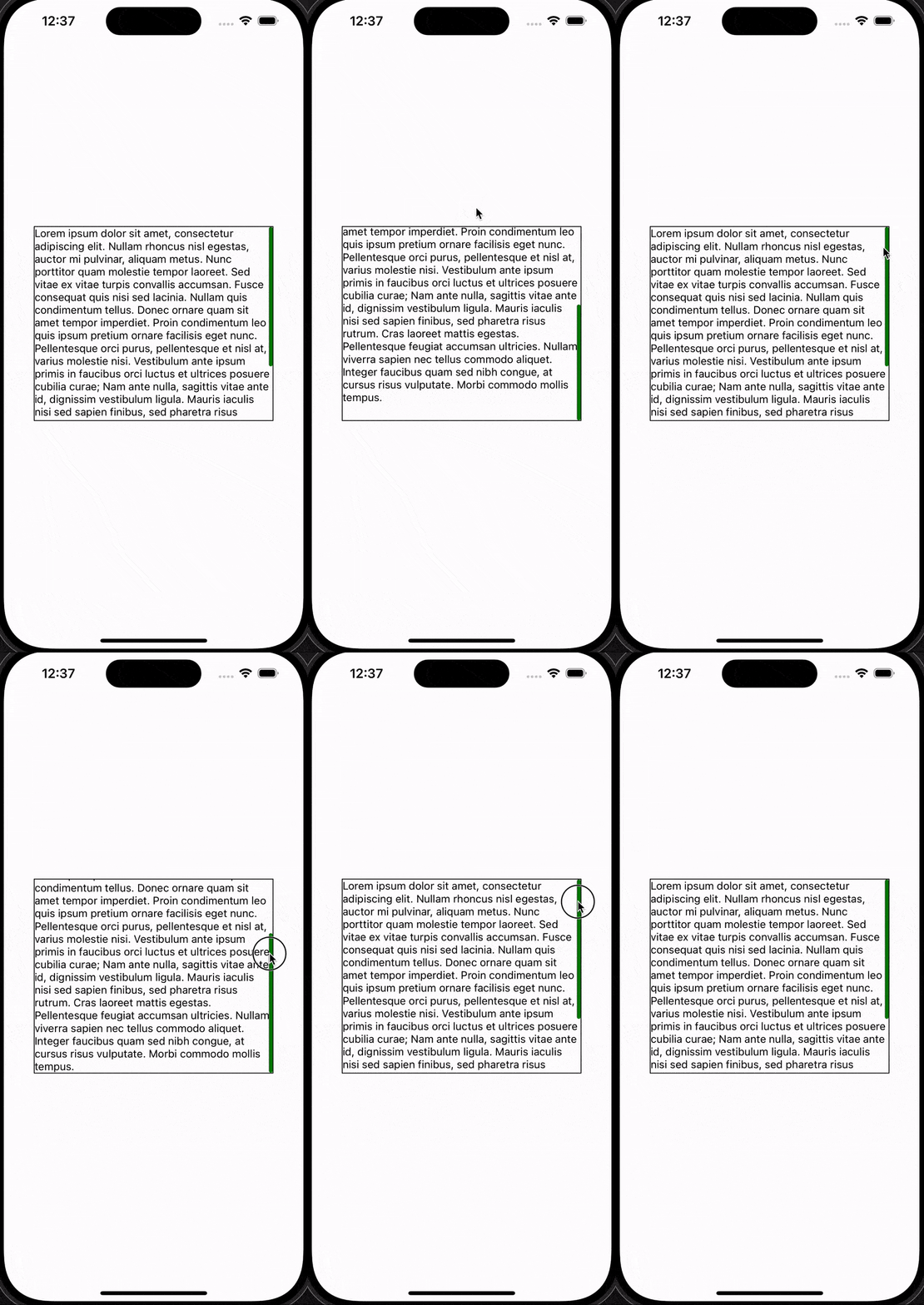
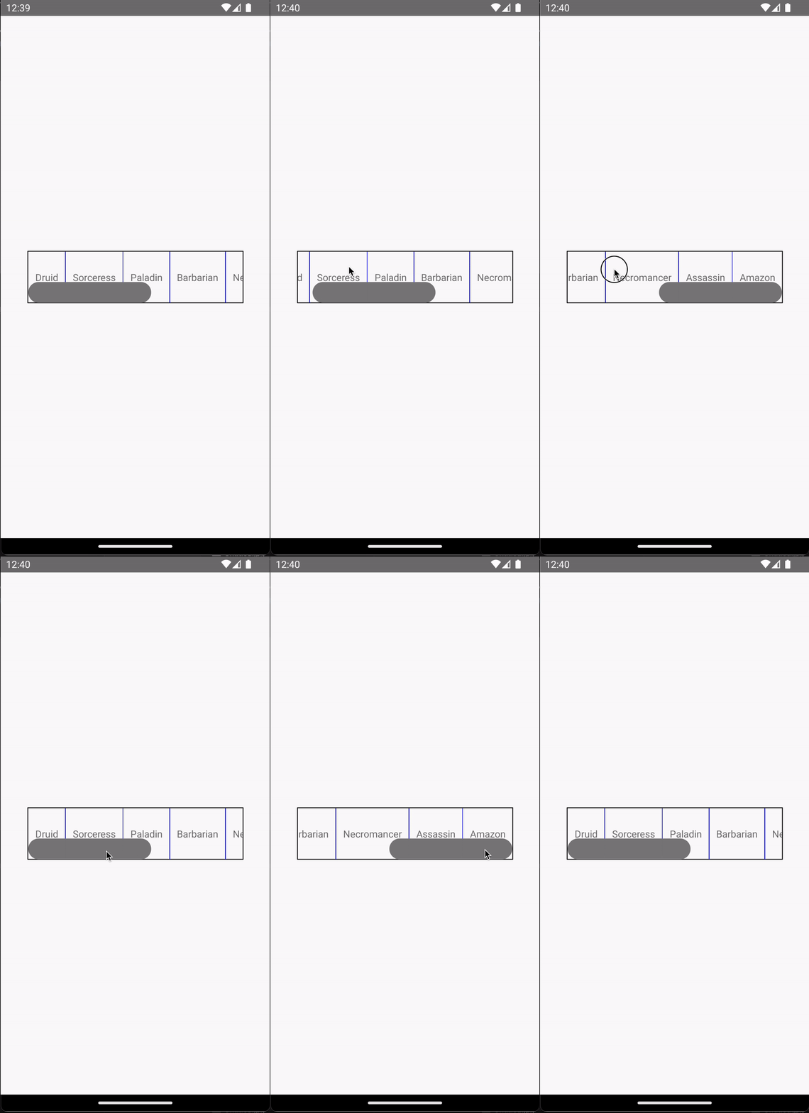
A react-native component that offers a customizable scroll indicator for ScrollView and FlatList
The idea of animating a scroll indicator in response to the scrolling on a scrollable component is borrowed from Lord Pooria's SO answer.
If you search for react native scroll indicator on npm, there are more than 10 packages already there. Compared to those, this package has the following advantages:
- Supports:
- Both
ScrollViewandFlatList - Both vertical and horizontal scrolling
- Indicator shrinking in iOS when user scrolls beyond the edge
-
inverted={true}inFlatList - Indicator customization just like a regular
View(e.g. color, width, position, etc.) - Draggable indicator (added in v0.3.0)
- Both
- Detailed documentation with comprehensive examples
- The animation logic of the indicator is well documented in the source code.
npm install @fanchenbao/react-native-scroll-indicatorimport * as React from 'react';
import {View, Text} from 'react-native';
import {ScrollViewIndicator} from '@fanchenbao/react-native-scroll-indicator';
const App = () => {
return (
<View
style={{
flex: 1,
justifyContent: 'center',
alignItems: 'center',
}}
>
<View style={{height: '30%', width: '80%'}}>
<ScrollViewIndicator
indStyle={{backgroundColor: 'green'}}
containerStyle={{
borderWidth: 1,
borderColor: 'black',
}}
>
<View>
<Text>
Lorem ipsum dolor sit amet, consectetur adipiscing elit. Nullam
rhoncus nisl egestas, auctor mi pulvinar, aliquam metus. Nunc
porttitor quam molestie tempor laoreet. Sed vitae ex vitae turpis
convallis accumsan. Fusce consequat quis nisi sed lacinia. Nullam
quis condimentum tellus. Donec ornare quam sit amet tempor
imperdiet. Proin condimentum leo quis ipsum pretium ornare
facilisis eget nunc. Pellentesque orci purus, pellentesque et nisl
at, varius molestie nisi. Vestibulum ante ipsum primis in faucibus
orci luctus et ultrices posuere cubilia curae; Nam ante nulla,
sagittis vitae ante id, dignissim vestibulum ligula. Mauris
iaculis nisi sed sapien finibus, sed pharetra risus rutrum. Cras
laoreet mattis egestas. Pellentesque feugiat accumsan ultricies.
Nullam viverra sapien nec tellus commodo aliquet. Integer faucibus
quam sed nibh congue, at cursus risus vulputate. Morbi commodo
mollis tempus.
</Text>
</View>
</ScrollViewIndicator>
</View>
</View>
);
};
export default App;import * as React from 'react';
import {View, Text} from 'react-native';
import {FlatListIndicator} from '@fanchenbao/react-native-scroll-indicator';
const App = () => {
return (
<View
style={{
flex: 1,
justifyContent: 'center',
alignItems: 'center',
}}
>
<View
style={{
height: '10%',
width: '80%',
}}
>
<FlatListIndicator
flatListProps={{
ItemSeparatorComponent: () => (
<View style={{width: 1, backgroundColor: 'blue'}} />
),
data: [
'Druid',
'Sorceress',
'Paladin',
'Barbarian',
'Necromancer',
'Assassin',
'Amazon',
],
renderItem: ({item}) => (
<View style={{justifyContent: 'center', padding: 10}}>
<Text>{item}</Text>
</View>
),
}}
horizontal={true}
position="bottom"
indStyle={{width: 30}}
containerStyle={{borderWidth: 1, borderColor: 'black'}}
/>
</View>
</View>
);
};
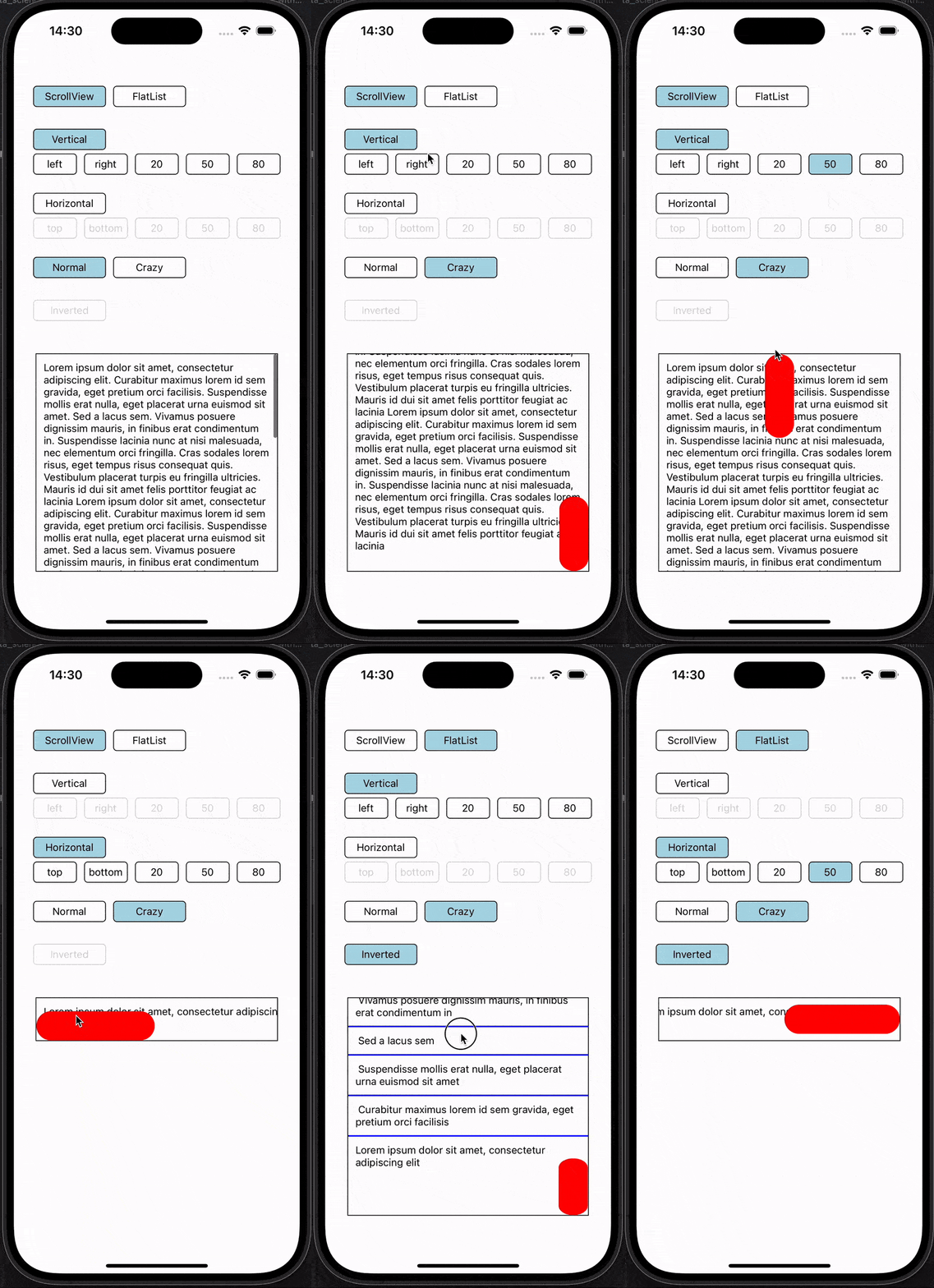
export default App;The comprehensive example takes advantage of the scroll indicator's customizability. A brief summary of the corresponding props for each option is given below. For details, refer to the Props table.
- Horizontal:
horizontal={true} - Vertical:
horizontal={false} - left:
position="left" - right:
position="right" - top:
position="top" - bottom:
position="bottom" - 20:
position={20} - 50:
position={50} - 80:
position={80} - Normal:
indStyle={backgroundColor: 'grey', width: 5} - Crazy:
indStyle={backgroundColor: 'red', width: 40}
Download this repo
git clone https://github.com/FanchenBao/react-native-scroll-indicator.gitGo to the example folder and sets up the example app
npm installWhile inside the example folder, run the app for iOS
npm run iosor Android
npm run androidThe example app is running from ./example/App.tsx
| Props | Type | Default | Note |
|---|---|---|---|
| horizontal | boolean | false |
If false, vertical scrolling. If true, horizontal scrolling. |
| position | string | number | '' |
Desired position of the indicator. One can supply "left" or "right" for vertical scrolling, in which case the indicator will be placed at the left or right edge of the view. The same goes for "top" or "bottom" for horizontal scrolling. In addition, one can supply a number, which indicates where in the view the indicator's center line (along the scrolling direction) will be located. For example, position={20} horizontal={false} would place the center line of the indicator at 20% of the view's width from its left edge. position={80} horizontal={true} would place the center line of the indicator at 80% of the view's height from its top edge. If the indicator's girth is too big such that if its center line is placed at the desired location, the indicator would overflow outside the edge, the position will be automatically clamped to ensure no overflow takes place. This is demonstrated in the comprehensive example when the "Crazy" option is selected. If supplied an empty string, the position is automatically assigned to "right" if vertical scrolling, or "bottom" if horizontal scrolling. |
| persistentScrollbar | boolean | false |
If false, scroll indicator does not show if the content can fit the view. If true, scroll indicator shows under all circumstances. |
| indStyle | ViewStyle | {backgroundColor: 'grey', width: 5} |
Styling of the scroll indicator. The scroll indicator is just an Animated.View. Thus, any props that modifies a View can potentially modify the appearance of the scroll indicator. Note that width refers to the girth of the indicator, which is width in vertical scrolling but height in horizontal scrolling. borderRadius value will be derived from the width prop to make it round (i.e., half the value of width) if not overridden. Please do not assign the following props, as they will be overwritten and won't have any effect: position, height, transform. |
| scrollViewProps | ScrollViewProps | {} |
ScrollViewIndicator only. Props to pass to the underlying ScrollView.Please do not pass the following props, as they will be overwritten and won't have any effect: horizontal, showsVerticalScrollIndicator, showsHorizontalScrollIndicator, onContentSizeChange, scrollEventThrottle.Note that onScroll and onLayout are allowed (updated in v0.4.0). |
| flatListProps | ScrollViewProps & FlatListProps | required |
FlatListIndicator only. Props to pass to the underlying FlatList. This is a required prop, as one must supply data and renderItem to FlatList. Please do not pass the following props, as they will be overwritten and won't have any effect: horizontal, showsVerticalScrollIndicator, showsHorizontalScrollIndicator, onContentSizeChange, scrollEventThrottle.Note that onScroll and onLayout are allowed (updated in v0.4.0). |
| containerStyle | ViewStyle | {} |
Styling of the parent container that holds both the scroll indicator and the scrollable component (updated in v0.4.0). |
The package is designed to be a substitute of ScrollView and FlatList under the most basic usage. Thus, despite allowing any props from ScrollView and FlatList to be passed to ScrollViewIndicator and FlatListIndicator, the package has NOT been fully tested on the combination of all the props. It is very likely that some prop combinations would break the custom scroll indicator. If that happens, please raise an issue or suggest a feature request on GitHub.
See the contributing guide to learn how to contribute to the repository and the development workflow.
MIT
Made with create-react-native-library


