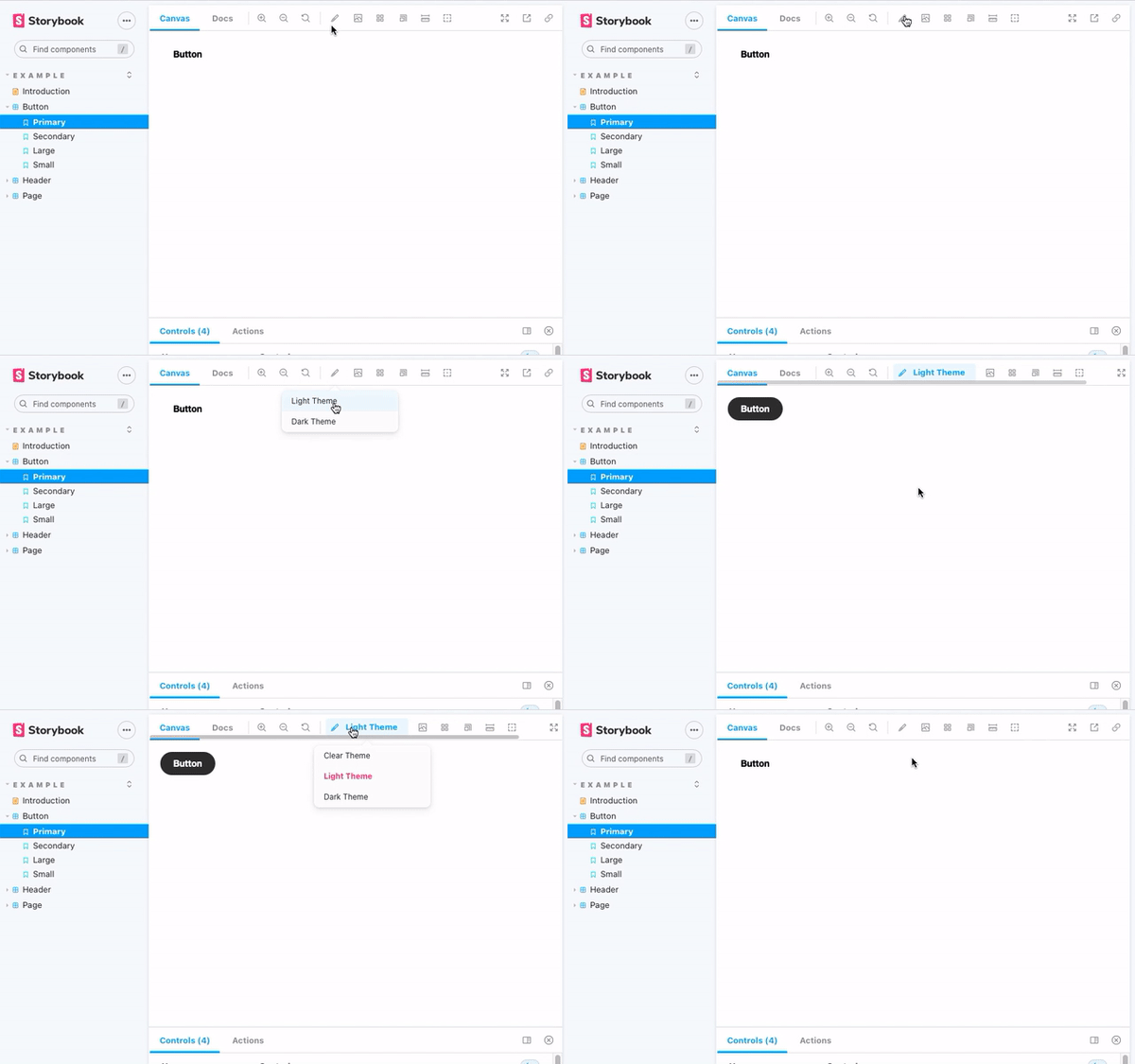
Storybook CSS Variables Theme can be used to switch out CSS files in Storybook.
npm install @etchteam/storybook-addon-css-variables-theme --save-devCreate a file called main.js in your .storybook folder.
Add the following code to it:
module.exports = {
  addons: ['@etchteam/storybook-addon-css-variables-theme'],
};Create a file called preview.js in your .storybook folder.
In this file you will need to import your style files using a loader. Here's an example of how to do this:
import light from '!!style-loader?injectType=lazyStyleTag!css-loader!../src/styles/light.css'
import dark from '!!style-loader?injectType=lazyStyleTag!css-loader!../src/styles/dark.css'
This code calls style-loader with ?injectType=lazyStyleTag so that it doesn't run the CSS immediately.
You can swap out css-loader for your preferred SCSS/Less/etc loaders.
Any loaders used here will need to be installed in your project: npm i -D style-loader css-loader
In the same preview.js file import the decorator from the CSS Variables Theme addon
import cssVariablesTheme from '@etchteam/storybook-addon-css-variables-theme'

export const decorators = [
  cssVariablesTheme,
];
Then pass the CSS files to the addon via the exported parameters.
export const parameters = {
  cssVariables: {
    files: {
      'Light Theme': light,
      'Dark Theme': dark,
    }
  }
}
If a default theme should be selected from first load add 'defaultTheme' to the options.
export const parameters = {
  cssVariables: {
    files: {
      'Light Theme': light,
      'Dark Theme': dark,
    },
    defaultTheme: 'Light Theme'
  }
}Pass the theme key as the theme parameter on the story to default to a specific theme:
export default {
  title: 'Example/Header',
  component: Header,
  parameters: {
    cssVariables: {
      theme: 'dark'
    }
  }
};You can access the currently set theme from the context object provided by storybook as the second parameter.
const Template: ComponentStory<typeof Button> = (args, context) => (
  <Button {...args}>{context.themeId}</Button>
);
Alternatively watch the custom storybookcssvariables:theme:change event on the document.
document.addEventListener(
  'storybookcssvariables:theme:change',
  (event: CustomEvent) => {
    console.info(`The theme changed to ${event?.detail?.theme}`);
  },
);Themes are stored in storybook globals.
Pass the theme to the url as a query by adding &globals=cssVariables:mytheme to the url.
If multi word theme query is &globals=cssVariables:my+theme
This addon applies styles through a decorator.
So, within MDX files, styles will only apply to a <Story> or <Canvas>.
Made with ☕ at Etch

