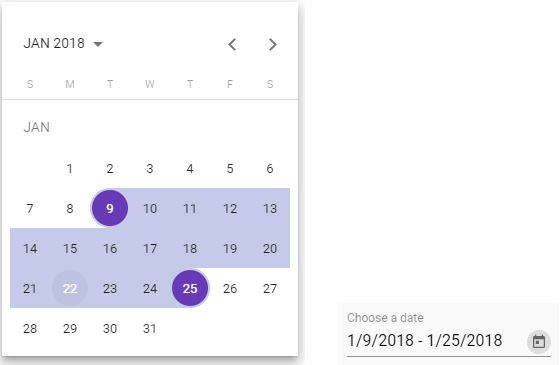
Material range datepicker
Material datepicker with range support
What is this?
This is patched version of Material Datepicker for Angular with range selection support.
I created this repository and this package due to it takes a lot of time to contribute to material2 repository.
Issue in material2 repo.

DEMO with extra features examples
Advantages
- You can change order of views: month, year and multi-year
- You can keep calendar to be opened after selecting a date (in singular range mode) or a range of dates (in range mode)
- You can use all original material attributes: min, max, formControl and others
Changelog
7.4.0
Inline usage of calendar. See demo. Thanks to @beyondsanity for this feature
7.3.0
Introducing footer component for calendar. See demo for example usage. Thanks @paullryan for this feature
7.2.1
Update to datepicker material 7.3.1
7.2.0
Select first date on close feature
7.1.0
Range selection have a preview now.
6.1.0
Merged #31
- Add option to sort views when clicking on period label button (month -> year or year -> month)
- Add option to enable closing datepicker after date selection #30
It's awesome, but how to use it?
As easy as pie.
Installation: yarn add saturn-datepicker or npm install saturn-datepicker
Import SatDatepickerModule, SatNativeDateModule and MatDatepickerModule
  <mat-form-field>
    <input matInput
        placeholder="Choose a date"
        [satDatepicker]="picker"
        [value]="date">
    <sat-datepicker #picker [rangeMode]="true"></sat-datepicker>
    <sat-datepicker-toggle matSuffix [for]="picker"></sat-datepicker-toggle>
  </mat-form-field>
Add styles:
- If you are using CSS: copy-paste or include somehow the file
saturn-datepicker/bundle.css - If you are using SCSS (preferable):
@import '~saturn-datepicker/theming';
@include sat-datepicker-theme($theme); # material theme data structure https://material.angular.io/guide/theming#defining-a-custom-theme
ngModel/formControl value have this interface:
export interface SatDatepickerRangeValue<D> {
  begin: D | null;
  end: D | null;
}
FAQ
How to change date format or locale?
As same as for material, but with more code, just import constants from 'saturn-datepicker'.
Also you need to install @angular/material-moment-adapter package.
import { DateAdapter, MAT_DATE_FORMATS, MAT_DATE_LOCALE, SatDatepickerModule } from 'saturn-datepicker'
import { MAT_MOMENT_DATE_FORMATS, MomentDateAdapter } from '@angular/material-moment-adapter'


@NgModule({
    imports: [
        SatDatepickerModule,
    ],
    providers: [
        MyReportsService,
        {provide: DateAdapter, useClass: MomentDateAdapter, deps: [MAT_DATE_LOCALE]},
        {provide: MAT_DATE_FORMATS, useValue: MAT_MOMENT_DATE_FORMATS},
    ],
})
export class MyModule {
}

For advanced formatting, please look through material documentation.

Also you can see [#78](https://github.com/SaturnTeam/saturn-datepicker/issues/78) [#81](https://github.com/SaturnTeam/saturn-datepicker/issues/81) [#53](https://github.com/SaturnTeam/saturn-datepicker/issues/53)
How to add option to sort views when clicking on period label button ?
orderPeriodLabel option sort the label period views.
- Default [multi-year]: multi-year then back to month
- Month [month]: month > year > multi-year
  <mat-form-field>
    <input matInput [satDatepicker]="resultPicker">
    <sat-datepicker
        #resultPicker
        [rangeMode]="true"
        orderPeriodLabel="month">
    </sat-datepicker>
   </mat-form-field>
How disable closing datepicker after date selection ?
closeAfterSelection option enables or disables datepicker closing after date selections. By default the option is true
  <mat-form-field>
    <input matInput [satDatepicker]="resultPicker">
    <sat-datepicker
        #resultPicker
        [rangeMode]="true"
        [closeAfterSelection]="false">
    </sat-datepicker>
   </mat-form-field>
In range mode, how to select the first date selected if the user closes the picker without selecting another ?
selectFirstDateOnClose option enables or disables the selection of the first date when closing the datepicker before selecting another date.
By default the option is false
  <mat-form-field>
    <input matInput [satDatepicker]="resultPicker">
    <sat-datepicker
        #resultPicker
        [rangeMode]="true"
        [selectFirstDateOnClose]="true">
    </sat-datepicker>
   </mat-form-field>
Licence: MIT
