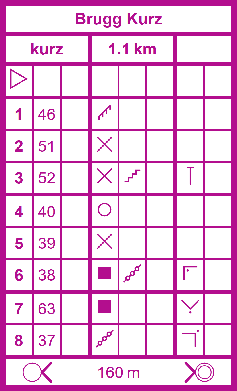
Control Description Sheet
A web component that allows you to easily create control description sheets for orienteering courses. Uses vector graphics. Check out this demo for an overview of the functionality.
Installation
Either install the package using npm
npm i @city-ol/control-description-sheet
or include the script:
<script
  type="module"
  src="https://unpkg.com/@city-ol/control-description-sheet/control-description-sheet.js"
></script>
Usage
This web component is made up of two distinct elements
-
The
<control-description-sheet>element, which acts as the parent element and is given the information shown in the header and footer of the sheet as its attributes, i.e. the title (title), course name / number (course), total distance (distance), total elevation gain (elevation) and the distance to the final control (finalDistance). -
Each control then corresponds to a
<control-description>element. The control code must be passed as an attribute (code) and the control number is computed automatically. The subsequent columns can be filled with addtional information by specifying the attributeswhich,feature,appearance,dimensions,locationandother. Valid values for these attributes are the keys of theSYMBOLSobject inside thecontrol-description-sheet.jsfile. These symbols were taken from the OpenOrienteering Mapper software. The row of a control can be highlighted by setting ahighlightedattribute.
The control sheet from the example from above can thus be created as follows:
<control-description-sheet
title="Brugg Kurz"
course="kurz"
distance="1.1 km"
finalDistance="160 m"
>
<control-description></control-description>
<control-description code="46" feature="fence"></control-description>
<control-description code="51" feature="crossing"></control-description>
<control-description
code="52"
feature="crossing"
location="north_end"
appearance="stairway"
></control-description>
<control-description code="40" feature="special_item_o"></control-description>
<control-description code="39" feature="crossing"></control-description>
<control-description
code="38"
appearance="linear_thicket"
location="north_west_corner_inside"
feature="building"
></control-description>
<control-description
code="63"
location="south_corner_outside"
feature="building"
></control-description>
<control-description
code="37"
location="north_east_corner_outside"
feature="linear_thicket"
></control-description>
</control-description-sheet>Styling
The web component uses a shadow dom and should thus not be affected by the CSS on your website. Some basic styling can be made on the <control-description-sheet> element, which also affects the <control-description> elements. The supported CSS variables are --primary (sets the color of the text, icons and borders), --secondary (sets the highlighting color), --width (total width of the sheet) and --border-radius (only outermost border). Check out the demo to see how this looks like.
control-description-sheet {
  --primary: black;
  --width: 120px;
  --border-radius: 5px;
}
Credits
The icons for the description of individual controls are taken from the OpenOrienteering Mapper software, which is licensed under the GNU General Public License v3.0. No visual changes have been made, but the icons are stored in a modified format.
Contributing
To create the custom-elements.json file, run the following command:
npx web-component-analyzer analyze control-description-sheet.js --outFile custom-elements.json
License
This project is licensed under the GNU General Public License.


