
ngx-theme
🔗 Stackblitz demo
Table of content
Purpose
This purpose of this lib is to manage dynamic themes accross Angular apps.
Requirements
- Angular 12 or higher
Supported UI frameworks
- ✅ Tailwind
- ✅ Angular Material > 12.0.0
Principle
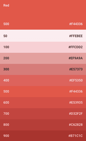
This library generates a palette with darker / lighter variants for each provided color based on the Material Design color system
Example of a palette format:
const primaryPalette: Palette = {
    50: '#FFEBEE',
    100: '#FFCDD2',
    200: '#EF9A9A',
    300: '#E57373',
    400: '#EF5350',
    500: '#F44336',
    600: '#E53935',
    700: '#D32F2F',
    800: '#C62828',
    900: '#B71C1C',
    contrast: {
        50: '#000000',
        100: '#000000',
        200: '#000000',
        300: '#000000',
        400: '#ffffff',
        500: '#ffffff',
        600: '#ffffff',
        700: '#ffffff',
        800: '#ffffff',
        900: '#ffffff',
    },
}; |
|
All these color shades are then inserted in the document as CSS variables and then used by Material and/or Tailwind to define their own theming which will be used by frontends (thanks to the presets).
Installation
yarn add @brumeilde/ngx-themeUse
With NgxThemeModule :
forRoot config
type Palettes = { myPaletteName: string };
type Colors = { myColorName: string };

const colorConfig: IColorConfig<Palettes, Colors> = {
    palettes: {
        myPaletteName: '#5876d9',
        paletteWithContrast: {
            baseColor: '#7FB5B5',
            constrast: { dark: '#000000', light: '#ffffff' },
        },
    },
    simpleColors: { myColorName: '#2e959a' },
};

@NgModule({
    // ...
    imports: [
        NgxThemeModule.forRoot(colorConfig, {
            frameworks: ['tailwind'], // optional, default : ['tailwind', 'material']
        }),
    ],
    // ...
})
export class AppModule {}
Injection tokens
type Palettes = { myPaletteName: string; paletteWithConstrast: IDetailedColorInput; };
type Colors = { myColorName: string };

const colorConfig: IColorConfig<Palettes, Colors> = {
    palettes: {
        myPaletteName: '#5876d9',
        paletteWithContrast: {
            baseColor: '#7FB5B5',
            constrast: { dark: '#000000', light: '#ffffff' },
        },
    },
    simpleColors: { myColorName: '#2e959a' },
};

@NgModule({
    // ...
    imports: [NgxThemeModule],
    providers: [
        { provide: COLOR_CONFIG, useValue: colorConfig },
        { provide: THEME_OPTIONS, useValue: { frameworks: ['tailwind'] } }, // optional, default : ['tailwind', 'material']
    ],
    // ...
})
export class AppModule {}
ℹ️
NgxThemeModulewill generate color palettes on app initialization so the theme is created before app inits.
With NgxThemeService :
type Palettes = { myPaletteName: string };
type Colors = { myColorName: string };

export class AppComponent {
    constructor(
        private themeService: NgxThemeService<IColorConfig<Palettes, Colors>>) {}

    setAppColors(): void {
        this.themeService.updateColors({ palettes: { myPaletteName: '#5876d9' }});
    }

    get textColor(): string {
        return this.themeService.theme.getColorShade(300, 'myPaletteName');
    }
}
Add tailwind preset
// tailwind.config.js
const tailwindPreset = require('@brumeilde/ngx-theme/tailwind-preset');

const ngxThemePreset = tailwindPreset({
    palettes: ['myPaletteName', 'paletteWithContrast'],
    simpleColors: ['myColorName'],
});

module.exports = {
    // ...
    presets: [ngxThemePreset],
};
You can then use tailwind class with your color names:
<div class="bg-myColorName">
    <p class="text-myPaletteName-400/75">Theme</p>
</div>
<div class="bg-paletteWithContrast-600">
    <p class="text-paletteWithContrast-600-contrast">Constrast test</p>
</div>
Add material theme
// angular.json
   "stylePreprocessorOptions": {
        "includePaths": ["node_modules/@brumeilde/ngx-theme/presets/material"]
    },
/* styles.scss */
@use '@angular/material' as mat;
@use 'generate-material-palette' as palette;
$primary-palette: palette.createpalette('myPaletteName');
$accent-palette: palette.createpalette('myOtherPaletteName');
$warn-palette: palette.createpalette('myThirdPaletteName');
$material-primary-palette: mat.define-palette($primary-palette);
$material-accent-palette: mat.define-palette($accent-palette);
$material-warn-palette: mat.define-palette($warn-palette);
$my-theme: mat.define-light-theme(
(
color: (
primary: $material-primary-palette,
accent: $material-accent-palette,
warn: $material-warn-palette
)
)
);
@include mat.core();
@include mat.all-component-themes($my-theme);CSS
You can also directly use the generated css variables:
.my-text {
    background-color: var(--color-paletteWithContrast-700);
    color: var(--color-paletteWithContrast-700-contrast);
}
Incoming features
Whenever I get time 🙃
- Material full scss palette generator
- Rgb colors
- Dark theme palettes