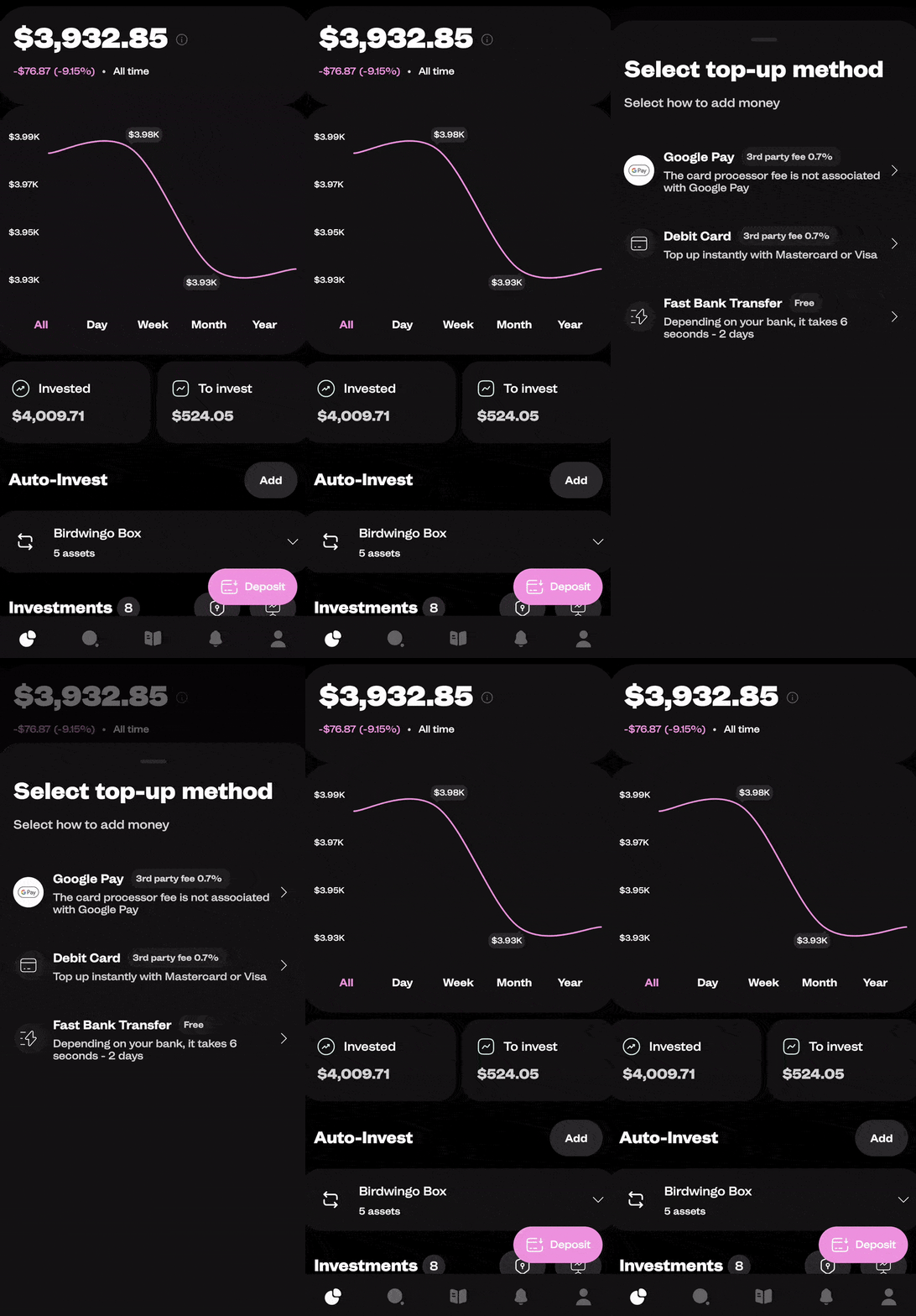
🕶️ Swipe-to-Close Functionality: Easily close modals with a single swipe gesture, providing an intuitive user experience.
🎨 Customizable Appearance: Adjust the color, size, animation, and more to make it blend seamlessly with your application's design.
💃 Smooth Animations: Enjoy smooth and pleasing animations that offer a polished look and feel.
📱 Responsive Design: Adapts to various screen sizes and orientations, ensuring a consistent appearance across devices.
⚙️ Easy Integration: With minimal code, you can have Swipe Modal up and running in your application.
♿ Accessibility Support: Designed with accessibility in mind, allowing all users to interact with the modal effortlessly.
🌍 Cross-Platform Support: Works seamlessly on both iOS and Android, providing a unified experience.
react-native-swipe-modal is a customizable and animated modal component that can be used in React Native applications. It provides a smooth swipe-to-close functionality along with various configuration options to suit different use cases. It is used in the Birdwingo mobile app to show different kinds of popups and explanations.
npm install react-native-reanimated
npm install react-native-gesture-handler
npm install @birdwingo/react-native-swipe-modalTo use the SwipeModal component, you need to import it in your React Native application and include it in your JSX code. Here's an example of how to use it:
import React, { useRef } from 'react';
import { View, Text } from 'react-native';
import SwipeModal, { SwipeModalPublicMethods } from '@birdwingo/react-native-swipe-modal';


const YourComponent = () => {

  const modalRef = useRef<SwipeModalPublicMethods>(null);

  const showModal = () => modalRef.current?.show(); // Call this function to show modal
  const hideModal = () => modalRef.current?.hide(); // Call this function to hide modal

  return (
    <SwipeModal ref={modalRef}>
      <View>
        <Text>Swipe Modal</Text>
      </View>
    </SwipeModal>
  );

};

export default YourComponent;| Name | Type | Default value | Description |
|---|---|---|---|
children |
ReactNode|ReactNode[] | required | The content to be rendered inside the modal. |
bg |
string | 'black' | The background color of the modal. |
showBar |
boolean | true | Set to true to display a bar at the top of the modal. |
barColor |
string | 'grey' | The color of the bar at the top of the modal. |
barContainerStyle |
ViewStyle|ViewStyle[] | Additional styles applied to bar container view. | |
maxHeight |
'max'|'auto'|number | 'max' | The maximum height of the modal. If 'auto' maxHeight of modal will the height modal children need. |
defaultHeight |
number | maxHeight |
The default height of the modal. |
fixedHeight |
boolean | false | Set to true if you want to maintain a fixed height for the modal. It means that the height of the modal will get back to the initial position after swipe, if modal was not closed . |
style |
ViewStyle|ViewStyle[] | Additional styles to be applied to the modal. | |
closeTrigger |
'swipeDown'|'minHeight' | 'swipeDown' | The trigger to close the modal. 'swipeDown' means that modal will close when modal was swiped down by closeTriggerValue. 'minHeight' means that modal will close when height of modal is less than closeTriggerValue. |
closeTriggerValue |
number | 10 | The value that triggers the modal to close when using the closeTrigger. |
scrollEnabled |
boolean | false | Set to true if you want the modal content to be scrollable. |
scrollContainerStyle |
ViewStyle|ViewStyle[] | Additional styles to be applied to the scrollable container. | |
scrollContainerProps |
ScrollView['props'] | Additional props to be passed to the internal ScrollView component. | |
headerComponent |
ReactNode | A custom component to be displayed at the top of the modal. It's placed above scroll content | |
footerComponent |
ReactNode | A custom component to be displayed at the bottom of the modal. It's placed under scroll content | |
disableSwipe |
boolean | false | Set to true if you don't want allow gesture. |
visible |
boolean | false | Default value for modal visibility. It can be changed dynamically using public methods. |
onShow |
() => void | A callback function that will be triggered when the modal is shown. | |
onHide |
() => void | A callback function that will be triggered when the modal is hidden. | |
closeOnEmptySpace |
boolean | true | Set to true to close the modal when the user taps outside the modal's content. |
closeOnPressBack |
boolean | true | Set to true to close the modal when the user presses the back button (Android only). |
animationDuration |
number | 300 | The duration of the modal's opening and closing animations, in milliseconds. |
closeSpaceVisibility |
number (0 - 1) | 0.6 | A number representing the opacity of empty space, that will close the modal if closeOnEmptySpace is enabled. |
topOffset |
number | 0 | Determines the amount of space that the swipeable content will be offset from the top edge of window. |
containerProps |
ViewProps | Additional props to be applied to the container. | |
hideKeyboardOnShow |
boolean | true | Set to true if you want to hide keyboard on show modal if was opened. |
wrapInGestureHandlerRootView |
boolean | false | Set to true if you want to wrap content in to GestureHandlerRootView (required if you want to use modal inside react-native Modal component). |
useKeyboardAvoidingView |
boolean | true | Set to false if you want to show keyboard over the modal content. |
| Name | Description |
|---|---|
show |
Call this method to show the modal. |
hide |
Call this method to hide the modal. |
react-native-swipe-modal is sponsored by Birdwingo.
Download Birdwingo mobile app to see react-native-swipe-modal in action!


