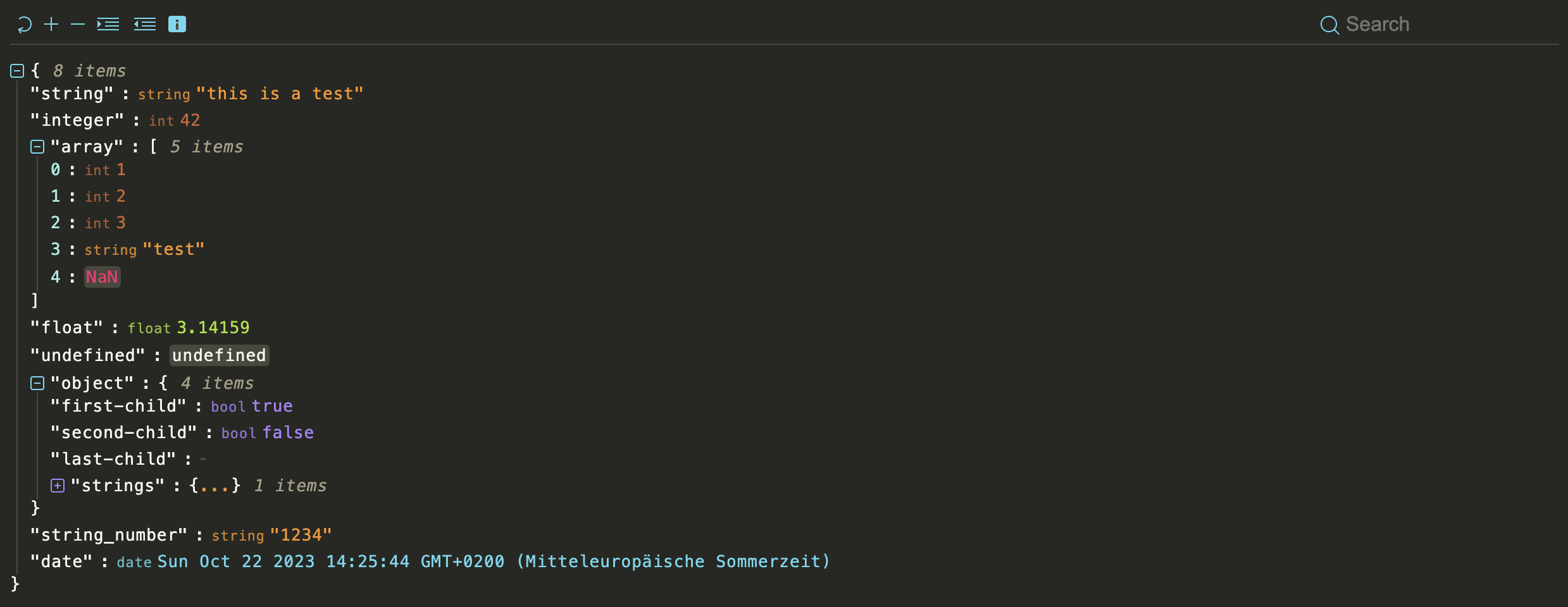
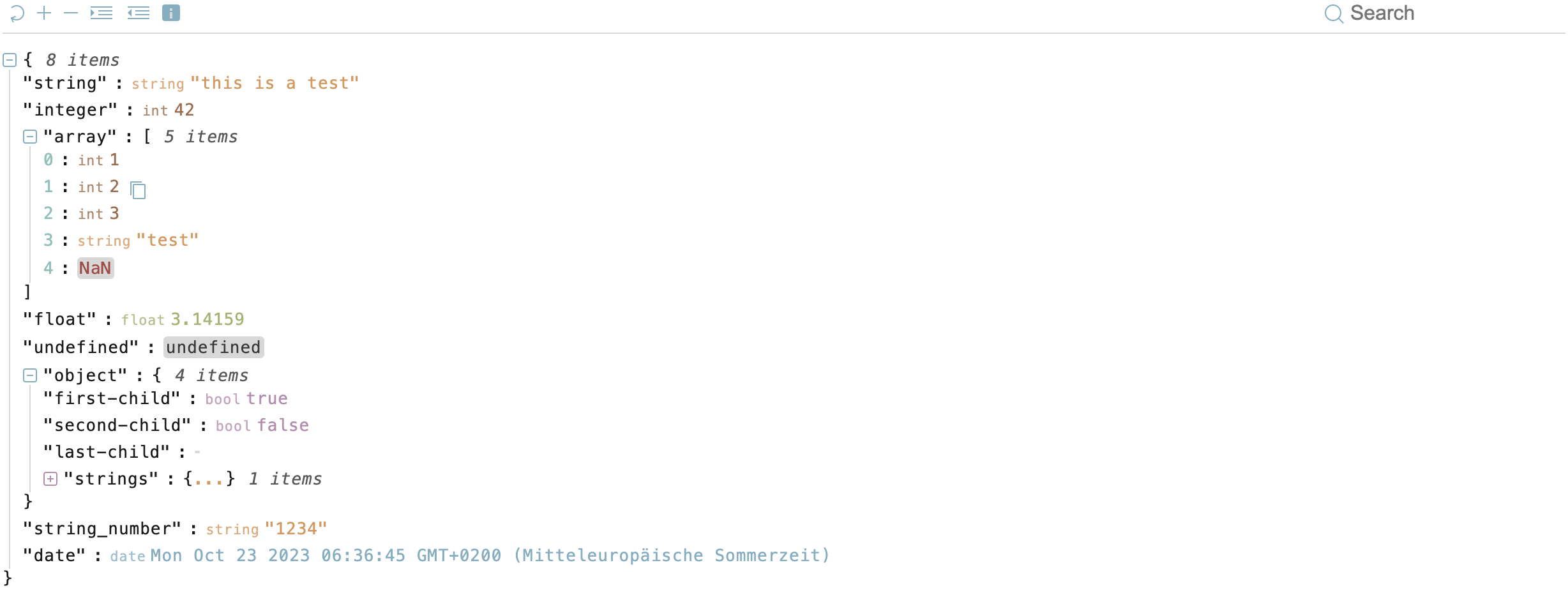
json-viewer is a modern JavaScript-based JSON data visualization tool designed with cutting-edge web technologies, including Web Components and Shadow DOM. This versatile tool empowers you to elegantly and attractively present JSON data within your web browser. It's well-suited for use in standalone web applications and seamlessly integrates with popular frameworks like React.
The packed size of this project is approximately 32.3KB. Please note that half of this size is dedicated to the predefined themes, allowing for rich visual customization.
For a live demonstration of json-viewer, please visit our demo.
json-viewer is inspired by the functionality and user-friendliness of react-json-view. However, our mission was to make this feature-rich visualization tool accessible beyond the confines of React. We've taken the best ideas from react-json-view and implemented them in json-viewer to cater to a broader audience.
- Stylish visualization of JSON data.
- Supports usage in the browser and within React applications.
- Utilizes modern web technologies like Web Components and Shadow DOM.
- Easy integration into existing projects.
- Customizable presentation and configuration.
You can easily install the json-viewer package using npm with the following commands:
npm install @andypf/json-viewerNext, include it in your project:
import "@andypf/json-viewer"Now, you're ready to use it as a custom HTML tag within your web application:
<andypf-json-viewer data='{"test": "Hello World"}'></andypf-json-viewer>To use json-viewer in your web application, load json-viewer.js and embed your JSON object within an HTML element of your choice and initialize json-viewer as follows:
<!DOCTYPE html>
<html>
  <head>
    <script src="https://pfau-software.de/json-viewer/dist/iife/index.js"></script>
  </head>
  <body>
    <andypf-json-viewer>{"name": "Helmut"}</andypf-json-viewer>
  </body>
</html>To include the "json-viewer" element in your HTML, you can pass options as attributes:
<andypf-json-viewer
  indent="2"
  expanded="true"
  theme="default-light"
  show-data-types="true"
  show-toolbar="false"
  expand-icon-type="arrow"
  show-copy="true"
  show-size="true"
  data='{"example": "data"}'
></andypf-json-viewer>
You can also provide the data option as the content of the "json-viewer" element:
<andypf-json-viewer
  indent="2"
  expanded="true"
  theme="default-light"
  show-data-types="true"
  show-toolbar="false"
  expand-icon-type="square"
  show-copy="true"
  show-size="true"
>
  { "string": "this is a test ...", "integer": 42, "array":[ 1, 2, 3, "test",
  NaN], "float":3.14159, "string_number":"1234", "date": "Tue, Oct 17, 2023,
  08:58 AM" }
</andypf-json-viewer>
You can also provide a URL to a JSON file as the 'data':
<andypf-json-viewer
  data="https://microsoftedge.github.io/Demos/json-dummy-data/64KB.json"
  theme="monokai"
  expanded="2"
  show-toolbar="true"
></andypf-json-viewer>If you prefer JavaScript, you can set the options programmatically:
const jsonViewer = document.createElement("andypf-json-viewer")
jsonViewer.id = "json"
jsonViewer.expanded = 2
jsonViewer.indent = 2
jsonViewer.showDataTypes = true
jsonViewer.theme = "monokai"
jsonViewer.showToolbar = true
jsonViewer.showSize = true
jsonViewer.showCopy = true
jsonViewer.expandIconType = "square"
jsonViewer.data = { example: "data" }json-viewer can also be used as a React component in your React applications.
import React from "react"
import JsonViewer from "@andypf/json-viewer/dist/esm/react/JsonViewer"

// use the component in your app!
const MyComponent = () => <JsonViewer data={jsonObject} />
Or if you prefer a more customized approach:
import React from "react"
import "@andypf/json-viewer"

const JsonViewer = ({ data, ...props }) => {
  const ref = React.useRef(null)

  React.useEffect(() => {
    if (ref.current) {
      ref.current.data = data
    }
  }, [data])
  return <andypf-json-viewer ref={ref} {...props} />
}

export default JsonViewer| Option | Type | Default Value | Description |
|---|---|---|---|
indent |
Number | 2 | The number of spaces used for indentation when rendering the JSON data. |
expanded |
Number or Boolean | 2 | The initial depth to which the JSON data is expanded. You can also set it to true to fully expand the data, or false to collapse it. |
theme |
String or JSON Object | "default-light" | The theme used for styling the JSON viewer. You can provide a JSON object with custom CSS variables. There are many predefined themes |
showDataTypes (show-data-types) |
Boolean | true | Whether to display data types (e.g., "string", "number") alongside the values. |
showToolbar (show-toolbar) |
Boolean | false | Whether to display the toolbar with expand and indent options and a searchbar. |
expandIconType (expand-icon-type) |
String | "square" | The type of icons used for expanding and collapsing JSON nodes. You can choose "square", "circle" or "arrow". |
showCopy (show-copy) |
Boolean | true | Whether to show the copy button to copy the JSON data to the clipboard. |
showSize (show-size) |
Boolean | true | Whether to display the size (number of characters) of the JSON data. |
data |
Stringified JSON or URL String | (Not specified) | The JSON data to be visualized. You can provide it as a stringified JSON or a URL string. Alternatively, you can pass the data via the API as an object or as content within the tag. |
If the toolbar is enabled, users have access to the following functions:
- Reset: Restore the original view.
- Expand: Expand all levels by one (+1).
- Collapse: Collapse all levels by one (-1).
- Indent: Increase the indentation level by one (+1).
- Indent: Decrease the indentation level by one (-1).
- Search: Search for specific elements within the JSON.
The "theme" option allows you to choose from various themes:
- apathyashes
- atelier-dune-light
- atelier-dune
- atlas
- bespin
- black-metal
- brewer
- bright
- brogrammer
- brushtrees-dark
- brushtrees
- chalk
- circus
- classic-dark
- classic-light
- codeschool
- cupcake
- cupertino
- darcula
- darktooth
- default-dark
- default-light
- dracula
- eighties
- embers
- flat
- fruit-soda
- github
- google-dark
- google-light
- grayscale-dark
- grayscale-light
- greenscreen
- gruvbox-dark-hard
- gruvbox-light-hard
- harmonic-dark
- harmonic-light
- heetch-light
- heetch
- helios
- hopscotch
- horizon-dark
- ia-dark
- ia-light
- icy
- isotope
- macintosh
- marrakesh
- materia
- material-lighter
- material
- mellow-purple
- mexico-light
- mocha
- monokai
- nord
- ocean
- one-light
- onedark
- papercolor-dark
- papercolor-light
- paraiso
- pico
- pop
- railscasts
- seti
- solarized-dark
- solarized-light
- spacemacs
- summerfruit-dark
- summerfruit-light
- tomorrow-night
- tomorrow
- tube
- twilight
- woodland
- zenburn
Tailor the visual theme to your preferences by crafting a JSON object with the following properties, based on the 16 fundamental colors outlined in the Base16 styling. Please note that not all colors are employed in this project:
-
--base00: Default Background -
--base01(unused): Lighter Background (Reserved for status bars, line numbers, and folding marks) -
--base02: Borders and Background for types NaN, null, and undefined -
--base03(unused): Comments, Invisibles, Line Highlighting -
--base04: Item Size -
--base05: Default Foreground, Brackets, and Colons -
--base06(unused): Light Foreground (Infrequently used) -
--base07: Keys, Colons, and Brackets -
--base08: Color for NaN -
--base09: Ellipsis and String Values -
--base0A: Regular Expressions and Null Values -
--base0B: Floating-Point Values -
--base0C: Number Keys -
--base0D: Icons, Search Input, Date -
--base0E: Booleans and Expanded Icons -
--base0F: Integers
This versatile approach empowers you to create a tailored theme that aligns with your specific UI element requirements, giving you the freedom to fine-tune the visual experience of your JSON viewer.
Example:
{
  "--base00": "#101112",
  "--base01": "#1C1E1F",
  "--base02": "#26282A",
  "--base03": "#323639",
  "--base04": "#868A8E",
  "--base05": "#9DA0A2",
  "--base06": "#D2D5D7",
  "--base07": "#F1F2F3",
  "--base08": "#EF5253",
  "--base09": "#E66B2B",
  "--base0A": "#E4B51C",
  "--base0B": "#7CC844",
  "--base0C": "#52CBB0",
  "--base0D": "#33A3DC",
  "--base0E": "#A363D5",
  "--base0F": "#D73C9A"
}This project is licensed under the MIT License - see the LICENSE file for details.


