
Addo Design System
Tech stack
-
⚛️ Create React App (🛃 TypeScript version) -
📚 Storybook JS -
🎨 Tailwind CSS (UI components are exported with Tailwind Classes)
Quick start
-
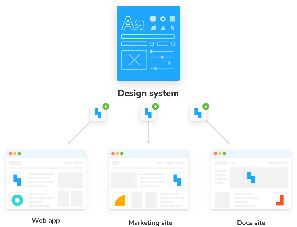
Add package to your project
Install the dependency.
# Install yarn add @addo-network/design-system -
Import
Start using the Design System UI components
// LinkButton.stories.tsx
import { LinkButton, LinkButtonProps } from '@addo-network/design-system/'
-
import Design System global style colors to tailwind.config.js
const designSystem = require('@addo-network/design-system')

module.exports = {
theme: {
  colors: {
    'neutral-dark': designSystem.styles.colors['neutral-dark'],
    'neutral-gray': designSystem.styles.colors['neutral-gray'],
    'neutral-white': designSystem.styles.colors['neutral-white'],
    success: designSystem.styles.colors.success,
    danger: designSystem.styles.colors.danger,
    warning: designSystem.styles.colors.warning,
    info: designSystem.styles.colors.info,
    muted: designSystem.styles.colors.muted
  }
}
typographyandiconsare also available.
Storybook
Add the Design System components to your project's Storybook. We can do that by updating .storybook/main.js to the following:
// .storybook/main.js
const designSystem = require('@addo-network/design-system')

module.exports = {
  stories: ['../src/**/*.stories.@(js|jsx|ts|tsx)'],
  refs: {
   'design-system': {
     title: 'My design system',
     //👇 The url provided by Chromatic when the Design System was deployed
     url: designSystem.design_system_url,
   },
 },
  addons: [
    '@storybook/addon-links',
    '@storybook/addon-essentials',
    '@storybook/preset-create-react-app',
  ],
};
Philosophy
Design systems should only contain pure and presentational components. These components deal with how UI appears. They respond exclusively to props, do not contain app-specific business logic, and are agnostic to how data loads. These properties are essential in allowing the component to be reusable.
App-specific components that contain business logic should not be included because that hamstrings reuse by requiring consumer projects to have identical business constraints.
Storybook Doc
- Storybook tutorials.
- Design Systems for Developers tutorial.
- Official documentation: Storybook.
TODO:
- Only have one file of truth, right now we have
tailwind.config.jsand./src/components/styleguide/styles.ts - Documentation to update the package in your project.
- Documentation for
typographyandiconsimport into your project. - Use TailwindCSS Presets https://tailwindcss.com/docs/presets
- CI/CD with Github actions, NPM auto publish, and Chromatic to host Storybook.