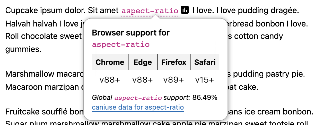
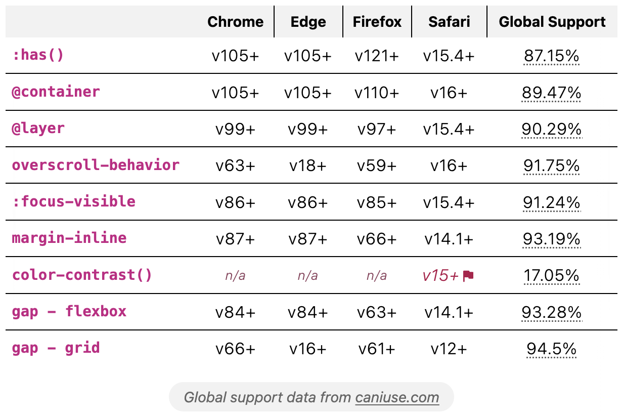
Eleventy filters for decorating inline-code with CSS broswer support data or rendering support tables. Data combined from caniuse and MDN, including version support started and global support percentages.
Plugin provides three filters, giving the option for rendering full support tables or turning inline code into buttons to trigger a popover panel.
Panel JavaScript is optionally included with the following features:
- toggling panels open and close
- closing upon
EscapeandTabor click outside the panel - closing open panels when another is toggled
- preventing overflow collision with the viewport (requires coordination with panel styles)
Note - due to inlining of this JS, it can appear to not work with Eleventy v1.0.1+ hot-reloading. A manual refresh may be required.
Styles are not provided, see the styling section for example structure and stylesheet.
Install the plugin:
npm install @11tyrocks/eleventy-plugin-css-browser-supportThen, include it in your .eleventy.js config file:
const cssBrowserSupport = require("@11tyrocks/eleventy-plugin-css-browser-support");

module.exports = (eleventyConfig) => {
  eleventyConfig.addPlugin(cssBrowserSupport);
};If you plan to use the inline code filter to produce collapsible panels, be sure to add the cssSupportPanels filter in your main template that outputs the final content, example:
{{ content | cssSupportPanels | safe }}Then, each time you want to render a support panel, replace inline code blocks with the cssSupport filter:
{{ 'aspect-ratio' | cssSupport }}You can also include a value, in which case only the property will be queried for support, such as the following will show margin-inline support:
{{ 'margin-inline: auto' | cssSupport }}Note a panel will only be generated and attached for the first instance of a duplicate property used within the same template.
Alternatively, render a full table showing support for one or more things, example:
{% cssSupportTable "aspect-ratio, :focus-visible, @layer, repeat()" %}To include a caption for the table, add it via the plugin option tableCaption, or include it as a second string value when including the cssSupportTable shortcode.
{% cssSupportTable "aspect-ratio, :focus-visible, @layer, repeat()", "Demo browser support" %}The API is intended to work for passing features as you would write them in CSS. As such, a few things will not be available if they exist on MDN under an expanded name. For example, > would be available as child.
Additionally, some features are nested and may be missed by the API. Exceptions are grid features (ex. repeat()), and color types (ex. color-contrast()) which have been explicitly included.
Review the data from MDN:
This plugin is BYOS (bring your own style) but you can check out the stylesheet included in the repo to produce the styles shown in the intro.
-
pointer-events: noneis added inline to the code and SVG icon - it's recommended to use a pseudo-element to extend the "hit area" of the button to cover the code element
- browser header cells receive a class in the format
css-support-header--[BROWSER-NAME] - cells for non-supported browsers receive the class
css-support-cell--na - cells for browsers that require a flag for support receive the class
css-support-cell--flagged
View panel HTML
<span class="css-support-panel-container">
  <code style="pointer-events: none;">aspect-ratio</code>
  <button
    type="button"
    class="css-support-button"
    aria-label="Browser support for aspect-ratio"
    aria-expanded="false"
    aria-controls="css-support-aspect-ratio"
  >
    <svg
      xmlns="http://www.w3.org/2000/svg"
      aria-hidden="true"
      class="css-support-icon"
      viewBox="0 0 24 24"
      width="24"
      height="24"
      style="pointer-events: none"
    >
      <path
        fill="currentColor"
        d="M7 17h2v-7H7Zm4 0h2V7h-2Zm4 0h2v-4h-2ZM5 21q-.8 0-1.4-.6Q3 19.8 3 19V5q0-.8.6-1.4Q4.2 3 5 3h14q.8 0 1.4.6.6.6.6 1.4v14q0 .8-.6 1.4-.6.6-1.4.6Z"
      ></path>
    </svg>
  </button>
  <div hidden id="css-support-aspect-ratio" class="css-support-panel">
    <div class="css-support-panel-table-container">
      <table class="css-support-table">
        <caption>
          Browser support for
          <code>aspect-ratio</code>
        </caption>
        <thead>
          <tr>
            <th>Chrome</th>
          </tr>
        </thead>
        <tbody>
          <tr>
            <td>v88+</td>
          </tr>
        </tbody>
      </table>
    </div>
    <small>
      <em>Global <code>aspect-ratio</code> support:</em> 86.49%<br />
      <a href="https://caniuse.com/?search=aspect-ratio">
        caniuse data for aspect-ratio
      </a>
    </small>
  </div>
</span>View table HTML
<div class="css-support-table-container">
  <table class="css-support-table">
    <thead>
      <tr>
        <td></td>
        <th class="css-support-header--chrome">Chrome</th>
        <th class="css-support-header--edge">Edge</th>
        <th class="css-support-header--firefox">Firefox</th>
        <th class="css-support-header--safari">Safari</th>
        <th>Global Support</th>
      </tr>
    </thead>
    <tbody>
      <tr>
        <th><code>:has()</code></th>
        <td>v105+</td>
        <td>v105+</td>
        <td class="css-support-cell--flagged">v103+</td>
        <td>v15.4+</td>
        <td><a href="https://caniuse.com/?search=:has()">66.61%</a></td>
      </tr>
      <tr>
        <th><code>@container</code></th>
        <td>v105+</td>
        <td>v105+</td>
        <td class="css-support-cell--na">N/A</td>
        <td>v16+</td>
        <td><a href="https://caniuse.com/?search=@container">63.75%</a></td>
      </tr>
    </tbody>
  </table>
  <p>Global support data from <a href="https://caniuse.com/">caniuse.com</a></p>
</div>The JS will add extra classes depending on the size of the viewport and it the panel is at risk of overflow. You may need to adjust the panel position styles accordingly.
Alignment classes:
-
.css-support-panel--left- added when the panel should align to the left side of the trigger button -
.css-support-panel--right- added when the panel should align to the right side of the trigger button
| Option | Type | Default |
|---|---|---|
| browserList | array | ["chrome", "edge", "firefox", "safari"] |
| showPanelTable | bool | true |
| includePanelJS | bool | true |
| tableCaption | str | null |
Note All available browsers are queried to get an accurate global support percentage.
The following array shows the complete list of valid browserList options.
[
  "chrome",
  "chrome_android",
  "edge",
  "firefox",
  "firefox_android",
  "ie",
  "opera",
  "safari",
  "safari_ios",
  "samsunginternet_android",
];
Example: Add Safari on iOS
eleventyConfig.addPlugin(cssBrowserSupport, {
  browserList: ["chrome", "edge", "firefox", "safari", "safari_ios"],
});To only show global percentage and caniuse link in the popover panel, use showPanelTable: false
eleventyConfig.addPlugin(cssBrowserSupport, {
  showPanelTable: false,
});If you'd like to write your own JS or include it in another way, you can disable the automatic inclusion with includePanelJS: false
eleventyConfig.addPlugin(cssBrowserSupport, {
  includePanelJS: false,
});This plugin relies on my package css-browser-support which returns the support data from MDN and global percentage from caniuse.

