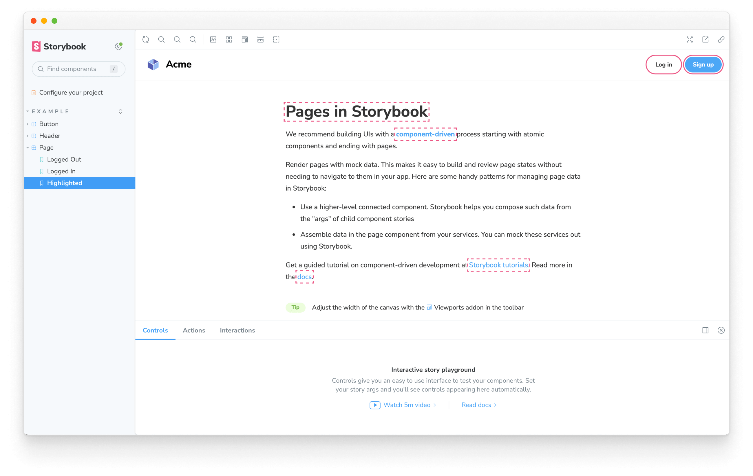
Storybook addon allows for highlighting specific DOM nodes within your story.
Use it to call attention to particular parts of the story. Or use it to enhance other addons that you might be building. For example, Accessibility addon uses it to highlight DOM nodes that are failing accessibility checks.
This addon requires Storybook 6.5 or later. Highlight is part of essentials and so is installed in all new Storybooks by default. If you need to add it to your Storybook, you can run the following command:
yarn:
yarn add --dev @storybook/addon-highlightnpm:
npm install @storybook/addon-highlight --save-devpnpm:
pnpm add --save-dev @storybook/addon-highlightAdd "@storybook/addon-highlight" to the addons array in your .storybook/main.js|ts:
// .storybook/main.ts

// Replace your-framework with the framework you are using (e.g., react-webpack5, vue3-vite)
import type { StorybookConfig } from '@storybook/your-framework';

const config: StorybookConfig = {
  addons: ['@storybook/addon-highlight'],
};

export default config;Highlight DOM nodes by emitting the HIGHLIGHT event from within a story or an addon. The event payload must contain an elements property assigned to an array of selectors matching the elements you want to highlight.
// MyComponent.stories.ts

import type { Meta, StoryObj } from '@storybook/react';
import { useChannel } from '@storybook/preview-api';
import { HIGHLIGHT } from '@storybook/addon-highlight';

import { MyComponent } from './MyComponent';

const meta: Meta<typeof MyComponent> = {
  component: MyComponent,
};

export default meta;
type Story = StoryObj<typeof MyComponent>;

export const Highlighted: Story = {
  decorators: [
    (storyFn) => {
      const emit = useChannel({});
      emit(HIGHLIGHT, {
        elements: ['.title', '.subtitle'],
      });
      return storyFn();
    },
  ],
};Highlights are automatically cleared when the story changes. You can also manually clear them by emitting the RESET_HIGHLIGHT event.
// MyComponent.stories.ts|tsx

import type { Meta, StoryObj } from '@storybook/react';
import { useChannel } from '@storybook/preview-api';
import { HIGHLIGHT, RESET_HIGHLIGHT } from '@storybook/addon-highlight';

import { MyComponent } from './MyComponent';

const meta: Meta<typeof MyComponent> = {
  component: MyComponent,
};

export default meta;
type Story = StoryObj<typeof MyComponent>;

export const ResetHighlight: Story = {
  decorators: [
    (storyFn) => {
      const emit = useChannel({});
      emit(RESET_HIGHLIGHT); //👈 Remove previously highlighted elements
      emit(HIGHLIGHT, {
        elements: ['header', 'section', 'footer'],
      });
      return storyFn();
    },
  ],
};The addon applies a standard style to the highlighted elements you've enabled for the story. However, you can enable your custom style by extending the payload object and providing a color and/or style properties. For example:
// MyComponent.stories.ts

import type { Meta, StoryObj } from '@storybook/react';
import { useChannel } from '@storybook/preview-api';
import { HIGHLIGHT } from '@storybook/addon-highlight';

import { MyComponent } from './MyComponent';

const meta: Meta<typeof MyComponent> = {
  component: MyComponent,
};

export default meta;
type Story = StoryObj<typeof MyComponent>;

export const StyledHighlight: Story = {
  decorators: [
    (storyFn) => {
      const emit = useChannel({});
      emit(HIGHLIGHT, {
        elements: ['.title', '.subtitle'],
        color: 'red',
        style: 'solid', // 'dotted' | 'dashed' | 'solid' | 'double'
      });
      return storyFn();
    },
  ],
};
