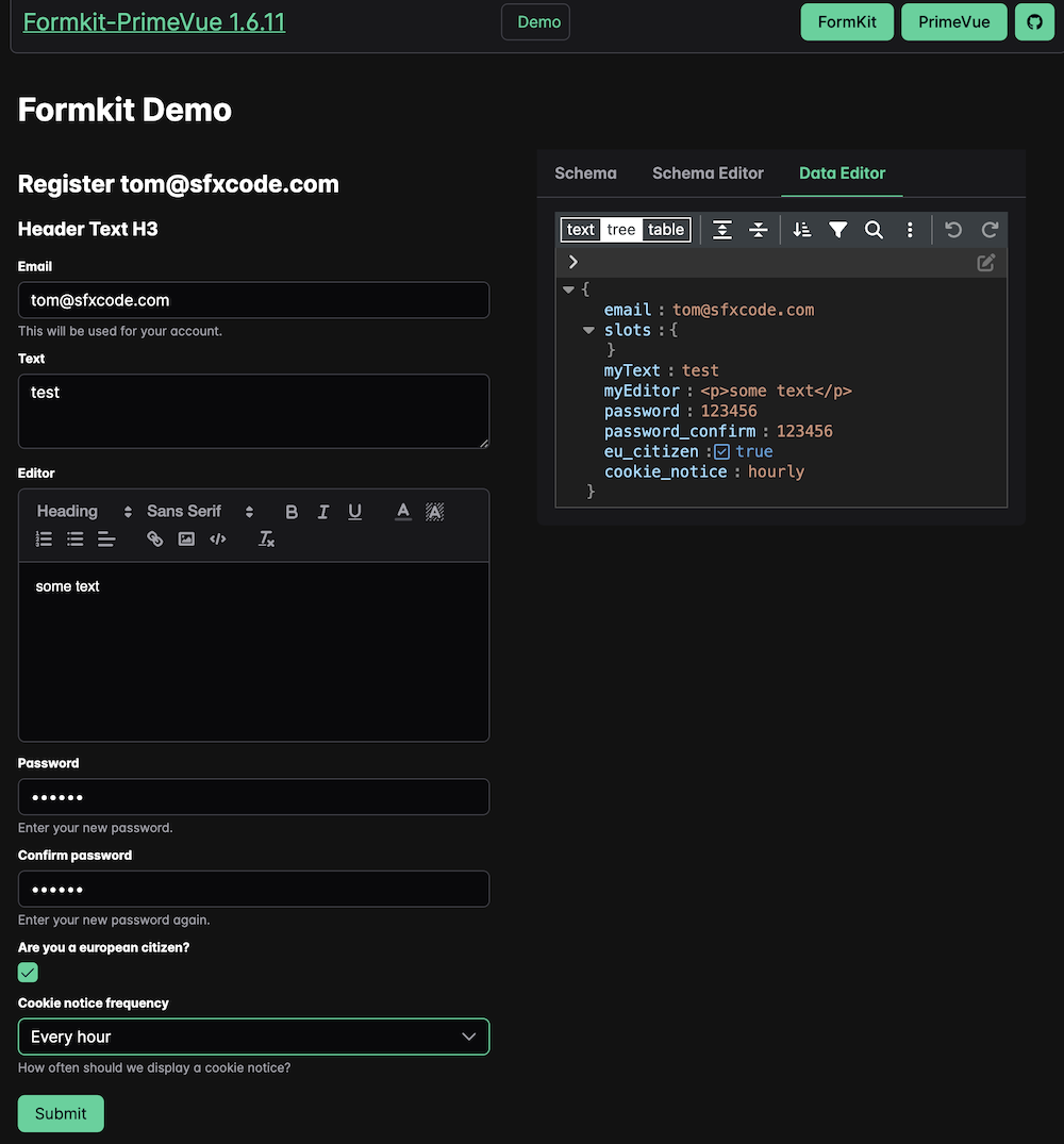
Helper classes for using Formkit with the PrimeVue UI Framework
import { defaultConfig, plugin } from '@formkit/vue'
import { primeInputs } from '@sfxcode/formkit-primevue'

  app.use(plugin, defaultConfig({
    locales: { de, en },
    // Define the active locale
    locale: 'en',
    inputs: primeInputs,
}))useFormKitSchema provide functions to simplify the usage of elements, components, lists, ...
Basic styling is provided with the formkit-primevue.scss file.
Features:
- Width of all text and dropdown elements is set to 100%
- Error Color by variable (--formkit-error-color)
- Some margins, font sizes ...
You can use it or take it as base for your own styling.
- All inputs are wrapped in a div with a p-formkit class
- Most Prime Components have access to class / styles attributes
- PT and PTOptions are available (https://primevue.org/passthrough/)
- Styling and PT demo available
Some samples for common tasks are available
Nuxt 3 PrimeVue Starter and Vite PrimeVue Starter with Formkit support available.
- AutoComplete
- Calendar
- CascadeSelect
- Checkbox
- Chips
- Dropdown
- Editor (HTML Editor)
- InputMask
- InputNumber
- InputOtp
- InputSwitch
- InputText
- InputTextarea
- MultiSelect
- Password
- Ranking
- Knob
- ColorPicker
- Listbox
- ToggleButton
- SelectButton
- TriStateCheckbox
- RadioButton
- TreeSelect

