react-native-form-fields
Cross-platform development is now an essential aspect of software
development. Node Packet Manager, the online repository is a go to site
for React Programmers. This is MetaSys' contribution based on challenges
we had while developing a single application for both Android and iOS.
We offer a flexible NPM package, for UI form field widgets which will
work on both Android and iOS platforms. The package is based on React
hooks and typescript, which provides an error-free field. It also gives
you a clean and consistent look and feel on iOS and Android devices with
high performance.
This React Native package has the basic form fields such as Radio
Button, CheckBox, Dropdown List and different types of Text Fields. The
code takes care of most use cases for the different fields. Developers
can pass the required properties and get the results easily and very
quickly. The documentation below will help you to easily integrate with
your React Native projects. This version is compatible with react-native
0.60 and above.
Content
-
Installation
-
Screenshots
-
Getting started
-
Properties
-
Contribution
Installation
Run npm i react-native-form-fields--save
import {

  RadioButton,

  CheckBox,

  IconTextField,

  BasicTextField,

  CustomTextField,

  DropDown } from 'react-native-form-fields';
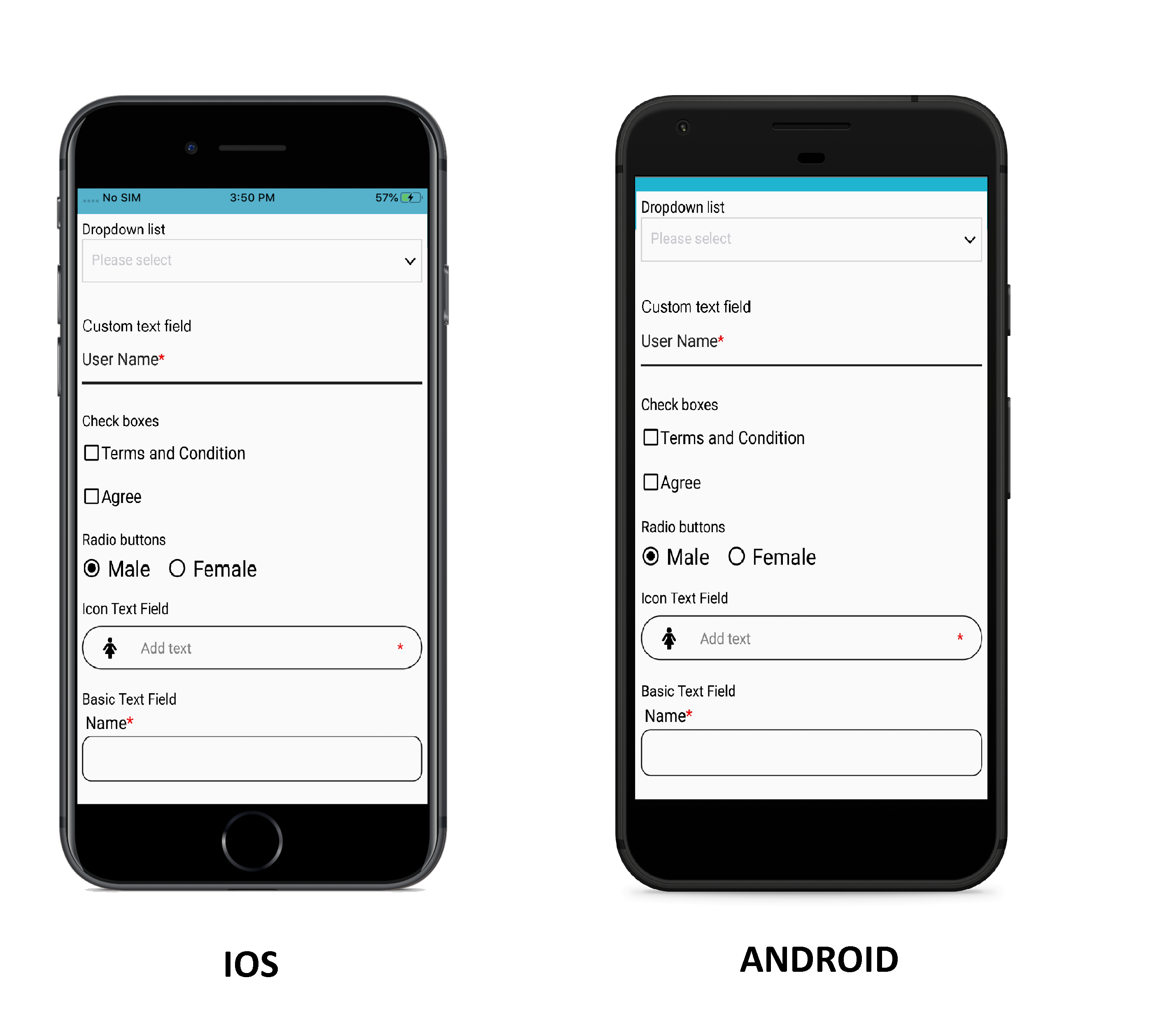
Screenshot
Getting started
Add react-native-form-fields to your JS file.
RadioButton
import {RadioButton} from 'react-native-form-fields'

const onChangeRadio = (selectedObj: any) => {

    console.log('Selected item = ', selectedObj.value)

  };

<RadioButton

  items={[{id:'item1',value:'male'},{id:'item2',value:'female'}]}

  onChange={onChangeRadio}

/>
Properties
| Name | Description | Type | Default |
|---|---|---|---|
| items | Field Items Array | Array | [ {id: 1, value: 'Option 1'}, {id: 2, value: 'Option 2'} |
| size | Field Size | Number | - |
| isVertical | Fields' Direction | Boolean | false |
| selectedValue | Selected Field | Object | - |
| onChange | Change Radio callback | Function | - |
| containerStyle | Field Container Style | Object | { flexDirection: 'row', justifyContent: 'center', marginRight: isVertical: '5%' |
| icon ContainerStyle | Field Icon Container Style | Object | {justifyContent: 'center', shadowColor: 'rgba(0,0,0, .2)', shadowOffset: { height: 1, width: 1 }, shadowOpacity: 1, shadowRadius: 1} |
| label ContainerStyle | Field Label Container Style | Object | { justifyContent: 'center'} |
| labelStyle | Field Label Style | Object | {fontSize: 20, paddingLeft: '2%',color: 'white'} |
| labelFontSize | Field Label Font Size | Number | 20 |
| labelColor | Field Label Font Color | String | black |
| selectedIcon | Selected Icon | Object | {size: 20, name: 'radio-button-checked',type: 'MaterialIcons',color:'black' } |
| unSelectedIcon | Unselected Icon | Object | { size: 20, name:'radio-button-unchecked', type: 'MaterialIcons', color: 'black' } |
| selectedElement | Selected Component | React Native Component | - |
| unSelectedElement | Unselected Component | React Native Component | - |
CheckBox
import {CheckBox} from 'react-native-form-fields'

<CheckBox label='Javascript' isMarked={true}/>
Properties
| Name | Description | Type | Default |
|---|---|---|---|
| isChecked | Set Checkbox Checked | Boolean | false |
| containerBgColor | Field Background Color | Number | - |
| containerFlexDirection | Fields' Direction | String | row |
| containerStyle | Field Container Style | Object | { flexDirection:'row',justifyContent: 'center', marginRight: isVertical : '5%'} |
| icon ContainerStyle | Field Icon Container Style | Object | {height: 20,justifyContent: 'flex-start',shadowColor: 'rgba(0,0,0, .2)',shadowOffset:{ height: 1,width: 1 },shadowOpacity: 1,shadowRadius: 1} |
| label ContainerStyle | Field Label Container Style | Object | { justifyContent:'flex-end'} |
| labelStyle | Field Label Style | Object | { fontSize:16, color: 'black'} |
| label | Field label | String | - |
| labelFontSize | Field Label Font Size | Number | 16 |
| labelColor | Field Label Font Color | String | black |
| onChange | Change checkbox callback | Function | - |
| checkedIcon | Checked Icon | Object | { size: 20, name: 'check-box-outline', type: 'material-community',color:'black' } |
| unCheckedIcon | Unchecked Icon | Object | { size:20, name: 'checkbox-blank-outline', type: 'material-community',color:'black' } |
| checkedElement | Checked Component | React Native Component | - |
| unCheckedElement | Unchecked Component | React Native Component | - |
DropDown
import {DropDown} from 'react-native-form-fields'

const dropdownStyles = {

      select: {color: 'white'},

      modalViewBottom: {backgroundColor: 'pink'},

      placeholder: {backgroundColor: 'yellow'},

      modalViewMiddle: {backgroundColor: 'red'},

    };

const onChangeDropdown = (value: any) => {

    console.log('selected value = ', value);

  };

<PickerSelect

     onChange={onChangeDropdown}

     style={dropdownStyles}

     items={[

             {id: 'item1', label: 'Apple', value: 'Apple'},

             {id: 'item2', label: 'Ball', value: 'Ball'},

             {id: 'item3', label: 'Cat', value: 'Cat'}

            ]}

     selectedItem={{id: 'item3', label: 'Cat', value: 'Cat'}}

/>
Properties
| Name | Description | Type | Default |
|---|---|---|---|
| items | Field Items Array | Array | - |
| useNativeAndroidPickerStyle | Native Android Dropdown | Boolean | false |
| style | Different styles | Object | - |
| modalProps | Modal View Props (Only iOS) | Props | - |
| dropDownProps | DropDown Props | Props | - |
| disabled | DropDown disabled for selection | Boolean | false |
| textInputProps | Field Text Input Props | Props | - |
| placeholderTextColor | Dropdown Placeholder Text Color | String | #C7C7CD |
| placeholder | Placeholder For DropDown | Object | - |
| selectText | Default Text for Dropdown view | String | Select |
| hideSelectBar | Render Dropdown Select Button Bar (iOS only) | Boolean | Select |
| onChange | Change Picker callback | Function | - |
| selectedItem | Selected item in the Dropdown list | Object | |
| itemTextColor | Items Text Color | String | black |
| dropdownIcon | DropDown Icon | Object | { size: 20, name: 'chevron-down', type: 'entypo', color: 'black' } |
| fieldIcon | DropDown Icon Component | React Component | - |
BasicTextField
import {BasicTextField} from 'react-native-form-fields'

const onChangeText = (text: string) => {

    console.log('Field text = ',text);

    setEmail(text);

  };

<BasicTextField

  label='Email'

  value={this.state.email}

  onChange={onChangeText}

/>
Properties
| Name | Description | Type | Default |
|---|---|---|---|
| label | Field Label | String | - |
| labelColor | Field Label Color | String | black |
| labelStyle | Field Label Style | Object | - |
| isRequired | Display Asterisk Symbol | Boolean | false |
| asteriskTextStyle | Asterisk Symbol Style | Object | { color: 'red', fontSize: 16 } |
| Value | Field Value | String | - |
| onFocusBorderColor | Field Border Color on focus | String | '#007AFE' |
| isError | To Display error | Boolean | false |
| errorText | Display Error Text | String | - |
| errorColor | Error Text Color | String | red |
| errorTextStyle | Error Text Style | Object | - |
| errorContainerStyle | Error Container Style | Object | {justifyContent:'center', marginLeft: '1%' } |
| hintText | Hint | String | - |
| hintTextStyle | Hint Style | Object | { color: 'orange', fontSize: 16, marginLeft: '2%' } |
| isSecureEntry | To Set Sensetive Text Stay Secure | Boolean | false |
| placeholder | Field Placeholder | String | |
| keyboardType | Keyboard Type | String | default |
| maxLength | Max Length Of The Field | Number | null |
| isClearTextOnFocus | To Clear The Text On Focus | Boolean | false |
| onChange | Change Text callback | Function | - |
| text FieldBorderColor | Field Border Color | String | black |
| textFieldStyle | Object | {color: 'black', paddingLeft: '2%', height: 40,fontSize: 20, paddingVertical: Platform.OS == 'android' ? 0 : null} | |
| textFieldContainerStyle | Object | {borderColor:'black', borderWidth: 1, borderRadius: 10} | |
| headerStyle | Object | {alignText: 'center', flexDirection: 'row',flexWrap: 'wrap', marginVertical: '0.5%',paddingLeft: '1%'} | |
| textInputProps | Props for Text Input | Props |
IconTextField
import {IconTextField} from 'react-native-form-fields'

const onChangeText = (text: string) => {

    console.log('Field text = ',text);

    setUserName(text);

  };

<IconTextField

   icon={{size: 20, name: 'female', type: 'font-awesome'}}

   value={this.state.userName}

   errorText='add text'

   isRequired={true}

   onChange={onChangeText}

/>
Properties
| Name | Description | Type | Default |
|---|---|---|---|
| icon | Field Icon | String | { size: 20,name: 'user', type: 'font-awesome'} |
| iconColor | Field Icon Color | String | black |
| value | Field Value | String | |
| borderColor | Field Border Color | Object | black |
| isRequiredStyle | Asterisk Symbol Style | Object | |
| defaultValue | Default Value | String | |
| isError | To Display error | Boolean | false |
| errorText | Display Error Text | String | |
| errorColor | Error Text Color | String | red |
| errorTextStyle | Error Text Style | Object | { marginLeft: '5%', color: 'blue' } |
| isSecureEntry | To Set Sensetive Text Stay Secure | Boolean | false |
| placeholder | Field Placeholder | String | |
| placeholderTextColor | Placeholder Text Color | String | grey |
| mainContainerStyle | Main Container Style | Object | { borderWidth: 1, flexDirection: 'row',borderRadius: 20,alignItems: 'center', height: 40, padding: 8, width: '100%'} |
| iconContainerStyle | Icon Container Style | Object | {width:'8%',marginRight: '2%', padding: 1 } |
| textFieldContainerStyle | TextInput Container Style | Object | {width:'88%'} |
| textInputStyle | TextInput Style | Object | {padding:2,color: 'black',...Platform.select({android: {height: 40}})} |
| onChange | Change Text callback | Function | - |
Custom Text Field
import {CustomTextField} from 'react-native-form-fields'
Features
Customized TextField Features
Animated state transitions (normal, focused and errored)
Customizable font size, colors and animation duration
Disabled state
Outlined and filled fields
Masked input support
Multiline text input
Character counter
Prefix and suffix
Accessory views
Helper text
const onChangeText = (text: string) => {

    console.log('Field text = ',text);

    setFirstName(text);

};

<CustomTextField

   labelText='First Name'

   errorMsg={this.state.firstNameErrorMsg}

   onChange={onChangeText}

   defaultText='Mr.'

   defaultTextPosition={right}

   animationDuration={500}

   isRequired={true}

   isMultiline={true}

   value={this.state.firstName}

/>
Properties
| Name | Description | Type | Default |
|---|---|---|---|
| isMultiline | Allow Multiple Lines | Boolean | false |
| defaultText | Prefix or Suffix Text | String | - |
| defaultTextPosition | Position Of The Default Text | String | left |
| value | Field Value | String | - |
| editable | Set Field Editable | Boolean | true |
| isRequired | Display Asterisk Symbol | Boolean | false |
| animationDuration | Animation Duration | Number | 20 |
| isError | To Display error | Boolean | false |
| errorText | Display Error Text | String | - |
| errorColor | Error Text Color | String | red |
| tintColor | Field Color On Focus | String | 'rgb(0,100,234)' |
| rootColor | Field Color When Not Focused | String | 'rgba(0, 0, 0, .87)' |
| textColor | Text Color | String | 'rgba(0, 0, 0, .87) |
| clearTextOnFocus | Clear The Text When Focused | Boolean | false |
| fontSize | Font Size Of The Text Input When Not Focused | Number | 16 |
| errorFontSize | Error Text Font Size | Number | 12 |
| activeFontSize | Font Size Of The Text Input When Focused | Number | 12 |
| autoCapitalize | Capitalize Text,Sentences,Words,Charachters | String | 'none' |
| characterLimit | Charachter Limit For The Text Field | Number | - |
| inputContainerOverrideStyle | Set Input Container Style | Object | - |
| inputOverrideStyle | Set Text Input Style | Object | - |
| onChange | Change Text callback | Function | - |
| textInputProps | Props for Text Input | Props | - |
Contribution
Any type of issues are welcome. Please add screenshots of the bug and code snippet. Also the quickest way to solve the bug is to reproduce it with one of the examples. We would also welcome Pull Requests.
git clone https://github.com/metasyssoftware/react-native-form-fields
npm install
npm run ios # or npm run android
Copyright and License
Author
License
MIT Copyright 2020 MetaSys Software Pvt. Ltd. All rights reserved.