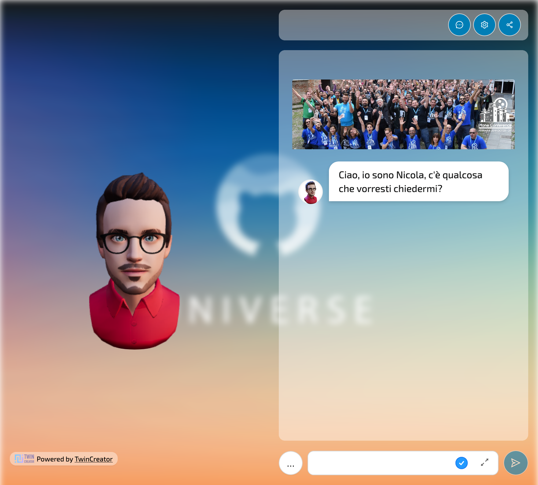
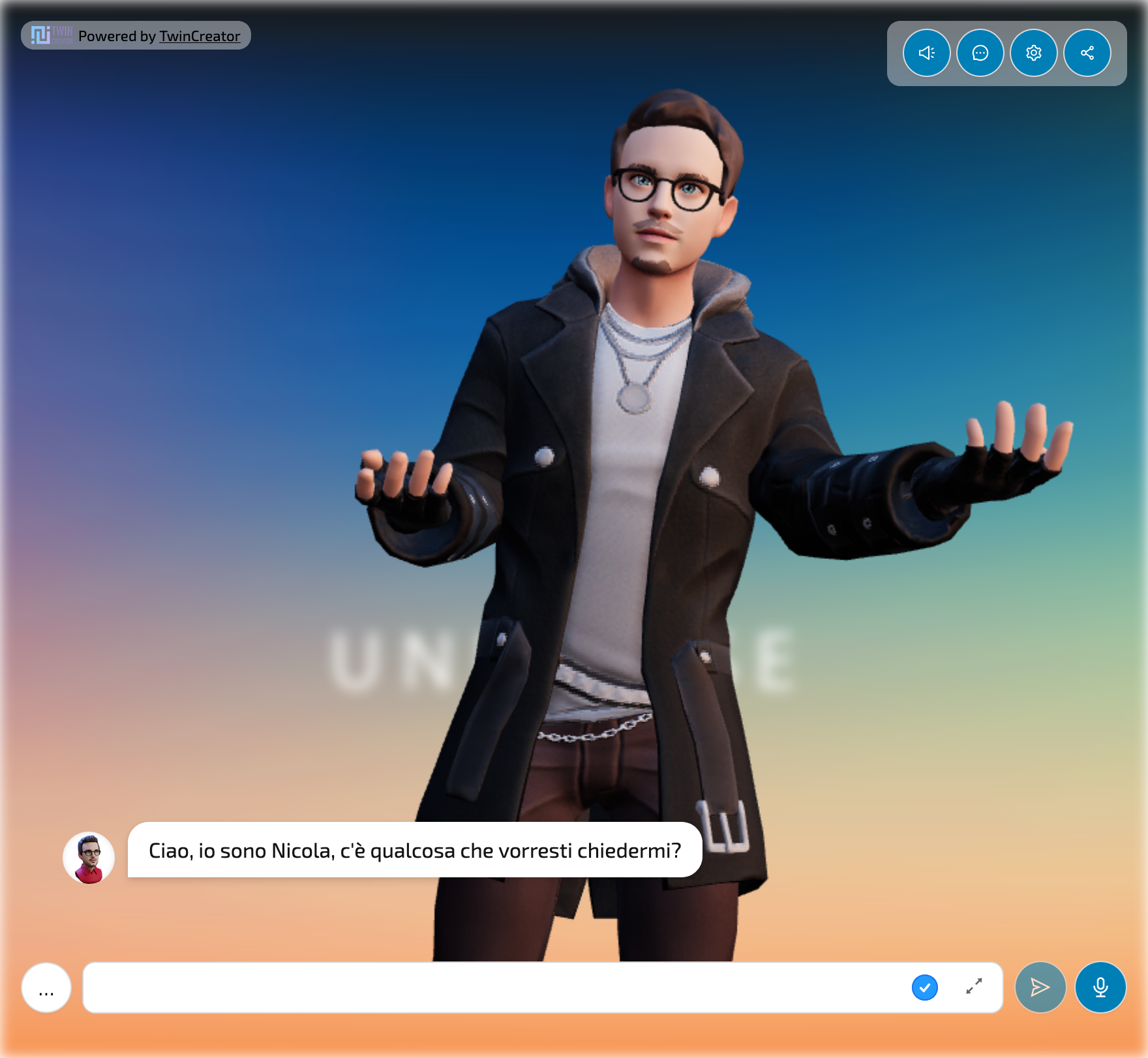
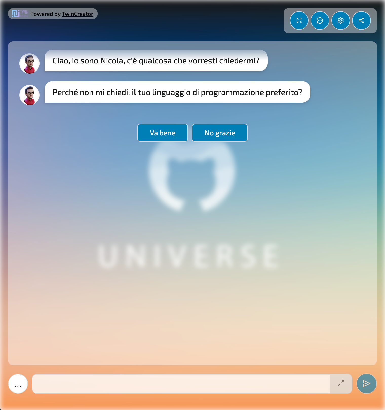
Library to integrate a Twin from Memori in a React app.
Web Platform: AIsuru
yarn add @memori.ai/memori-reactnpm install @memori.ai/memori-reactImport the component:
import Memori from '@memori.ai/memori-react';Import the CSS:
import '@memori.ai/memori-react/dist/styles.css';Then use it in your app:
const App = () => (
  <Memori
    memoriName="Memori"
    ownerUserName="nunziofiore"
    tenantID="app.memorytwin.com"
    apiURL="https://backend.memori.ai"
    baseURL="https://app.memorytwin.com"
    uiLang="it"
    showShare
    height="100vh"
  />
);| Prop | Required | Type | Default | Description |
|---|---|---|---|---|
memoriName |
* (see below) | string |
Name of the Memori | |
ownerUserName |
* (see below) | string |
Username of the Memori owner | |
memoriID |
* (see below) | string |
ID of the Memori | |
ownerUserID |
* (see below) | string |
ID of the Memori owner | |
tenantID |
✔️ | string |
Tenant ID, example: "aisuru.com" or "app.memorytwin.com" | |
sessionID |
string |
Initial Session ID, UUID which refers to the session to the Memori and identifies a conversation and its permissions (giver, receiver, anonymous). A session would be started autonomously with the params set, but if you have an existing and valid sessionID you can pass it as already opened one. Use this at your risk, as session recovery might break or start session as anon user. In most cases, you shoudn't use this prop. | ||
authToken |
string |
Authentication token from user login, needed for giver sessions to upload assets | ||
integrationID |
string |
Integration ID, UUID which refers to the public page layout | ||
secretToken |
string |
Secret token, the password of a private or secret Memori | ||
height |
string |
"100%" | Height of the Memori | |
showShare |
bool |
true |
Show the share button | |
showSettings |
bool |
true |
Show the settings panel button | |
showTypingText |
bool |
false |
Show default sentences while loading text (see: Typing stories) | |
showInstruct |
bool |
false |
Show the switch selecting between test mode or instruct mode, needs an administrative session as a giver | |
showLogin |
bool |
true |
Show the login button | |
showClear |
bool |
false |
Show clear chat history button | |
showOnlyLastMessages |
bool |
true or false * |
Show only last 2 messages. (*) Defaults to true for TOTEM and WEBSITE_ASSISTANT layouts, false otherwise |
|
baseURL |
string |
Base URL of the Memori, example: "https://aisuru.com" | ||
apiURL |
string |
"https://backend.memori.ai" | URL of the Memori API | |
tag |
string |
Tag of the person opening the session to the Memori, could be the giver or a receiver | ||
pin |
string |
PIN of the person opening the session to the Memori, could be the giver or a receiver | ||
context |
string |
Initial context of the conversation, dictionary with "key: value" pairs as context variables | ||
initialQuestion |
string |
Initial question to ask to the Memori, starts the conversation as this would be sent to the Memori | ||
uiLang |
'en' | 'it' |
"en" | Language of the UI, es: "en" or "it" | |
multilingual |
bool |
false |
Enable multilingual mode, if enabled the user can switch between spoken languages | |
spokenLang |
string |
Language of the spoken text, as defaults to user selection. Example: "en" or "it" | ||
onStateChange |
function |
Callback function called when the state of the Memori changes | ||
defaultSpeakerActive |
boolean |
true |
Default value for the speaker activation | |
AZURE_COGNITIVE_SERVICES_TTS_KEY |
string |
Azure Cognitive Services TTS key, used to generate the audio of the Memori and for STT recognition | ||
layout |
string |
Layout of the Memori, can be "FULLPAGE" (default), "CHAT", "WEBSITE_ASSISTANT" or "TOTEM", see below | ||
customLayout |
React.FC<LayoutProps> |
Custom layout component, see below | ||
customMediaRenderer |
(mimeType: string) => JSX.Element | null |
Custom media renderer, see below | ||
additionalSettings |
JSX.Element |
Custom JSX or component to render within the settings drawer | ||
userAvatar |
string |
Custom URL or React element to use as user avatar |
*: one of these pairs is required: memoriName + ownerUserName, memoriID + ownerUserID
The Memori can be displayed in three different layouts: FULLPAGE, CHAT, WEBSITE_ASSISTANT and TOTEM.
If you don't specify a layout, the default one is FULLPAGE.
You can override the default layout by passing a custom layout component to the customLayout prop.
The custom layout component must be a React functional component that accepts a LayoutProps object as props.
import type { LayoutProps } from '@memori.ai/memori-react/components/MemoriWidget';

const MyCustomLayout: React.FC<LayoutProps> = ({
  Header,
  headerProps,
  Avatar,
  avatarProps,
  Chat,
  chatProps,
  StartPanel,
  startPanelProps,
  integrationStyle,
  integrationBackground,
  ChangeMode,
  changeModeProps,
  sessionId,
  hasUserActivatedSpeak,
  showInstruct = false,
  loading = false,
  poweredBy,
}) => (
  <>
    {integrationStyle}
    {integrationBackground}

    <Spin spinning={loading} className="memori-mycustom-layout">
      {poweredBy}

      <div className="memori-mycustom-layout--controls">
        {sessionId && hasUserActivatedSpeak && Chat && chatProps ? (
          <Chat {...chatProps} />
        ) : startPanelProps ? (
          <StartPanel {...startPanelProps} />
        ) : null}
      </div>
    </Spin>
  </>
);
And then pass it to the customLayout prop:
  <Memori
    ...
    customLayout={MyCustomLayout}
/>You can override the default styles of the Memori by customizing the following CSS custom properties:
memori-client,
#headlessui-portal-root,
.memori-widget {
  --memori-primary: rgb(102, 103, 171);
  --memori-primary-text: #fff;
  --memori-inner-content-pad: 1rem;
  --memori-inner-bg: transparent;
  --memori-chat-bubble-bg: #ffffff60;
  --memori-text-color: #000;
  --memori-button-bg: #fff;
  --memori-button-text: #000;
  --memori-button-padding: 0.5rem 1.5rem;
  --memori-button-border-color: #d9d9d9;
  --memori-button-radius: 5px;
  --memori-button-box-shadow: 0 2px 0 rgba(0, 0, 0, 0.02);
  --memori-blur-background: 0px;
  --memori-drawer--width: 100%;
  --memori-drawer--width--md: 80%;
  --memori-drawer--width--lg: 60%;
  --memori-modal--width: 100%;
  --memori-modal--width--md: 80%;
  --memori-error-color: #ff4d4f;
}
You can review the default styles in the styles.css file.
When using the customLayout prop, you can also override the default components used by the client.
const MyCustomChat: LayoutProps['Chat'] = ({ history, sendMessage }) => {
  const [message, setMessage] = React.useState('');

  ...
}

const MyCustomAvatar: LayoutProps['Avatar'] = (props) => {
  ...
}

const CustomLayout: React.FC<LayoutProps> = ({
  avatarProps,
  chatProps,
  StartPanel,
  startPanelProps,
  sessionId,
  hasUserActivatedSpeak,
  loading = false,
  poweredBy,
}) => (
  <>
    <Spin spinning={loading} className="memori-mycustom-layout">
      {poweredBy}

      <div className="memori-mycustom-layout--avatar">
        <MyCustomAvatar {...avatarProps} />
      </div>

      <div className="memori-mycustom-layout--controls">
        {sessionId && hasUserActivatedSpeak && Chat && chatProps ? (
          <MyCustomChat {...chatProps} />
        ) : startPanelProps ? (
          <StartPanel {...startPanelProps} />
        ) : null}
      </div>
    </Spin>
  </>
);You can override the default media renderer by passing a custom function to the customMediaRenderer prop.
This can override the default media renderer for all media types or just for a specific one.
You can also use this to extend the default media renderer with additional media types.
<Memori
  ...
  customMediaRenderer={(mimeType: string) => {
    if (mimeType === 'custom/content-type') {
      return <MyCustomImageRenderer />;
    }

    return null;
  }}
/>When rendered, the Memori widget exposes some global functions that can be used to interact with the Memori.
let dialogState = getMemoriState();
let sessionID = getMemoriState().sessionID;
let dialogState = getMemoriState(myWidgetIntegrationId); // in case you have multiple widgets on the same page
Otherwise, you can achieve the same result manually by reading from the HTML code of the widget the attribute data-memori-engine-state.
let dialogState = JSON.parse(
  document.querySelector('div[data-memori-engine-state]')?.dataset
    ?.memoriEngineState ?? '{}'
);
Write and send a message to the Twin. You can use this method to send a message to the Twin, such as to continue a conversation with a specific message or following an action.
typeMessage('Hello World!');Additional parameters:
const waitForPrevious = true; // waits for previous message to be read, default: true
const hidden = true; // message is not visible to the user, only the response is, default: false
const typingText = "Asking the unicorns' opinion..."; // text to show in the loader while the Twin is answering, defaults to none
typeMessage('Hello World!', waitForPrevious, hidden, typingText);
There is also an alias function that does not show the message sent to the user, but only the Twin's response:
const waitForPrevious = true; // waits for previous message to be read, default: true
typeMessageHidden('Hello World!', waitForPrevious);

// alias to
typeMessage('Hello World!', waitForPrevious, true);- memori-api-client - API client for Memori
- memori-webcomponent - Web component for Memori, uses this library


