Melfore's UI kit library based on @mui/*.
Changelog | Contributing | Migration | Storybook
Starting from @melfore/mosaic v8.x Mosaic dropped support for React < v18.x and Material UI < v5.x
Add the package to your project with:
npm install @melfore/mosaic
It requires these peerDependencies to be installed in host project:
    "@emotion/react": ">= 11.8.2 < 12",
    "@emotion/styled": ">= 11.8.1 < 12",
    "@mui/icons-material": ">= 5.5.1 < 6",
    "@mui/material": ">= 5.5.3 < 6",
    "@mui/system": ">= 5.15.4 < 6",
    "@mui/x-date-pickers": ">= 6.16.0 < 7",
    "luxon": ">= 3.4.4 < 4",
    "react": ">= 18 < 19",
    "react-dom": ">= 18 < 19",
    "react-window": ">= 1.8.0 < 1.9.0"
Browse our StoryBook to discover all available components.
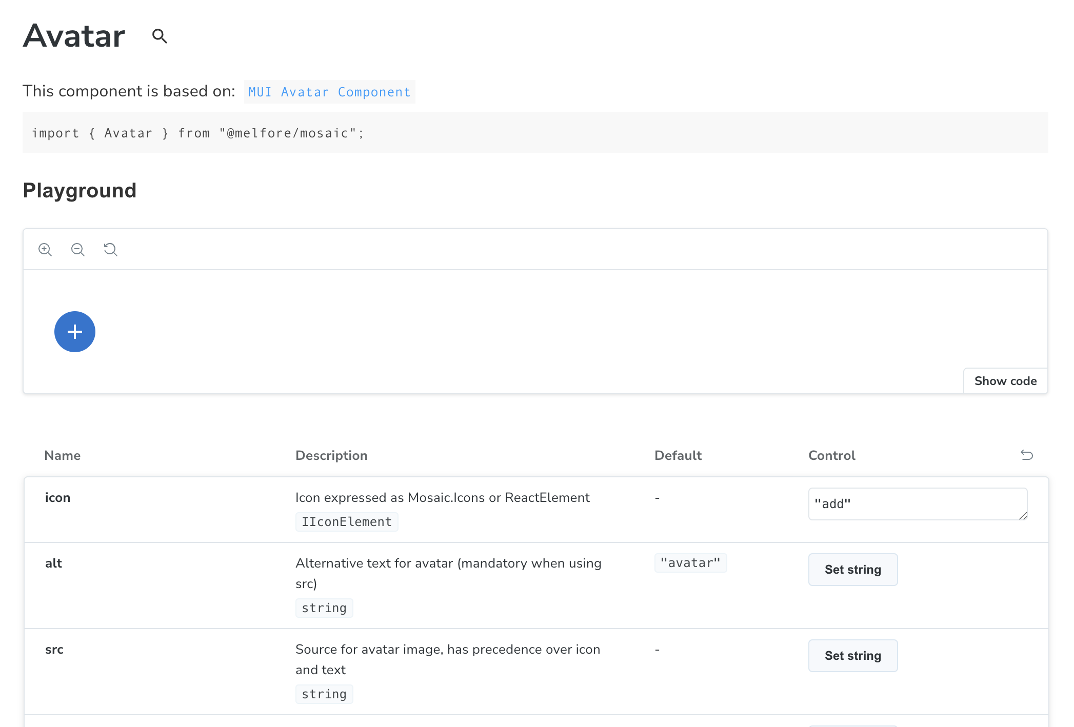
Each component has a dedicated docs page showing how to import plus a playground with a table listing all props that can be dynamically changed to see the results in real time.
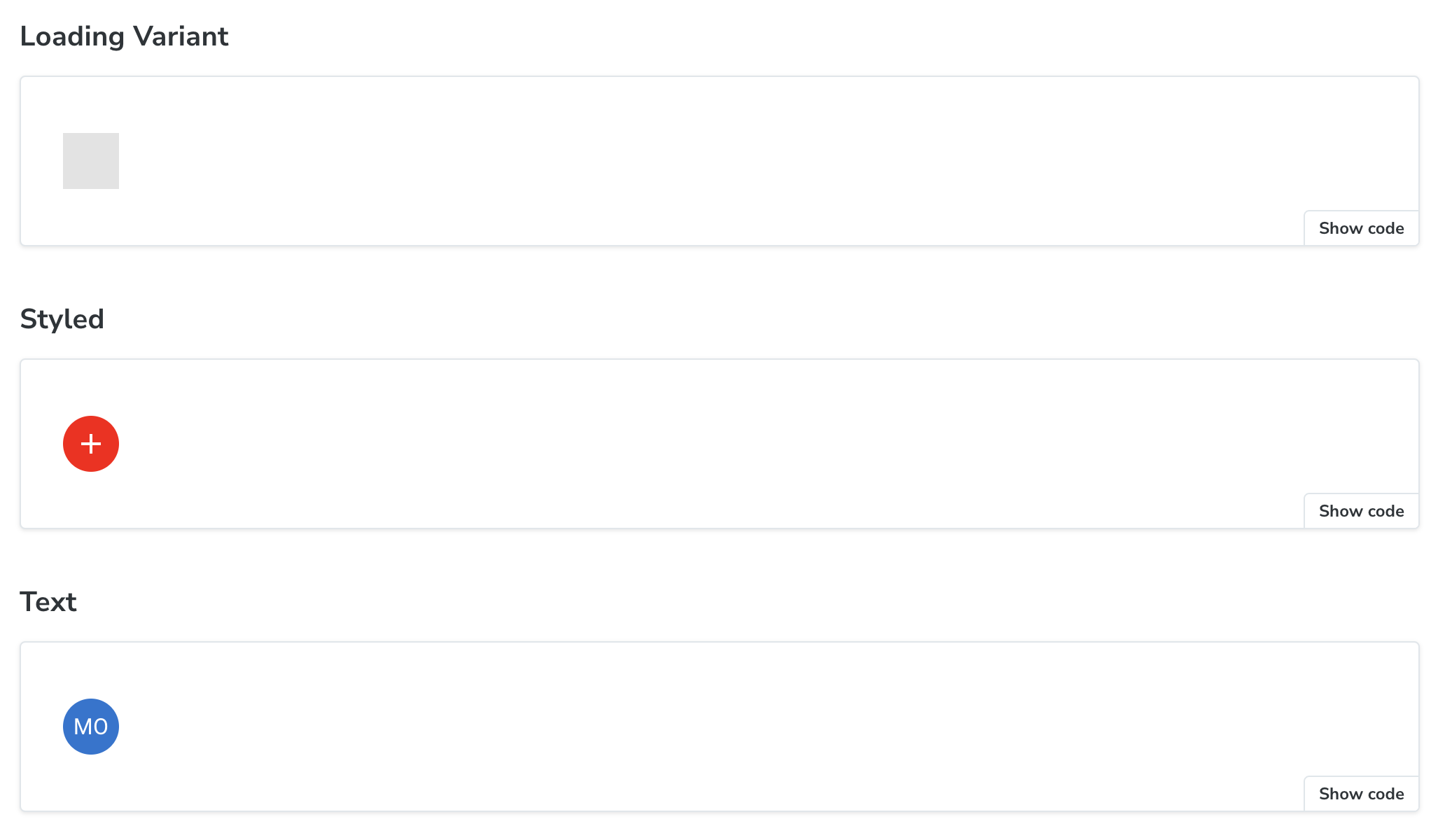
Below the props table you can find a list of most common usage scenario. These are ready to use samples that can be copied and pasted into your codebase using the Show code option.
Browse StoryBook to discover all available components.


