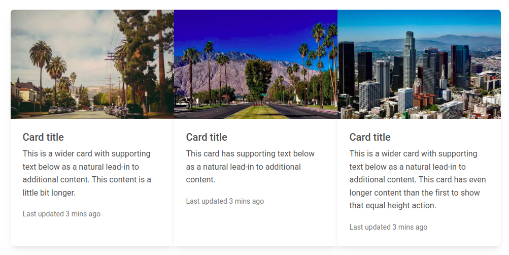
Responsive Card Deck built with Bootstrap 5, React 17 and Material Design 2.0. Bootstrap card-deck with multiple rows and standard breakpoints.
Check out React Bootstrap Card Deck Documentation for detailed instructions & even more examples.
Card deck layout
In addition to styling the content within cards, Bootstrap includes a few options for laying out series of cards.
Cards group
Use card groups to render cards as a single, attached element with equal width and height columns. Card groups start off stacked and use display: flex; to become attached with uniform dimensions starting at the sm breakpoint.
import React from "react";
import {
  MDBCard,
  MDBCardImage,
  MDBCardBody,
  MDBCardTitle,
  MDBCardText,
  MDBCardGroup,
  MDBContainer,
} from "mdb-react-ui-kit";

export default function Basic() {
  return (
    <MDBContainer className="mt-3">
      <MDBCardGroup>
        <MDBCard>
          <MDBCardImage
            src="https://mdbootstrap.com/img/new/standard/city/041.webp"
            alt="..."
            position="top"
          />
          <MDBCardBody>
            <MDBCardTitle>Card title</MDBCardTitle>
            <MDBCardText>
              This is a wider card with supporting text below as a natural
              lead-in to additional content. This content is a little bit
              longer.
            </MDBCardText>
            <MDBCardText>
              <small className="text-muted">Last updated 3 mins ago</small>
            </MDBCardText>
          </MDBCardBody>
        </MDBCard>

        <MDBCard>
          <MDBCardImage
            src="https://mdbootstrap.com/img/new/standard/city/042.webp"
            alt="..."
            position="top"
          />
          <MDBCardBody>
            <MDBCardTitle>Card title</MDBCardTitle>
            <MDBCardText>
              This is a wider card with supporting text below as a natural
              lead-in to additional content.
            </MDBCardText>
            <MDBCardText>
              <small className="text-muted">Last updated 3 mins ago</small>
            </MDBCardText>
          </MDBCardBody>
        </MDBCard>

        <MDBCard>
          <MDBCardImage
            src="https://mdbootstrap.com/img/new/standard/city/043.webp"
            alt="..."
            position="top"
          />
          <MDBCardBody>
            <MDBCardTitle>Card title</MDBCardTitle>
            <MDBCardText>
              This is a wider card with supporting text below as a natural
              lead-in to additional content. This card has even longer content
              than the first to show that equal height action.
            </MDBCardText>
            <MDBCardText>
              <small className="text-muted">Last updated 3 mins ago</small>
            </MDBCardText>
          </MDBCardBody>
        </MDBCard>
      </MDBCardGroup>
    </MDBContainer>
  );
}
How to use?
-
Download MDB React - free UI KIT
-
Choose your favourite customized component and click on the image
-
Copy & paste the code into your MDB project
More extended Bootstrap documentation
- React Bootstrap Code
- React Bootstrap Gallery
- React Bootstrap Hamburger Menu
- React Bootstrap Jumbotron
- React Bootstrap Maps
- React Bootstrap Mega Menu
- React Bootstrap Media object
- React Bootstrap Multiselect
- React Bootstrap Masonry
- React Bootstrap Contact form
- React Bootstrap Gradients
- React Bootstrap Pagination
- React Bootstrap Panels
- React Bootstrap Social Media icons & buttons
- React Bootstrap Search
- React Bootstrap Table sort
- React Bootstrap Table responsive
- React Bootstrap Table scroll
- React Bootstrap Table search
- React Bootstrap Textarea
- React Bootstrap Sidebar
- React Bootstrap Profiles
- React Bootstrap Nested Dropdown
- React Bootstrap Address Form
- React Scroll Back to Top button
- React Product Cards
- React Avatar
- React Carousel Slider with Thumbnails
- React Chat
- React Comparison table
- React Comments
- React Drawer
- React FAQ component / section
- React Invoice
- React News feed
- React Offcanvas
- React Order details
- React Page transitions
- React Quotes
- React Payment forms
- React Select with custom Input
- React Square Buttons
- React Testimonial Slider
- React Testimonials / Reviews
- React Survey form
- React Timeline
- React To Do List
- React Padding
- React Modal Size
- React Modal Backdrop
- React CSS Text Animations
- React Video
- React Modal Show, Close, Hide & Toggle
- React Card deck
