vuetify-number-input
vuetify-number-input is a simple wrapper for the Vuetify Text Field UI component for incrementing and decrementing numerical input.
Installation
Install the package from npm:
npm install --save @jzolago/vuetify-number-input
Add the package to your app entry point:
import Vue from 'vue'
import VuetifyNumberInput from '@jzolago/vuetify-number-input'

Vue.use(VuetifyNumberInput);
Usage
Once the plugin has been installed, you can now use the v-input-number component in your templates.
Use v-model to bind to the value.
<template>
	<v-input-number v-model="qty"></v-input-number>
</template>

<script>
export default {
	data() {
		return {
			qty: 0,
		};
	},
};
</script>
The v-input-number component
The component extends the Vuetify v-text-field component.
Props:
| Prop | description | type | default |
|---|---|---|---|
| label | Set input label | String | '' |
| min | Sets minimum value | Number | 0 |
| max | Sets maximum value | Number | 9999 |
| maxLength | Sets maximum number of digits. Must align with max
|
Number | 4 |
| outline | Sets outline style to the input | Boolean | true |
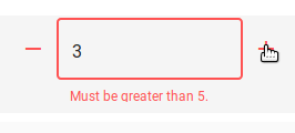
| rules | An array of functions called for validation that should either return true or a String error message. See Vuetify Text Field docs for details. |
Array | [] |
| step | Sets amount to be added/subtracted when using +/- icons | Number | 1 |
| value | Input value | Number, String | undefined |
Events:
@input: Emitted when value is changed using +/- icons or after user input.