<v-stack-bar>
<v-stack-bar> is a Polymer 3 web component for creating stack bar.
<v-stack-bar bars="[15,50,35]"></v-stack-bar>

<v-stack-bar bars="[15,50,35]" descriptions='["First element","Second element","Third element"]'></v-stack-bar>

<v-stack-bar bars="[20,30,50]" theme="lumo-success"></v-stack-bar>

<v-stack-bar bars="[1,20,80,140,52,33,674]" colors='["pink","green","brown","red","blue","black","red"]' background-colors='["blue","pink","green","black","brown"]'></v-stack-bar>

<v-stack-bar bars="[1,0,1]" colors='["pink","green","brown"]'></v-stack-bar>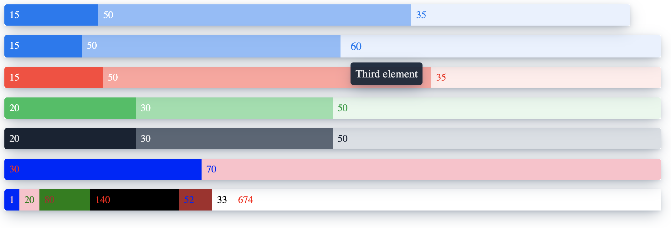
Getting Started
To use <v-stack-bar> the only required attribute is bars which contains a array of values.
There are more optional attributes:
- descriptions : array of text displayed on hover
- theme : lumo-primary, lumo-error, lumo-success and lumo-shade. By default configure only 4 different values
- colors: array of colors (to display the value inside the bar)
- background-colors: array of background colors
If the value = 0 then the bar is not displayed (but the color is reserved for the value).