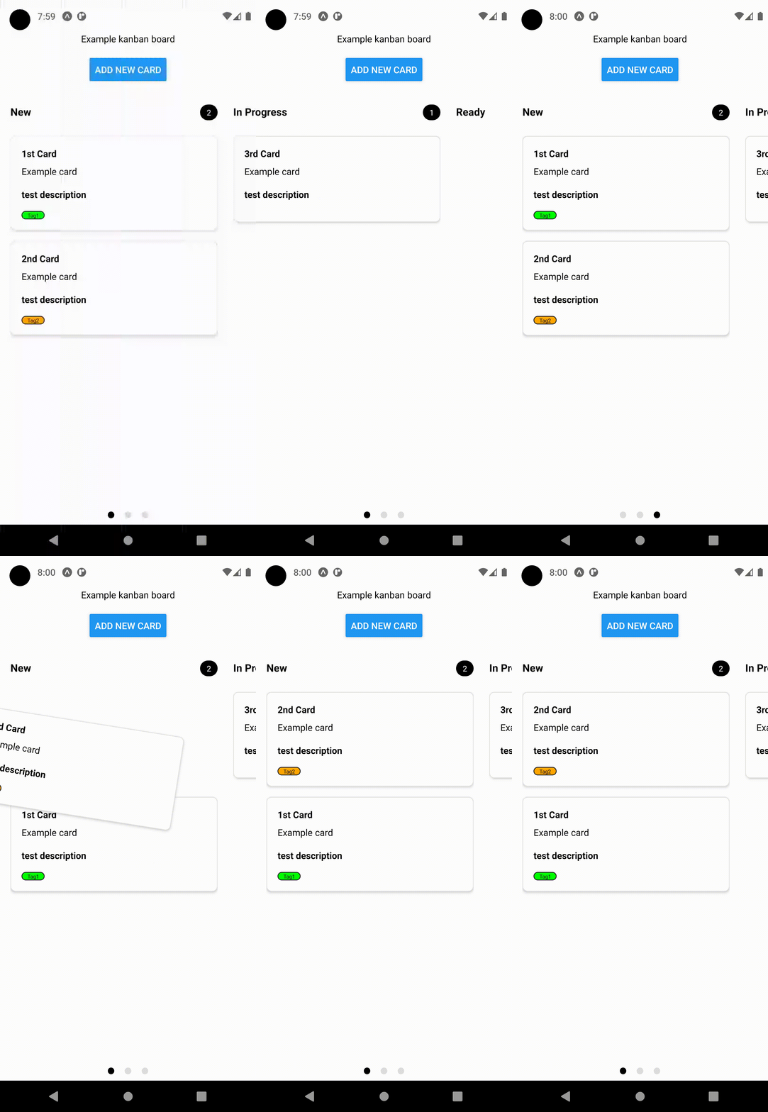
@intechnity/react-native-kanban-board
A kanban board for React Native.
Installation
npm install @intechnity/react-native-kanban-boardUsage
Import the necessary components and types:
import { KanbanBoard, ColumnModel, CardModel } from '@intechnity/react-native-kanban-board';Define the columns and cards:
const columns = [
  new ColumnModel("new", "New", 1),
  new ColumnModel("inProgress", "In Progress", 2),
  new ColumnModel("ready", "Ready", 3),
];

const cards = [
  new CardModel(
    "card1",
    "new",
    "1st Card",
    "Example card",
    "test description",
    [
      {
        text: "Tag1",
        backgroundColor: "#00FF00",
        textColor: "#000000"
      }
    ],
    null,
    1
  ),
  // ... add more cards ...
];
Create event handlers:
const onCardDragEnd = (srcColumn: ColumnModel, destColumn: ColumnModel, item: CardModel, targetIdx: number) => {
  // Handle card drag and drop
};

const onCardPress = (item: CardModel) => {
  // Handle card press
};
Render the Kanban Board component:
<KanbanBoard
  columns={columns}
  cards={cards}
  onDragEnd={onCardDragEnd}
  onCardPress={onCardPress}
/>
API
KanbanBoardProps
-
columns: ColumnModel[]
An array ofColumnModelinstances representing the columns on the Kanban board. -
cards: CardModel[]
An array ofCardModelinstances representing the cards within the columns. -
onCardPress?: (model: CardModel) => void
Callback function invoked when a card is pressed. -
onDragEnd: (srcColumn: ColumnModel, destColumn: ColumnModel, item: CardModel, targetIdx: number) => void
Callback function invoked when a card is dragged and dropped onto another column. It receives the following parameters:-
srcColumn: ColumnModel- The source column from which the card was dragged. -
destColumn: ColumnModel- The destination column where the card was dropped. -
item: CardModel- The card that was dragged and dropped. -
targetIdx: number- The index at which the card was dropped within the destination column.
-
-
renderCardContent?(model: CardModel): JSX.Element | null
Optional custom renderer for the card content. -
renderEmptyColumn?: (item: ColumnModel) => JSX.Element
Optional custom renderer for an empty column. -
cardContainerStyle?: StyleProp<ViewStyle>
Custom style for the card container. -
cardTitleTextStyle?: StyleProp<TextStyle>
Custom style for the card title text. -
cardSubtitleTextStyle?: StyleProp<TextStyle>
Custom style for the card subtitle text. -
cardContentTextStyle?: StyleProp<TextStyle>
Custom style for the card content text. -
columnHeaderContainerStyle?: StyleProp<ViewStyle>
Custom style for the column header container. -
columnHeaderTitleStyle?: StyleProp<TextStyle>
Custom style for the column header title.
Note: StyleProp<ViewStyle> and StyleProp<TextStyle> are types from the react-native package and are used to define custom styles for components.
Contributing
See the contributing guide to learn how to contribute to the repository and the development workflow.
License
MIT
TODO
- Render custom column
- Input margin/paddings
- Overhaul of KanbanContext Provider
- Style cards count indicator
- Tests
- CI linting

