
Hızlı geliştirme, kolay bakım ve erişilebilirlik için optimize edilmiş bir bileşen kütüphanesi.
Amacımız, GİB-UI tasarım sistemini kullanan uygulamalar için en uygun kullanıcı deneyimini sunmak üzere titizlikle tasarlanmış ve geliştirilmiş bir UI kütüphanesi sunmaktır. Tasarım ilkelerini ve geliştirme uygulamalarını dikkatli bir şekilde değerlendirerek, GİB tasarım sistemiyle sorunsuz bir şekilde uyum sağlayan ve uygulama kullanıcıları için genel kullanılabilirliği artıran sorunsuz ve kullanıcı dostu bir arayüz sağlamayı amaçlıyoruz.
@gib-ui/icons SvgIcon bileşenleri olarak kullanıma hazır 2.100'den fazla ikon içerir.
gib-ui/core ve gib-ui/icons kütüphanelerini yüklemek için:
npm install @gib-ui/corenpm install @gib-ui/iconsyarn add @gib-ui/coreyarn add @gib-ui/iconspnpm add @gib-ui/corepnpm add @gib-ui/iconsBu şekilde gib-ui bileşenleri ve ikonları react projenizin içinde kullanıma hazır olacaktır.
import { Button } from "@gib-ui/core";
import { Delete } from "@gib-ui/icons";

export default () => (
  <>
    <Button buttontype="primary">
      <Delete />
    </Button>
  </>
);
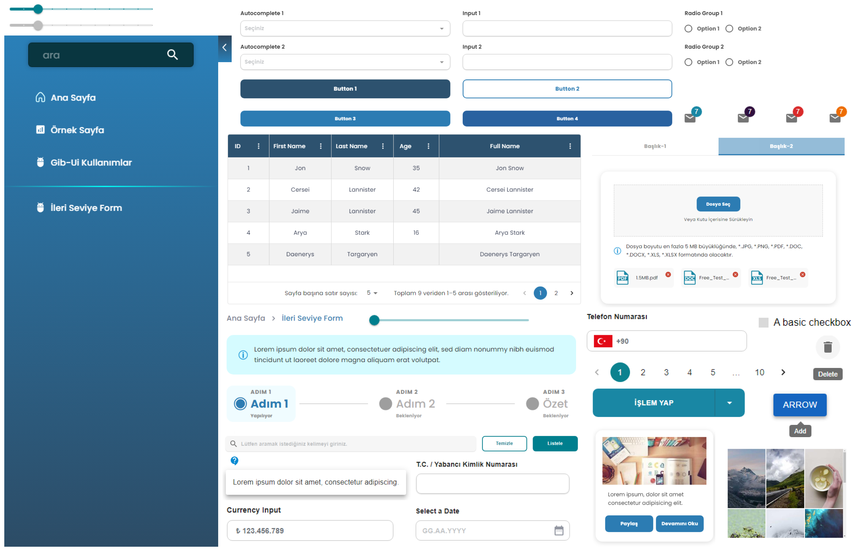
- 🎨 İyi tasarlanmış, özelleştirilebilir React bileşenleri.
- 🌍 Internationalization desteği.
- ⭐ Sorunsuz entegrasyon için güvenilir statik tipler sağlayan TypeScript ile yazıldı.
useWindowSize ile tarayıcı penceresinin boyutlarını takip edin.
import { useWindowSize } from "@gib-ui/core";

const App = () => {
  const size = useWindowSize();
  // Your component logic here, utilizing width and height values
  return (
    <div>
      The current window dimensions are:
      <p>Width: {width}px</p>
      <p>Height: {height}px</p>
    </div>
  );
};- Erhan Külekci - Frontend Team Lead @erhan.kulekci
- Berkay Yüksel - Frontend Developer @berkay.yuksel
- Funda Kartal - Frontend Developer @funda.kartal
- Umut Güler - Frontend Developer @umut.guler
A component library optimized for fast development, easy maintenance, and accessibility. Just import and go—no configuration required.
Our objective is to deliver a meticulously designed and developed UI library, tailored to offer the optimal user experience for applications utilizing the GİB-UI design system. Through careful consideration of design principles and development practices, we aim to provide a seamless and user-friendly interface that aligns seamlessly with the GİB design system, enhancing the overall usability for application users.
@gib-ui/icons includes the 2,100+ icons as SvgIcon components.
To install gib-ui/core with all its components and gib-ui/icons run:
npm install @gib-ui/corenpm install @gib-ui/iconsyarn add @gib-ui/coreyarn add @gib-ui/iconspnpm add @gib-ui/corepnpm add @gib-ui/iconsThis way gib web components and icons will be ready to use inside your react project.
import { Button } from "@gib-ui/core";
import { Delete } from "@gib-ui/icons";

export default () => (
  <>
    <Button buttontype="primary">
      <Delete />
    </Button>
  </>
);
- 🌟 Enterprise-class UI designed for web applications.
- 📦 A set of high-quality React components out of the box.
- 🔧 Comprehensive suite of design assets and developer utilities.
- ⭐ Written in TypeScript, ensuring reliable static types for seamless integration.
- 🌍 Internationalization support.
- 🎨 Powerful theme customization.
Track the dimensions of the browser window with useWindowSize.
import { useWindowSize } from "@gib-ui/core";

const App = () => {
  const size = useWindowSize();
  // Your component logic here, utilizing width and height values
  return (
    <div>
      The current window dimensions are:
      <p>Width: {width}px</p>
      <p>Height: {height}px</p>
    </div>
  );
};- Erhan Külekci - Frontend Team Lead @erhan.kulekci
- Berkay Yüksel - Frontend Developer @berkay.yuksel
- Funda Kartal - Frontend Developer @funda.kartal
- Umut Güler - Frontend Developer @umut.guler